
I was a few steps away from the checkout, MAC’s Warm Neutrals Palette in hand, when I thought… I actually won’t use around half of these colours. It doesn’t include any of the shadows I’ve been lusting after for a while now and, in my opinion, there are a few too many yellow-y honey shades and no “curve-ball” colours that would really mix up my every day looks. For £65, it’s a pretty steep investment in something I wouldn’t use all that much.
So I put it back and decided to build my own custom pro palette.
MAC eyeshadows aren’t cheap by any means (individual pans cost £10) so building your own 12 piece palette will cost just under double the price of the pre-made ones. But if being able to pick out your own shades means that you’re more likely to use them at every opportunity, the extra expense is surely worth it.
The range of colours and finishes offered by MAC is quite overwhelming when you’re trying to choose just twelve. Whenever I visit my local store, I go into a heady daze where everything and anything is beautiful, wonderful… and affordable (eesh), which doesn’t make for easy decision making.
But I’m going to (try and) be sensible. I’ve decided to choose 4 matte transition shades, 4 warm neutrals (frosts/shimmers) and 4 more unique, out-there colours to mix up my go-to looks. Here are my first 6 beauties:
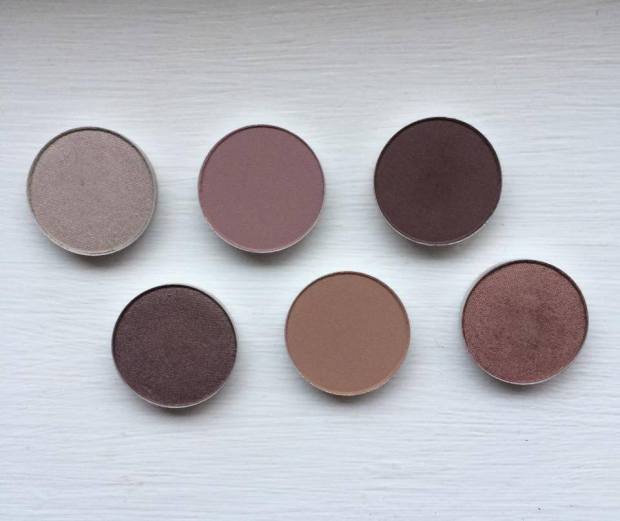
Mattes:

L-R: Wedge, Quarry, Handwritten
Wedge: This is one of MAC’s most popular transition shades, a lovely warm beige. Given that I’m a sucker for warm colours, I was surprised to find that I don’t actually own a matte in this colour, so it was an obvious choice to help blend other shadows. Its neutral hue and matte finish provide a “no make-up, make-up” look which is perfect for Spring and helps to add definition to the eye with subtle depth.
Quarry: A lesser known shade, Quarry is a unique grey-beige matte with a cool mauve undertone. In comparison to Wedge, Quarry is great for blending out cooler shades of grey, pastels and silver. Again, a great staple for lighter Spring-time looks when you want to tone down that dark smoked out eye.
 Handwritten: Okay, so I know I’ve just said that I’d look to tone down a smoky eye for Spring, but there are some days when nothing else will do. If in doubt, smoke it out, right?!
Black smokes can look a little heavy on my face, particularly if my eyes are tired and a little puffy, so I usually rely on chocolate browns or deep burgundies as my go-to smoke shades. Handwritten is ideal for this, either placed across the lid or blended into the crease.
Warm Neutrals:

L-R: Satin Taupe, Sable
Satin Taupe: My first “proper” eyeshadow was Bare Minerals’ Loose Shadow in the colour ‘Celestine,’ a beautiful mid-tone taupe with a gold shimmer. I must have worn it almost every single day whilst I was at university, no matter what the occasion. Since leaving (and having an income!), my makeup collection has grown and Celestine has gotten lost – or ‘over-shadowed’ (BADDUM…) – by my other palettes. When I swatched Satin Taupe, it instantly reminded me of Celestine (if not as shimmery) and I knew I had to have it.
Maybe it’s just me, but I often work on creating multi-tonal smokes in my crease and underneath my eyes, but can sometimes be left stumped as to what to use on my lid. I need a neutral colour with enough oomph to stand up to dark smokes and enough interest to work well be itself. Satin Taupe is the answer!
 Sable: This was the first shadow I was drawn to when scanning the shelves at MAC. Sable is a warm, earth coloured red – the marsala shade – with a delicate gold shimmer that is not at all ‘glittery,’ but rather has a gorgeous pearlescent finish. I tend to use this in a similar way to Handwritten to mix up my usual smoky eye looks. Though classed as a ‘shimmer,’ Sable’s shine is subtle enough to be smoked out in the crease without causing your eyes to glimmer like beacons – an absolutely beautiful shade perfect for switching up classic looks for those summer-time date nights!
Curve-balls:

Vex: This is a strange colour, but strange in a really really good way. It doesn’t look much of a “curve-ball,” but it’s duo-chrome finish is so difficult to capture on camera. While it looks like an ordinary silver grey shadow in some lights, in others it shines like a pearl with pink, purple and green hues. The best way to draw out the multi-dimensional colour of this shadow is to foil it with MAC’s Fix+ or another mixing medium. I’ll definitely be making the most of this shade this Spring as it makes for a gorgeous compliment to pastels and smokes alike, it’s great for adding a quirky edge to simple looks.
 So, that’s half of my collection already sorted! Ideas for my next 6 shades include ‘Cranberry,’ ‘Pink Freeze,’ ‘Mythology,’ ‘Plum Dressing,’ ‘Crystal’ and ‘Trap’ with possible curve-balls being ‘Plumage,’ ‘Sumptuous Olive,’ ‘Jest’ and ‘Lucky Green.’
What are your favourite MAC shades? Would you consider making your own custom palette?
Hope you like!
Molly x

Quarry is so pretty! 🙂
I love all these shades! I have a few single mac eyeshadows but I sort of got addicted to palettes from the likes of Stila and Urban Decay. I do plan on making my own Mac Pro palette at some point though! Woodwinked and All That Glitters are two of my favourites!! X