Review: Urban Decay’s Perversion Mascara and Cream Eyeliner

This post is one of two halves, one glowing review and one not-so-glowing, and not in the order I expected.

Anyone who follows me on Instagram will know that I can’t be without my eyeliner, whereas I usually skimp on mascara and opt for falsies. So it was a huge surprise to me that out of Urban Decay’s ‘Perversion’ range, I would love the mascara and really really really (really) dislike the gel liner. I’m not one for hating on a product, but I feel like I need to share my disappointment in the hope that I bought a ‘dud’ and that someone will point out that I’m completely mistaken.

I guess it’s better to get the negative out of the way first…

Super-Saturated Ultra-Intense Waterproof Cream Eyeliner in ‘Perversion,’ £16.00

Regardless of what I’m about to write, I remain a huge fan of UD’s eye products, particularly their Naked and Vice palettes with their signature pigmented, creamy finish. I therefore can’t understand why I haven’t taken to the Perversion Gel Liner; it seems, to me, to be a bit of a blip for an otherwise great, reliable brand.

I bought this as soon as I saw the glint of glass at the bottom of my Illamasqua liner pot; thinking I’d switch things up (despite my love of Illamasqua’s Precision Gel), I chose UD for its claims to be “super-saturated.” But I was a little suspicious when I first opened the jar and tried to swatch the mixture on my hand. I applied a little pressure, but nothing. My finger was as pale as ever. Maybe a film or crust had settled on top, I thought. So I picked up my eyeliner brush and scratched away at the surface. And I did really did have to scratch… (you can see from this picture below how the mixture isn’t exactly ‘creamy’)

Though I had more success in picking up some colour this way, I was really disappointed with the pigmentation and texture. As you can tell from the pictures, it is not at all ‘saturated,’ but looks more like yesterday’s liner after a few too many vodkas and a lonnnnnng sleep. To achieve the standard opaque finish would take a lot of coats and even then I don’t think it would be possible to achieve a clean, precise line – the mixture is just too thick and solid to work with. I even tried to scoop some out and ‘whip’ it to a smoother consistency, but the product dries almost immediately and begins to crumble, covering my cheeks in flecks of black powder 😥

Has anyone else experienced this? I’ve considered adding a little Fix+ or mixing medium to loosen it up, but I’m afraid this will weaken the colour, making it ‘wishy-washy’ (for want of a better term). Have I just been unlucky with one of a bad batch?

Perversion Mascara, £17.00

I did hesitate before buying the Perversion mascara, but then it began to follow me everywhere… It seemed to crop up in every magazine I read and all over my Facebook page advertised as the best mascara around.

Before now I thought that my eyelashes were beyond help. A couple of years ago I got into the habit of repeatedly curling them after I’d applied my mascara. One day at uni (while I was trying to look my best for a date… bloody typical), a whole bunch from the inner corner of my left eye fell out. And therein began my reliance on false eyelashes. Though my lashes have grown back, they are incredibly weak and poker straight so it’s rare that I find a mascara that doesn’t weigh them down with lumps of product.

Just one coat (!)

Just one coat (!)

But, UD’s Perversion is very different. As it’s so pigmented, one stroke is all you need to blacken your lashes. Unlike its eyeliner counterpart, this mascara really is super-saturated. It also holds well throughout the day; my drugstore mascaras – I mainly use Rimmel – begins to flake after around 4 hours, but Perversion stays fresh for the whole working day.

If UD were to make this mascara even better, I would suggest a double–ended wand. While the current wand is perfect for preventing clumps, it is big and cumbersome, particularly when trying to apply mascara to the lower lashes.

With summer on the way, though, I think it is worth investing in a decent mascara like this one to avoid the struggle of falsies on those sweaty, eye-squintingly sunny days.

How do your experiences with these products compare? Have they entered your ‘essentials’ list?

Hope you like!

Molly x

Follow me on Instagram: http://www.instagram.com/beautsoup

My First Purchases From NARS: Audacious Lipstick and Eyeshadow

In my local Selfridges store, the Illamasqua counter is only metres away from the NARS counter, but it had never troubled me to go to ‘the other side’ until my last visit when I caught sight of the Audacious lipstick stand.

I’d seen numerous blogs raving about them, so I thought I’d pop over and have a cheeky swatch. And that was that. I fell down the rabbit hole into a beautifully luxurious NARS-y wonderland.

Well, almost. The three sample lipsticks that caught my eye were decidedly chewed and when I summoned up the courage to buy one without testing it, I was told there was none left in stock. Frustrated and geared up to buy something, I looked over the eyeshadows, found the one I fancied, and was told that, again, there was no stock.

2015/01/img_0498-1.jpg

Eyeshadow in ‘Strada’ (£18.50) and Audacious Lipstick in ‘Anna’ (£24)

I looked e.v.e.r.y.w.h.e.r.e and eventually found them on ASOS’s site, two days later and here they are!
Packaging

As I opened the delivery box, the first thing I noticed was the size and weight of the products. The lipstick is the same shape as my Illamasqua ones, but bigger and heavier (!). It feels like a superior, quality, expensive product. The eyeshadow, too, sits in a smart, compact clam-shell style box with a cute little mirror on the inside. The only issue is its rubberised coating which shows mucky fingerprints like WOAH.

But the lipstick, in particular, is finished with little touches that makes it just that bit better than the other mid-range brands. The lid is magnetised – a handy little extra which means there’s no chance of it falling off in your handbag – and the actual lipstick is engraved with the NARS logo, which might add nothing to the product itself (especially when you’ve used so much that it begins to read ‘ARS’) – but it feels special all the same.

Colour

It was verrrrry difficult to decide what lip colour to go for; the line has 40 shades in total from the lightest nude to the deepest purple – there is a colour for every style and occasion. I’ve got a thing for dark reds/deep plums so was instantly drawn to Charlotte and Ingrid, but with Spring fast approaching, I thought it would be more worthwhile to invest in a light, versatile colour.

2015/01/img_0495.jpg After much deliberation (I even thought about blowing my wages on the whole collection at one point), I chose Anna. I’ve read quite a few descriptions on the internet where Anna is called a ‘smoky rose.’ I can see what they mean… kind of. To me, ‘smoky’ suggests dark, warm colours, like MAC’s Smoked Purple, but Anna is actually a medium, cool-toned, pink-mauve shade. It is the perfect pink; not pastel, not Barbie, but somewhere in between.
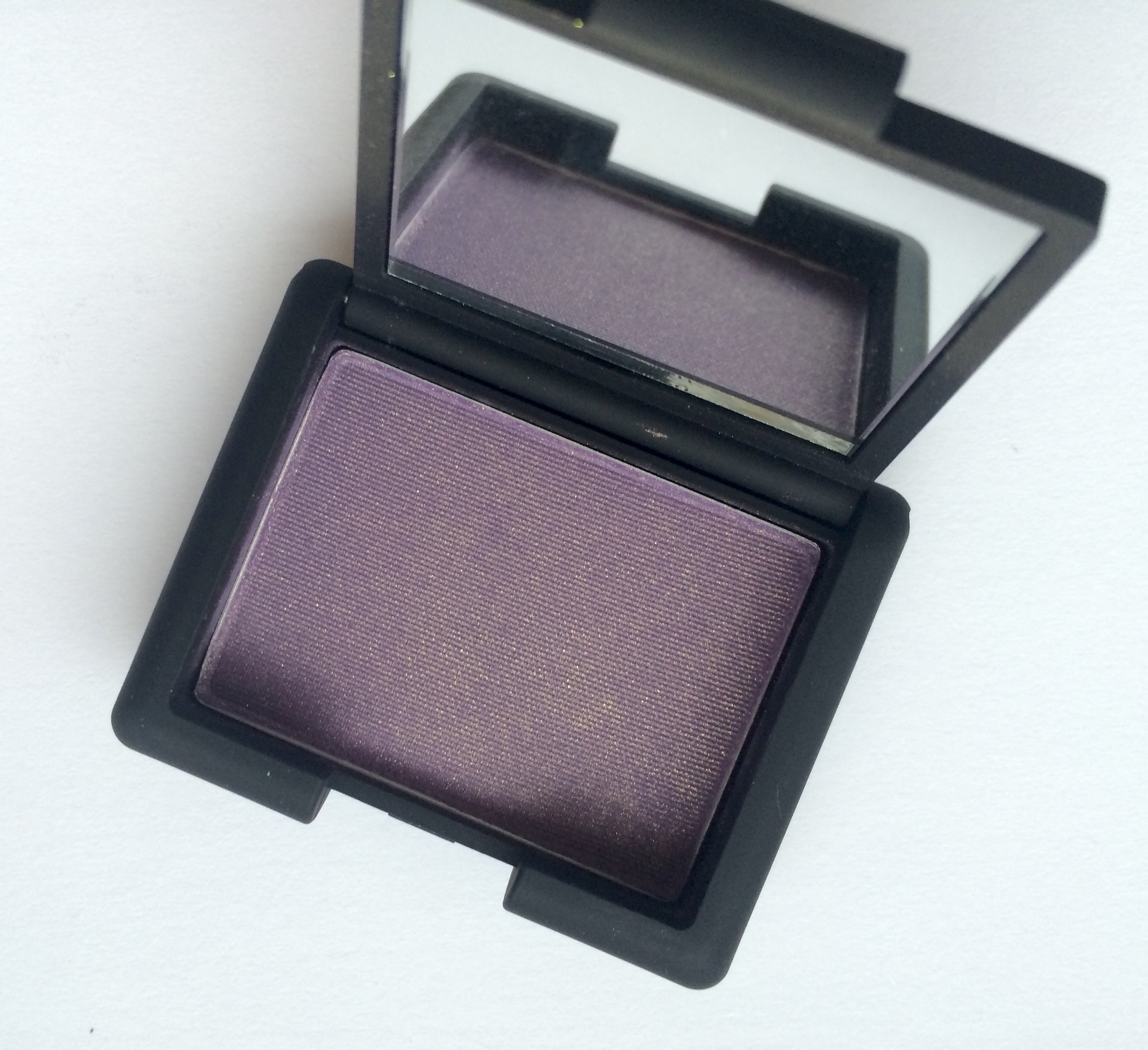
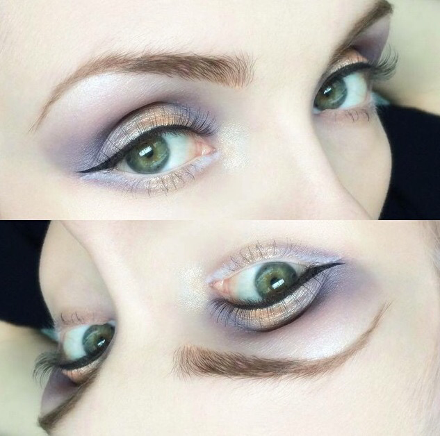
Unlike the lipstick, I didn’t choose Strada, Strada chose me ❤ It is an absolutely beautiful eyeshadow unlike anything I’ve seen before. Pastels are set to be big this Spring and many brands have released their own lilac shadows in various hues, think Illamasqua’s Creep. What is unusual, however, is Strada’s gold shift. I’ve never thought to pair lilac with gold, but assumed its cool tones would work better with an equally cool silver highlight, like Sugarpill’s Frostine. The fine gold shimmer that runs through this shadow is not only unique in itself, but also gives you more freedom to experiment with the rest of your makeup, creating new combinations of cool and warm colours.

2015/01/img_0502.jpg Application

The lipsticks in the Audacious range are dubbed as the ‘one-stroke’ wonders, so highly pigmented that there’s no need to swipe your lips more than once. I was sceptical as my lips can sometimes be a little dry meaning that one coat can look quite patchy. But it is actually true! With one coat, my lips were covered! The colour wasn’t as strong as I would have liked, but they really were covered. I tend not to apply more than two coats before I am happy with the intensity of colour and the even coverage. Anna has a lovely buttery texture that allows the colour to transfer easily to the lips, but its semi-matte finish means that – without going wild at the buffet – it can stay put for almost 4 hours before wearing away from the centre of the mouth.

10933061_10152553275486128_1167534661_n

Strada, on the other hand, isn’t so pigmented. I think I’ve been spoiled by the colour-rich, crazy pigmented shades like those of Illamasqua and Lime Crime, but it certainly takes a lot more effort to bring out it’s gorgeous colour. This could well be because it is a shimmer rather than a matte shadow as shimmers are notorious for not having such a strong colour pay-off. In the picture shown below, I applied around three coats of the shadow with a soft blending brush. As it turns out, this shadow doesn’t respond well to foiling; wetting the mixture brings out the shimmer more so than the colour. To achieve the most true colour, I’d recommend using a white/extremely pale eyeshadow base instead. NYX’s Jumbo Eye Pencil in Milk (my hero) is perfect for this.

2015/01/img_1486.png

The intense gold colour is Illamasqua’s Furore, see my earlier blog post on pure pigments.

These won’t be my last purchases from NARS. In my opinion, the tangible quality of the products makes that extra £5-£10 well worth it. I’m already trying to choose my next lipstick, Anita or Bette?

What are your favourite NARS products?

Hope you like!

Molly x

My Favourite Foundations: Rimmel, Illamasqua and MAC

You’ve heard it all before, especially of late, “It’s all about that bass base.”

Having recently bought – though I feel better about the price if I say ‘invested in’ – Illamasqua’s SkinBase Foundation, I thought it would be fitting to write a review on my three favourite bases.

Rimmel Match Perfection in 001 Light Porcelain £6.99

So when I wake up at 6am, bleary eyed and puffy faced, it feels like a waste to apply my ‘best’ foundation for work. In the stuffy air of commuter trains and busy offices, I want a light, breathable foundation that won’t leave me feeling icky by 5pm.

Colour and Coverage : Seeing these foundations side by side, it’s clear that ‘pale’ doesn’t always mean pale; too peach, too pink, too orange, I’ve tried the lot.

Rimmel’s ‘Light Porcelian’ is truly the perfect colour for me; a fairly neutral shade with a slight pink hue that helps warm up my pale bits and tone down my blotchy bits. As the consistency of this foundation is very runny, when blended out, its coverage is sheer to light. It is therefore better intended for evening out complexions rather than concealing dark circles or blemishes. That being said, it is relatively easy to build up to a light to medium coverage if you apply a layer, set with powder, and then apply another layer.

Finish and Staying Power: You’ll have to pardon my lack of technical terms, but this foundation is very ‘wet.’ It is runny when dispensed from the bottle and has a similarly moisture-rich feel on the skin which is both a good and a bad thing. The dewy, satin finish means that I can fake healthy, hydrated skin even in this bitterly cold weather. I reviewed this foundation as part of my ‘Five Steps to Dewy Skin’ (read it here) and still believe that it is the best for achieving that desirable ‘glow from within’ look.

For those with oily skin, though, it may proof just too greasy feeling. I often find that, as the day goes on, the product slides away from my nose and down between my eyebrows where my skin can get oily. On the train home from work, the last thing I’m bothered about is my foundation, but if I were to wear this foundation for an event, I would recommend applying powder throughout the day to blot the excess moisture. Overall, though, it’s not bad for only £7!

The Weekend Foundation: Illamasqua’s Skin Base in 02, £32

At the weekend, I want the same breathable feel as my weekday foundation, but with a fuller coverage. So at the other end of the price spectrum is Illamasqua’s SkinBase Foundation, my weekend foundation. I had read a lot about this foundation before committing myself to buying it and, on the whole, I’m not too disappointed.

Colour and Coverage: 02 is the lightest colour offered by the SkinBase range, excluding pure white. As you can tell from the swatch, the difference between Illamasqua’s and Rimmel’s lightest shades is huge! 02 is described as ‘Pink Undertone with Yellow’ meaning it has the same balanced tone as Rimmel’s foundation, but is a lot lighter. If anything, this is a little too light for me so I often mix it with my Rimmel or MAC products to suit my skin.

The consistency of the product shouldn’t fool you; though it is just as runny as Rimmel’s foundation, it is considerable more pigmented. So while it can only be applied in very thin layers at a time, you’ll probably need fewer layers to mask those dark circles and blemishes. This cuts out that gross greasy feeling you get with heavy foundations and avoids clogging up your pores – yay!

With a good medium coverage, the SkinBase will even out skin tones, minimise dark circles and go someway towards hiding those angry spots.

Finish and Staying Power: The finish is somewhere between satin and matte as the formula is based on a BB cream rather than a standard foundation. BB Creams are full coverage foundations with a multi-functional purpose, acting as a primer, foundation, concealer and sun-screen. Amazing, right? Well, yes – if all of these functions work perfectly. As a foundation/concealer, the SkinBase is great but susceptible to over-working. I always apply my foundations with a beauty blender and have found that with too much dabbing the foundation begins to lift away, causing uneven coverage. The product also transfers easily to my fingers without using a substantial dusting of powder to set it. This means that any touching or poking at my face can leave behind noticeable fingerprints. But I guess that’s the price I have to pay for its silky texture.

As a primer, the SkinBase is so-so. I have experienced no sliding, caking or break-down before 5-6 hours of wear. Buuuuuut (and there’s always a but), it does have a habit of settling into my pores and fine lines soon after I apply it – and by soon, I mean about 10 minutes. It similarly clings to my dry patches, so be sure to moisturise well before using it! Using a primer beforehand does limit this, though that defeats the purpose of the ‘multi-functional’ formula. Illamasqua’s Hydra Veil primer, for example, is £30 and I feel that spending £62 on an effective primer/foundation combination is too expensive.


The Day to Night Foundation: MAC’s Studio Fix Fluid in NC15, £21.50  

With MAC’s Studio Fix Fluid, I don’t need to use a primer, but can rely on it alone to take me from a day in the office to a night in the pub!

Colour and Coverage: As you can tell from the swatch, this is the darkest shade I own, even though it is the lightest shade produced by MAC. The colour looks so different to the two other foundations because I opted for the yellow toned (NC – Neutral Cool) rather than the pink toned (NW – Neutral Warm) shade as I felt that NW15 was that bit too pink for me to pull off (just google any comparative swatches to see what I mean).

Many people assume that Studio Fix Fluid is full coverage, but it is actually a build-able medium coverage foundation, which puts you in control of where the most product should go. This means that I rarely need to use a concealer and even when I do, it is only to cover particularly dark circles or very angry spots.

Finish and Staying Power: This foundation has a natural matte finish; it is shine-free, but not so matte as to make your face appear flat and lifeless. Perfect!

As it contains silicone and various powders, the formula can zap moisture from the skin so those with dry skin should be sure to properly moisturise before applying to achieve the most consistent finish. For those with combination or oily skin, however, this is actually a bonus. As the product absorbs excess oil, there is very little movement throughout the day. I have found that it stays even and fresh looking for around 8 hours!

As you can probably tell, I have very little negative to say about MAC’s Studio Fix Fluid. If anything the colour is slightly off, but I do lighten it with powder and highlighter. It would probably my favourite out of the 3, but I try to mix up my foundation routine throughout the week to save clogging my pores with too much highly pigmented, heavy coverage product.

So what are your favourite foundations?

Hope you like!

Molly x

Review: Lime Crime’s Venus Palette

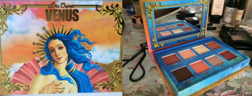
Introducing the “newtrals,” Lime Crime’s Venus mixes “Botticelli’s classical painting with the rebellion of the early 90s” to create the grunge palette.

I thought I’d collected my fair share of ‘warm’ eyeshadows: think MAC or Sigma’s ‘Warm Neutrals’ and you think taupes, caramels, the token frosted copper and highlight. But for Lime Crime, warm means deep red, russet and chocolate.

Needless to say, I saw the swatches on Instagram and fell head over heels, but was a little anxious as to how the ‘oranges’ and ‘reds’ (for want of more poetic titles) would translate on my fair skin. The smoked out bruised look may have worked in the 1990s, but this is 2015 and I have to pop in Sainsbury’s without any stares.

So when Santa left this under the Christmas tree, I got to work testing different looks and combinations. Here are my thoughts:

Colour choice: This is the best part of the palette and, perhaps, the most important part. There is a good even range of dark and light shades, all with their own unique tones that are unlike any shadows I’ve tried before. They are, too, surprisingly versatile; Icon and Divine are especially useful for giving a new twist to my go-to looks. That being said, it is worth being careful not to go wild with the reds; blended too far around the eye and it won’t be pretty, more sickly.

The wide range of the colours provided means that there will be at least one that isn’t for you. For me, this is Rebirth, the colour of ‘an overripe nectarine’ (…) or a bold medium orange. It is a beautiful shade, but will not work with my skin tone. Though I do like to use a light dusting on my cheeks over my usual blusher, just to add a different hue.

I would also like Aura to be a little lighter. As the palette’s highlight, for me, Aura would work better as a cream/champagne rather than a gold as I find myself having to brighten it with a whiter shade (usually UD’s Bobby Dazzler). Although, without it’s subtle metallic colour, the palette would be a little flat. The jury’s out!

Pigmentation: Below are the official swatches that I originally saw on Instagram. As you can see the satin shades, Aura and Shell, are particularly bright and bold, and the mattes deep and opaque. Lovely. Though I’d imagine that Doe Deere (the inventor of the palette and owner of those fingers) used some sort of eyeshadow brightener to boost the colours. Lime Crime actually does produce a brightener, but it’s £13.50 and I’d rather spend that amount on a new velvetine.

The pigmentation, then, without such a brightener can vary. Matte shades tend to need two or three coats if they’re going to look as deep and consistent as they do here. I usually cover my eye with NYX’s Jumbo Eye Pencil in Milk to achieve the most ‘true’ colour; the white base serves as a brightener would, but costs almost a third of the price. The Satin shades have a slightly better consistency, but also need a little help from a mixing medium if they’re going to look as bold as they do above.

Texture: The texture reminds me a lot of Sigma shadows. They seem ‘thin’ on the eye. By that I mean weightless, with a velvet feel. While that’s lovely, there is a fine line between that and ‘chalky.’ The mattes, in particular, can feel chalky if applied in layers and do have a fair amount of fall-out (but I’m yet to use a palette that doesn’t).

Special Mentions:

Divine: ‘Dusty Stone’

The rather bleak description does this colour no justice at all. Divine makes the perfect transition shade, but I also like to use it alone to shade my crease for subtle everyday looks. The more it is blended, the more the colour seems to develop from an average taupe to a lovely pink-toned beige. It’s like MAC’s Velvet Teddy in an eyeshadow!

venus

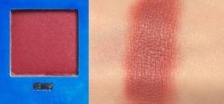
Venus‘The Colour of Bruised Fruit’

It’s UD’s Vice 3’s Sonic, but better. Venus is a gorgeous red-brown with a light satin finish. Despite it’s unusual colour, it is surprisingly versatile and can work with similarly warm tones as well as navy, deep purples and silver. An essential shade for that sultry smokey eye.

Creation: ‘Rust Brown’

I left this colour untouched for a long time assuming that it was too orange-y for me to pull off, until one Sunday afternoon – pjs on and nothing to do – I decided to test it out. I absolutely love it! Creation is an unusual burnt orange colour that looks beautiful when paired with Divine. A must-have for those with green eyes!

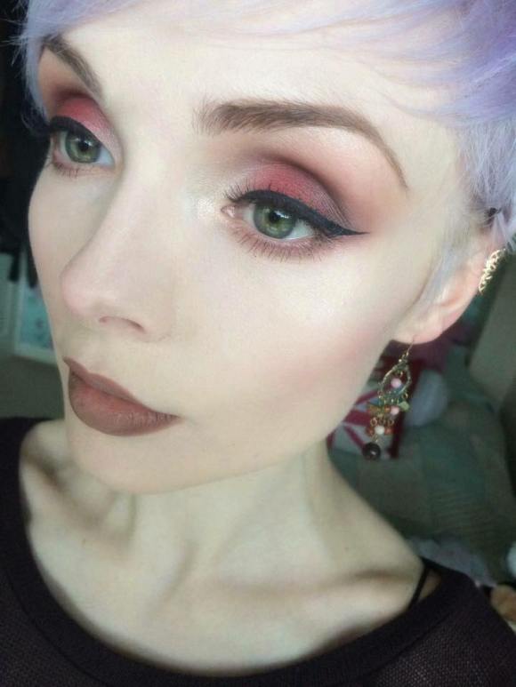
In this look, I used Divine, Venus, Creation and a little Icon on my eyes, Aura to highlight my cheekbones and Rebirth as blush:

10893332_10152537124636128_354730897_n

What do you think of the Venus palette?

Hope you like!

Molly x

My Contouring Routine

I’m a recent contouring convert; ever since that photo of Kim Kardashian, I’ve been trying to add some definition to my face, drawing various lines in various colours in various places.

I’ve tried taupe, bronze and dark brown eyeshadows, eye pencils, creams and blushes in the hope of achieving the right look and after many attempts (and some utter disasters), I think I’ve finally cracked it!

Shading

Illamasqua’s Skin Base Lift in White and Cream Pigment in Hollow (both £17.50)

My first step is to ‘shade’ my face, or to map out where I want the light and shadow to be; I find that by first adding a subtle glow and depth to the skin, any extra definition added later to the nose and cheekbones looks more authentic. To do this, I’ve found the best products to use are cream pigments, essentially colour-rich concealers.

After applying my foundation and a very light layer of concealer around my eyes (just to even out those blueish veins), I apply the two pigments in those places that I feel need an extra oomph.

(Please excuse the damp hair and pyjamas…my getting-ready routine isn’t at all glamorous)

My favourite products for this shading are Illamasqua’s Skin Base Lift in White and Cream Pigment in Hollow. The Skin Base Lift has a beautifully silky, almost gooey, texture that blends easily with my foundation without losing any of its brightness. While it adds a visible glow to my skin, I don’t rely on this as my sole concealer. Illamasqua claims that each of the Skin Base Lifts has a peach undertone that perfectly counteracts blueish hues, particularly around the eyes. I guess having chosen the white shade, which obviously has very little peach to it, I have had to compromise on this full coverage. Nevertheless, I would recommend this product for those with pale skin who may struggle to find a contouring product light enough to make a noticeable difference.

Hollow is another product ideally suited to paler skin types due to it’s cooler tone. Before using this, I had been using Benefit’s Hoola to define my cheekbones: Hoola is known for having a cooler tone than most bronzers meaning it works well on even the fairest skin, but I personally prefer Hollow as its colour is cooler still, meaning it adds shade without any unconvincing ‘tan’ or orange hue.

Once applied, I then blend these pigments out with my beauty blender being sure to avoid any streaks, but also to keep the colours within their demarcated ‘zones.’

Defining

NYX Powder Blush in Taupe (£6.00) and Illamasqua’s Gleam in Aurora (£21.50)

For adding further, more defined, shadows to my face, I prefer to use a dark powder. As I like to add a little more colour to my nose (which, due to my combination skin, can get oily), I use a powder to avoid adding more product, which can lead to caking.

I use NYX’s Powder Blush in Taupe, a similar grey-brown to Hollow, to carve out my cheekbones with a dense blusher brush and to shape my nose with a detail brush, as shown below. As a powder, it is much easier to build up substantial colour without clogging the skin with too much product.

That being said, for my highlighter, I would have typically used a white eyeshadow with a light shimmer, until I discovered Illamasqua’s Gleam. I recently bought a bundle from eBay which included this Gleam and now I can’t stop using it.

gleamaurora

Many reviews I have read have complained that this highlighter’s sticky formula can lift off foundation and it certainly does (I have caused all kinds of blotches because of it) if not used sparingly. To me, it is less of a cream and more of a gel-like consistency and, though quite peculiar to work with, produces the most ethereal delicate glow.

My Gleam, Aurora, is a lovely champagne colour which works well with warmer shades of eyeshadow and lipstick on fair skin. With cooler shades of make-up, I would probably opt for a similarly cool toned highlighter – I’m waiting for Illamasqua to bring out a white/silver Gleam!

My face is now ready for eyeliner, mascara, the works! Contouring can look lovely and natural when just set with a little powder and left alone, but can also provide a base for adding a little blush or extra bronzer. In the look below, I chose to keep it simple with an ordinary contour and neutral lips and eyes.

What are your favourite products for contouring?

Hope you like!

Molly x