Anastasia Beverly Hills ‘Sun Dipped’ Glow Kit

My obsession with illuminators knows no bounds and the ABH Glow Kits are by far the highlight of my collection. The newest addition? The ‘Sun Dipped’ Glow Kit, released just last month.

Following the model of the two previous palettes, ‘Sun Dipped’ contains four large pans of metallic powder, but the shades inside are entirely different to those of its predecessors. While ‘Gleam’ was largely cool toned, and ‘That Glow,’ warm, ‘Sun Dipped’ is a perfect combination of the two.

SunDippedGlowKit

Claudia Soare, known as Norvina on IG (@norvina1), says that the kit is ‘reminiscent of summer. It represents the sun in various stages of the day, various places in the world, and items that reminds us of summer.’ And it’s true, including shades evocative of both pearly moonbeams and the dazzle of bright midday sun.
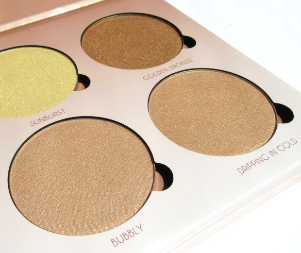
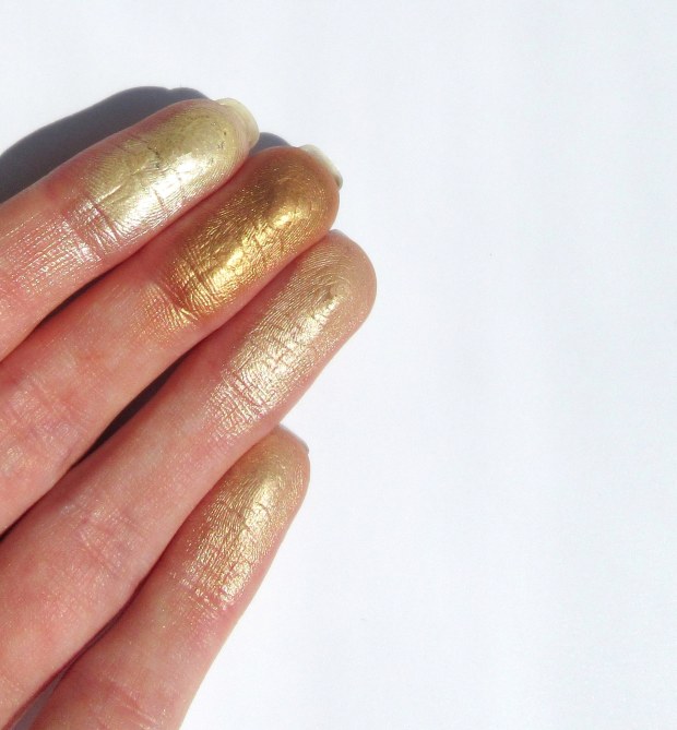
Shades:

-Bronzed: ‘amber with a penny metal finish’

-Summer: ‘luminous sand with a white gold finish’

-Tourmaline: ‘warm taupe with a rose gold finish’

-Moonstone: ‘radiant quartz with a pearl finish’

IMG_0429IMG_0430

Colour Range:

The combination of pearls, taupes and golds in this palette make it even more universal than the previous two. Though ‘Moonstone’ and ‘Summer’ are very alike, they do appeal to different tastes, the first having only a slightly cooler cast than the second. Fans of ABH Illuminators – now extremely hard to get hold of – will find that ‘Moonstone’ is very (very!) similar to ‘Starlight,’ a favourite for those with fair skin, and that ‘So Hollywood’ is reborn in the shade, ‘Summer.’

‘Bronzed’ is a touch too dark for my skin tone, but it can be layered over bronzer for an ultra sun-kissed vibe. And, for a sucker for warm tones like myself, it makes a stunning eyeshadow, especially with a chocolate brown smoky eye.

I can just about get away with ‘Tourmaline’ on my fair skin, which is lucky because it must be my favourite shade ever. It’s such an unusual combination of cool and warm tones, much like the ‘Riveria’ Illuminator, a rose gold. Depending on your skin tone, it will swatch as either a gorgeous taupe or a gilded pink. Either way, it’s beautiful!

IMG_0437

IMG_0445

You can also mix shades to create your own custom highlight; my favourite combination is ‘Moonstone’ and ‘Tourmaline,’ which together create a lovely pink champagne colour. Once I’ve applied a bit of fake tan and some extra bronzer, however, the mix of ‘Summer’ and ‘Bronzed’ will help bring the perfect glow to my holiday snaps! The possibilities, though not quite endless, are many: just dip your brush back and forth between the shades to combine the powders and voilà!

Texture & Staying Powder:

As with the other kits, the powders aren’t exactly creamy, but are rather very finely milled. Though this causes a fair amount of fall-out, they are extremely lightweight and are less likely to cake when layered over cream based foundations or concealers. It takes a few swirls of the finger or brush to really gather up the pigment, but dampening your brush – ideally using a mixing medium like MAC Fix+ rather than water – can really help achieve maximum shine.

Unable to decide between ‘Gleam’ and ‘That Glow’? Then the ‘Sun Dipped’ Glow Kit is ideal for you and makes for the ultimate makeup companion this summer. Will you be taking the plunge? Coming soon to Roses Beauty Store!

Anastasia Beverly Hills ‘That Glow’ Glow Kit

If 2015 was the year of contouring, 2016 is the year of highlighting. Both Jeffree Star and Nikkie Tutorials have recently taken to Youtube to post full-face looks using only highlighting powders and central to their routines are the ABH Glow Kits.

Released at the end of 2015 to honour Anastasia Soare’s birthday, the palettes continue the success of the brand’s Illuminators, which took the beauty world by storm. And what could be better than one highlighter? Well, four.

ThatGlow1

The ‘That Glow’ Kit is the warmer of the two palettes currently available (though we await the release of the ‘Sun Dipped’ version this summer): while the ‘Gleam’ Kit offers rosy, pearl tones, ‘That Glow’ is all about a golden bronze shine. As a pale girl myself, I must confess that I snapped up ‘Gleam’ in an instant, ‘That Glow’ just looked too bronzy, my milk bottle skin wouldn’t do it justice. But, I was wrong. In fact, in my opinion, the ‘That Glow’ Kit is the slightly more versatile palette of the two, even for someone as fair as me.


Packaging:

In contrast to the weighty, decorative, luxurious, packaging on the market – the Urban Decay Gwen Stefani Blush Palette, for example – the Glow Kits cardboard casings may be a little underwhelming. That being said, they are very resilient to wear and tear, mostly because they are so slim and lightweight. They can be slipped into a suitcase, handbag or Zuca without taking up much room at all. The pans can also be removed and added to a custom magnetic palette if preferred.


IMG_0387

IMG_0390.JPG

So, the shades themselves:

-Sunburst: ‘a bright luminous gold with a metallic finish’

-Bubbly: ‘a champagne rose with a pearlescent finish’

-Dripping in Gold: ‘a lavish gold with a vivid reflective finish’

-Golden Bronze: ‘a sultry, warm bronze with a gold-flecked finish’


Colour Range:

There really is a shade for everyone, and for every possible use on the face, eyes and body. Though ‘Sunburst’ looks very yellow in the pan, on the skin it is less a ‘luminous’ gold than a true champagne that, if not used as a highlight, can be mixed with face powder for that all-over luminosity. ‘Bubbly’ and ‘Dripping in Gold’ are very, very similar in colour, but their respective pink and peach undertones means that they can be layered over top of blush for the ultimate mineralised finish. Lastly, ‘Golden Bronze’ <3. This shade is just too warm for me to use as a highlight, but makes for the most beautiful eyeshadow when paired with neutrals or jewel toned emeralds and navies.

IMG_0392

IMG_0395

Texture & Staying Powder:

The powders aren’t exactly soft and buttery, but are rather very finely milled. This means, though there is a fair amount of fall-out, they are extremely lightweight on the skin and are less likely to cake when layered on top of foundation, concealers or other cream-based products. Their intensity is somewhere between Becca and The Balm (swatched below); it takes a few swirls of the brush/fingers to really gather up the pigment. That being said, the powders are buildable and can also be applied with a damp brush – ideally, using a mixing medium like MAC Fix+ rather than water – to maximise their shine.

With summer just around the corner, the ‘That Glow’ Kit is the perfect addition to any makeup arsenal; it is truly a ‘kit,’ not just a highlighter palette, but an eyeshadow/blush/body bronzer set rolled into one.


Will you be getting your glow on? Check it out That Glow Kit.


*this link will take you to Roses Beauty Store, an online UK makeup stockist. In return for some of the newest releases, I’ll be blogging for them regularly.


Review: Illamasqua’s Gel Sculpt

Illamasqua’s Gel Sculpt was heralded as the new thing in contouring. It would usher in a new era of defining the face, they said. But, for what it’s worth, I’m unconvinced.

I remember the social media posts leading up to its launch: monochrome, abstract, mysterious. The hype surrounding the unveiling was huge and I was completely sucked in. I had my phone on my desk at work, continually checking my emails until it dropped into my inbox: ‘Available now.’ But then the delivery arrived and compared to the enormity of its billing, the box was teeny tiny. 

It’s so good that you won’t need to use a lot…It’ll last forever, I told myself.

And yes it probably will, because – two months later – I’ve only used it once.

Take off the cap and you’ll find a cylinder of solid gel (it reminds me of roll-on deodorant) with a fresh floral smell. Weird, but I can handle weird. Scoot the gel across your hand and it gets weirder. What, in the bullet, looks like the perfectly cool, deep IMG_4456taupe transfers to the skin as a pale coffee hued smudge. Gel Sculpt is really a glorified cheek tint and a strange one at that.

In their quest to create the first ‘natural’ looking contouring product, Illamasqua have skimped on the colour-punch that typifies their brand. Silhouette, so far, is the only shade intended to ‘sculpt’ the face so I understand that they needed to produce a shade that would suit every skin tone, but the truth is there isn’t a universal colour that will please everyone and, even if there was, I don’t imagine it would be as warm toned as this. I guess the name ‘Silhouette’ implies its intention to mimic natural looking shadows, but I can’t help but think it should be called ‘Obvious.’

The picture on the left was taken after just one stroke on my hand, immediately after application. As you can see, the colour is wish-washy, the coverage sheer and the finish oddly glossy. When I first used this on my face, I quickly applied more coats, presuming the colour would deepen as desired, but the sepia only became more opaque… in patches. With a slight hesitation, I took up my make-up sponge to dab off the excess and start again, but by that time the gloss had turned to matte, the gel had dried and my contour was fit to survive pollution on a nuclear scale.

illamasqua

L-R: One stroke; Two strokes; A desperate amount of strokes.

A waterproof contouring product that won’t fade or rub away throughout the day? Amazing!

If you actually like it…

I just can’t seem to get my head around this product. I’ve tried applying it straight from the bullet onto my cheeks, but it dries too quickly leaving an unyielding streak of bronze that refuses to blend. I’ve also tried Illamasqua’s recommended method of application: the gel is applied to the fleshy part of your palm beneath your thumb on one hand; then bounce your palms together to distribute the product over both hands; finally, with your thumbs parallel to your ears, dab the product onto your cheeks, cradling your cheekbones.

IMG_4463

What I mean by “the fleshy part of your palm beneath your thumb.”

This method is great for creating a subtle hue around the face… if you’re careful. But as there’s little to no precision involved, it’s quite difficult to stop the product from straying into your hairline or down onto your jaw (and there’s no hope of neatening it up afterwards). I tried this method just before writing this post and had to apply more foundation underneath to try and sculpt some sort of shape from the brown splodge, which I eventually completely covered in NYX’s Taupe blush. Fail.

Perhaps, in a different shade, I’d appreciate Gel Sculpt a little more. The formula is innovative, but fraught with practical issues like ‘how on earth do I apply this?’ If the gel wasn’t to set as quickly as it does, it would be a whole different story, but for now it will sit gathering dust on my dresser.

What do you think of Illamasqua’s Gel Sculpt?

Hope you like!

Molly x

Laura Mercier’s Priming Duo: Foundation Primer + Eyebright

Primers have become an increasingly important part of my daily routine as I’ve gotten older. In my early teens, I had woefully dry skin, particularly around my nose, and found no way to remedy it other than to pull away the loose flakes (GROSS). In my late teens, I seemed to miraculously develop a T-zone and experienced ‘angry spots’ and open pores for the first time along with my already crispy nose (DOUBLE GROSS). Now, in my early twenties, my skin has plateaued at a manageable, if sometimes frustrating, combination of greasy and flaky (triple gross?). So along with my usual concoction of moisturising products, primers are a staple of my make-up kit.

Laura Mercier’s Foundation Primer, £29

Before now, my first and only primer had been Revlon’s Photoready which, despite having used it religiously for three years, wasn’t always up to scratch. Though it keeps my makeup in place for around 4 hours without noticeable creasing, its chalky paste-like texture does little for my already dry skin. It not only makes my rough patches more pronounced but can make my whole face feel tight and uncomfortable. So having scoured the internet for an alternative, there was one primer that seemed to stand out from the crowd – Laura Mercier’s Foundation Primer.

I know, I’m considerably late to the party, but its continued success since its first release in 1995 is hard to ignore. Winner of InStyle’s Best Beauty Buys Award last year, I figured its £29 price tag was a small price to pay for such an apparently amazing product. And who am I to argue with InStyle? Nobody.

But, as with anything, it has its quirks. Having used such a thick primer for years, the consistency was the first thing to strike me. It is a particularly loose, semi-set gel that turns to liquid as soon as it touches the skin. This carries the usual benefits: a little goes a very long way, there’s no risk of it caking and it feels instantly hydrating. Which are all good, but deceptive.

The formula is so thin that it feels as though it’s not actually doing much to your face, much like splashing it with water. Perhaps I’ve been kept in the dark for too long, but I’ve always associated primers with making my skin feel ‘buffed,’ that crazy smooth, lump and dimple-free, almost furry, feeling when all pores are filled and all wrinkles blurred. This meant, on first application, I assumed I hadn’t applied enough and coated my face in at least three days’ worth only to find my skin as un-‘buffed’ as ever…and a little sticky.

So the trick is to let it set before applying any products on top; if you’re too hasty, the formula has no time to create that desired ‘barrier’ over pores and fine lines and you’ll see no pay off. But give it a minute or so and this stuff makes for a lightweight, but seemingly impenetrable face fortress.

Unlike some, less expensive primers, this doesn’t zap all moisture from the skin in an attempt to prevent shine; instead it sets to a semi-matte, ‘second skin’ finish that allows for a flattering natural sheen. This is great news for those with dry/combination skin like mine, as it doesn’t feel tight or dehydrating and allows for what ‘glow’ you have to peak through. For those with oily skin, though, this formula may not be ‘heavy-duty’ enough to hold back shine for the whole day. On my oilier days (phases of the moon and all that…), I’ve noticed that, although my makeup doesn’t budge, I still need something to blot my T-zone. Those with oily skin types may therefore prefer to give the Oil-Free version of this primer a try as it is specifically geared towards controlling oil production and soothing blemish prone skin.

IMG_0233

The wonders of Laura Mercier’s Foundation Primer have been talked about for almost twenty years, and with good reason, but before you invest, it’s worth testing out the product at your local beauty counter to get a feel for its effective, if peculiar, formula.

Laura Mercier’s Eye Basics in Eyebright, £19

Laura Mercier’s Eye Basics are a small collection of tinted eye primers that work to prime, conceal and correct your eyelids. Seven of the Basics are neutral colours intended for particular skintones, but the eighth, Eyebright, is a striking baby blue. Even when Laura Mercier does colour, it’s in the most sophisticated of ways, with deep plums, navies and emerald greens so Eyebright stood out as something entirely different… I had to buy it.

The reviews of this product on various sites are awful with most complaining about the unusual colour, but I like it…I think. Due to a consistent lack of sleep (and a slight allergy to eyelash glue), my eyelids are always puffy in the morning. This, together with my already pale skin tone, makes for sallow, veiny and swollen skin that needs to be soothed and hidden, pronto. A sweep of Eyebright and my eyelids look instantly brighter and more even; the pale blue colour helps give life to pallid skin and neutralises redness, while anti-oxidants Vitamin A, C and E along with other anti-inflammatories reduce puffiness. Unlike the other colours in the range, Eyebright also has medicinal properties (apparently… LM doesn’t state exactly what these are) to heal and soothe broken skin. Which I don’t have…but when I do, it’ll be helpful.

Once blended, much of the colour fades to an almost sheer, white semi-matte finish which my fair skin can get away with wearing alone, but I’d  imagine that, on darker skin tones, this white wash across the eyes would look too stark. As a base for eyeshadows, though, Eyebright works with any skin tone and helps cling to pigment, making shadows look more opaque and pigmented.

Crease-resistant and waterproof, Eyebright is a good product to have in your beauty arsenal to give a much needed lift to tired eyes, used alone to colour correct and conceal or beneath eyeshadows to prime. That being said, this isn’t cheap. And does it do something that no other product can? Well, no, not really. A good concealer, corrector or eyeshadow base can do pretty much the same thing. For me, the real benefit of Eyebright is the colour; concealers and correctors can hide dark circles and redness, but are rarely pale enough to truly ‘brighten’ my skin. ‘Brightening’ concealers are often very yellow – in an attempt to cancel out blueish shadows. On certain skin tones, this just replaces one problem with another – tiredness with ‘jaundice.’ If you’ve been searching for something to avoid both of these issues, then maybe it’s worth giving Eyebright a go!

Would you consider Laura Mercier’s primers? What are your favourite priming products?

Hope you like!

Molly

Faking a tan: MAC’s Powder Blush in Harmony

The sun is coming out, summer’s on its way and, yes, I could just sit outside slathered in oil with a sheet of tin foil, but why sweat when I can just fake a tan? This tutorial will show you, especially you pale folk, how to fake it without the risk of streaks or that lingering smell of biscuits.

11348840_10152797372816128_1972554482_n

Contour

So, of course, the most important part of this look is your base with the secret being – as always – contouring. Whatever you do, do not try and fake it by using a darker shade of foundation/concealer! Contouring will only add colour to those areas of your face that would usually catch the sun, making for a more natural looking ‘tan.’

My preference for this look is a powder contouring product; cream-based pigments and concealers can look a little heavy on the skin and the look we’re aiming for is something fresh and ultra-natural. Powders are also much easier to work with in terms of building up colour and blending thoroughly. My go-to powder contour will forever be NYX’s Blush in Taupe, a perfect cool-toned brown. But, alas, a tan will never be cool-toned, so my mission began – find a warm contouring product for the palest of the pale.

11287403_10152797372791128_561216259_n

And here it is, MAC’s Powder Blush in Harmony, my most favourite product for this Spring/Summer. The colour is particularly difficult to describe as it lies somewhere between warm and cool tones. MAC describe it as a “muted rose-beige brown,” which kind of sounds like they couldn’t decide how to label it either, but I guess they’re not far wrong. The key with Harmony is that it doesn’t have that bronzer-type orange/terracotta look, instead it’s ‘rose-beige’ hue mimics the colour that pale skin would conventionally turn in the sun (providing it’s slathered in factor 30).

I begin by first applying my usual concoction of foundation: MAC’s Studio Fix Fluid in NW10 and Illamasqua’s Skinbase in 02. On the left below I have indicated the areas that I would usually contour using MAC’s Harmony and on the right, those areas I would contour with my conventional cool-toned contour, i.e. NYX’s Taupe blush.

Screen Shot 2015-05-21 at 18.17.57.png

Add the two together and viola – sunkissed skin! As you can see, I bring my warm contour a little wider and higher than my cool contour, straying into the areas of my face I would usually highlight. Just as highlighter is used on the high points of the face, so too should this warm contour as these areas (cheekbones, nose, chin and forehead) are always the first to tan.

I choose to apply MAC’s Harmony first using my Zoeva Cream Contour Brush (though intended for cream based products, the angled edge of this brush makes it ideal for hugging the natural curvature of my face), being careful to diffuse it as much as possible – the wonderful feather-light formula makes this very easy! Blending a small amount of product around and underneath your jaw line will help prevent your neck looking a completely different colour to your face and I also like to add some across my collarbones to continue the illusion that I’m lusciously bronzed all over (remember to do this if you’re wearing a low cut top).

11358692_10152797372746128_69643950_n

I then use my MAC 186 Small Contouring Brush (it’s small, dense tip is great for focused and defined contouring) to apply NYX’s Taupe into the hollows of my cheeks using tight circular motions in an upwards direction. I’ve added a comparison photo of the cool and warm contour to give you an idea of how warm Harmony is (please excuse the state of my NYX’s blush, it’s particularly loved!).

Then for my nose, I use my Sigma Detail Brush to draw two lines about a centimeter apart down the edges of my nose with Urban Decay’s ‘Tease’ eyeshadow from the Naked 2 palette (NYX’s Taupe works equally well, but the buttery eyeshadow is particularly easy to blend). Having blended this in with my fingers, I use any excess product left on the 186 brush to continue blending and deepen the colour.

Highlight

MAC’s Lightscapade holds a special place in my heart as a 10/10 highlighter, but I think this look requires something a little warmer than its pale champagne colour. My favoured highlighter for this Spring/Summer is Illamasqua’s Lumos from the Sculpting Duo; it’s peachy gol11304283_10152797372771128_223119123_nd tone with super-fine shimmer adds the perfect natural ‘glow’ to the skin that, together with MAC’s Harmony, makes for the ultimate ‘sun goddess’ pairing.

I apply this is all of the conventional areas (overlapping some of my warm contour), particularly focusing on the bridge of nose and the highpoints of my cheekbones using my Zoeva Luxe Highlighter Brush. Beware that Lumos is a particularly fine powder so you may need a few coats to get the glimmer you desire (it also has quite a lot of fall out, so don’t apply it whilst wearing your best white dress…I speak from experience).

Blush

I don’t feel that this look really needs a blusher as there is already plenty of warmth in the contour; all the same I opted for an blushequally bronzed, glowy looking colour just to finish the face (I guess you could use a pink or plum, but I think the ‘flushed’ cheek is more girl-next-door than beach babe).

MAC’s Cream Colour Base in Shell makes the ideal blush for this sun-kissed look; just as Harmony brings together just the right amount of pink and beige, so does Shell have the perfect blend, a iridescent rose gold. With its gorgeous glossy finish, this cream colour adds that “fresh-from-the-sea” glow to balance the matte contour. I apply it with my fingers to the apples of the cheeks, sweeping it back and upwards to join my highlight, sitting just above my contour. This product also makes for a striking yet simple eyeshadow, just dab over the lid for a super chic take on the glossy eyes trend.

Eyes + Lips

For the look that I originally posted on Instagram, I chose a cool brown/taupe palette for my eyes and lips, using MAC’s Satin Taupe eyeshadow and LA Splash Cosmetics’ matte liquid lipstick in Ghoulish. I find that warm, deep colours can sometimes make me appear paler than usual as my skin doesn’t have the same depth of colour. So here I worked on the opposite principle: these neutral cool tones help to accentuate what warmth there is in my skin and so help me to appear more ‘tanned.’

tanyrah

That being said, my favourite lipsticks to add to this base are at the other end of the ‘subtle’ spectrum. MAC’s Costa Chic or Jeffree Star’s 714 are both neon coral, a shade notable for making tans look ahhhhh-mazing. The sheer brightness of these lippies can’t help but to emphasis the warmth of your contour making even the palest of the pale appear lusciously golden (I used Costa Chic in the picture on the right above). I’ll be writing another blog post specifically on coral lipsticks so stay tuned!

Will you be ‘faking’ it this summer?

Hope you like!

Molly x

Review: Anastasia Beverly Hills Contour Kit

I really want to love this palette, but I can’t.

Anastasia Beverly Hills is the brand that turns girls into goddesses. First they fixed our eyebrows and now they fix our faces, sculpting cheekbones and jawlines since April 2014 when the long awaited Contour Kit went on sale.

It’s only in the last few months that I’ve truly realised the wonders of contouring and so, ever since, this palette has been at the top of my wish list. Last Thursday I received some particularly good news (more on this in a later post!) and decided to just bite the bullet.

I’d seen pictures of the palette all over Instagram, but expected a little more than what I got. It looks, dare I say it… cheap *wince*

With the image ABH has as a glamourous, luxury brand, I think it would better suit an Illamasqua-esque packaging: an all-black, glossy case made of sturdy, chunky material with a mirror inside, maybe? Instead, the casing is made of a stiffened, matte black card, the type that will scuff and mark quite easily. Oh, and there’s no mirror 😦 I’d actually be happy to pay more than £40 for this kit if the packaging was just that bit more ‘fancy.’

11088254_10152696530011128_1867326654_n

But, even then, I still couldn’t use it.

Short of extending out a robotic arm and applying the powders for me, I expected them to deliver on every level. And, don’t get me wrong, there’s not a huge hype surrounding this kit for nothing; it seems that what money has been saved on the quality of the packaging has gone into the quality of the powders.

The term ‘buttery’ gets used a lot by beauty bloggers, but these powders really are lusciously smooth. You’d be forgiven for thinking they were cream-based; there’s no fall out and the pigmentation is amazing, even with the smallest dab of the brush. It’s another cliché, but a little really does go a verrrrrry long way. I’d imagine it would be a long time before you needed to buy a refill pan.

11086953_10152696548201128_256792745_n

For me, it will be a very very very long time – you could even say forever – as I won’t be using 4 of the 6 shades.

So now for the meaty bit: the colours.

I should have seen this coming. The palette is intended for ‘Light/Medium’ skin and though I fit into the former category, I certainly don’t fit the latter. I’ve seen a number of fair girls pull these shades off beautifully but, on reflection, perhaps they aren’t as pale as I am…

The Face Powders

11091167_10152696530006128_1864087248_n

As the two matte shades in the palette, I’ve assumed that Vanilla and Banana are the intended ‘face powders’ for setting and correcting. Vanilla, while a lovely colour in itself, should really be called ‘Light Peach.’ In the swatches below I’ve compared Vanilla to Bare Minerals’ Powder Foundation in ‘Fair’ and MAC’s Mineralise Powder in ‘Light,’ the difference is huge. There’s no way someone as pale as I am could use this as a powder; on Saturday, I actually used it in place of a blush!

11081453_10152696463956128_147367902_n

I knew when I ordered the palette that I would very rarely use Banana – if at all. If you like the sound of Ben Nye’s Banana Powder (which is quite hard to get hold of in the UK), this would make a great alternative. For me, however, the colour is just too strong to use alone. I tried it as a corrector and it works wonderfully, cancelling out the blueish hues of under eye circles. Just dab it over problem areas and then cover with your usual liquid concealer. But having just bought Bobbi Brown’s corrector (which comes in a paste form), I don’t think I’ll be swayed to choose Banana instead. Powder correctors can turn gummy when used under liquid concealers and, with all the primer in the world, it still manages to crease and cake.

The Highlighter

11091167_10152696530006128_1864087248_nThe last of the three light shades is Sand, a pale nude shimmer. This is by far my favourite colour in the palette; it’s delicate shimmer catches the light in just the right way, it’s in no way glittery but has an almost pearlescent finish. In the photo below, I’ve compared Sand to my current go-to highlighters.

As you can see, the colour is very similar to Illamasqua’s Helios from the extremely popular Sculpting Duo. 

Much like Vanilla, Sand is most definitely a peachy nude, however, the satin finish means even pale girls like me can get away with it, especially when it’s layered over blusher. Ideally, though, Sand would look something more like MAC’s Lightscapade, a more universal champagne shade that suits both cool and warm undertones.

11117804_10152696560741128_1989199120_n

The Contour Powders:

11081443_10152696529991128_653013877_n  (L-R: Java, Fawn, Havana) Again, I knew when I ordered the kit that I would find little use for Java and Havana, as both are particularly warm browns. But, I thought, with Fawn – a cool earthy shade – to rely on, I could use them to add a touch of warmth when the sun was out and when (if) I caught a tan this summer.

Of course, this depended on me liking Fawn. But I don’t. In the palette, sandwiched in between two russet shades, Fawn looks the perfect grey-brown. On my face, though, it’s still just that bit too orange-y.

11088253_10152696463796128_1131556952_n

In the photo above, I’ve compared the three colours to other contouring products I own. My go-to shades are Illamasqua’s Cream Pigment in Hollow and NYX’s Blush in Taupe, both of which have a much cooler hue when compared to Fawn. Fawn is a lot like Benefit’s Hoola with the volume turned up. 

I have to be careful to add only a modest amount of Hoola before I tip into Tango territory, so Fawn is all the more risky for me. But layered with a touch of blush, Fawn makes for a lovely plum coloured blush/bronzer that’s perfect for a night out, but for a Spring day, it is just that bit too heavy for my taste.

Overall, I’d give this palette a 6 out of 10. The only saving grace being the quality of the powders; as you can see from my swatches, their pigmentation and opacity rivals cream pigments! But, while the colours aren’t unusuable, they do need to be mixed with other products in order to suit my skin tone.

ABH has since promised a ‘Fair/Light’ kit, which will hopefully include all those shades necessary for sculpting a pale face: white, silver, champagne and taupe.

Either that, or I’ll have to get a spray tan..

Hope you like!

Molly x

Essentials: Bobbi Brown’s Corrector

I’m tired. Okay, I’m exhausted. But I don’t want people to know it.

And it happens every time: an hour after applying my makeup, they start to creep back to the surface, those dark under eye circles. These aren’t just ‘bags,’ they’re suitcases and they refuse to go away.

Despite a cocktail of concealers, my attempts to mask them are all in vain. By 3pm my eyes look dark and drawn. So how do those other people do it? How do they look as fresh at 8pm as they did at 8am? The answer: correctors.

Colour correctors can be applied underneath concealers in a paste form, or over the top of concealers in powder form, and are produced in a variety of shades according to their purpose (and their place on the colour wheel):

Green counters red –for taming angry spots and broken veins;

Yellow counters purple –for masking particularly dark circles, scarring and bruising;

Orange counters blue – for hiding under eye circles;

I chose Bobbie Brown’s Corrector (£19.00) because of its amazing texture; correctors are, by their nature, a lot thicker and tackier than concealers, but this is thick while easy to blend, gooey but not greasy. In my opinion, Bobbi Brown also has the widest variety of shades available. I had looked into buying MAC’s Conceal and Correct duo but found the colour choices quite limited. Yes, I want enough orange to hide my dark circles, but I don’t want to look like I’ve had a fight with a can of St Tropez.

The lightest shade of corrector available in the Bobbi Brown range is called ‘Porcelian Bisque,’ an almost magnolia colour with the slightest hint of warmth. I assumed that this would be the ideal shade for me, but when swatching it in-store I found it too light (!shock horror!). This would be a great choice for those wanting to try a tame corrector for the first time, or those lucky enough to have only the faintest dark circles. I, on the other hand, want a Photoshop worthy corrector, so I picked ‘Porcelian Peach.’

11020337_10152672991041128_404125399_n

As the name suggests, this shade is still among the lightest offered by the brand, but it has a considerable orange hue. In the swatch above I’ve compared it to my typical concealer shade, NARS Radiant Creamy Concealer in Chantilly (on the left). Bobbi Brown’s offering is the brightest of the two by far and has a salmon-esque colour as opposed to NARS’ typically yellow-toned bases. The corrector immediately lifts and brightens the skin, while it’s texture (I hope you can tell from this swatch just how thick and luscious it is) acts as both a wonderfully smooth primer and a glue to hold down your concealer.

I have to admit, I was a little nervous at first; being so pale, I’m particularly paranoid about my colour choices and, though I’ve had a number of concealer faux pas, I’ve never applied something so peachy intentionally. But, it works! In the pictures below, I applied my base as I usually would on the left and have added the corrector on the right. The difference is huge, and wonderful!

The true test of a corrector is its staying power. When your concealer begins to break down and fade after 5-6 hours (even when using the premium brands), a corrector will stay in place at full coverage for around 8-9 hours, meaning your face looks as fresh and dark circle-free as it did when it was first applied.

Of course, it’s not a miracle worker and there are some things to be careful of. This is by no means a light formula and adding another paste to your makeup routine does increase the risk of caking and creasing. The former can be easily avoided as long as you aren’t heavy-handed and blend the corrector in well – a  little goes a very long way (this one in particular won’t lose its intensity once blended).

As for creasing, I’ve found that applying a good amount of primer beforehand and a fair dab of powder afterwards helps to stop this from happening for the majority of the day. When I begin to notice lines appearing, it simply work the products back into my skin using my finger, reapply some powder, and I’m ready to go for the next few hours: a small price to pay for a dark circle eraser!

So, would you consider Bobbi Brown’s corrector?

Do you use correctors as part of your getting ready routine?

Hope you like!

Molly x

Essentials: Illamasqua’s Hydra Veil

There’s a lot of hype, and an equal amount of confusion, surrounding Illamasqua’s Hydra Veil. What is it? What does it do? Why does it look like that?! Well as someone who battles with flaky, dry skin, anything with ‘hydra’ in its name is an instant hit with me. Saying that, at £30, this product isn’t cheap and with its exact purpose somewhat ‘veiled’ in mystery (BADDUM-TSCH), it’s been one of those items that I’ve been lusting after, but not quite had the guts to buy.

Then payday came around and I got a little spendy.

I understand that there is a thread throughout my posts on the theme of “I bought this thinking it was [blah] when it turned out to be [significantly different blah].” Please trust that I really, really, do do my research on products before I buy them, but Hydra Veil seemed to evade any form of definition. What is a primer? What is a moisturiser? Neither or both?

So I bought it thinking it was the former; my foundation, particularly Illamasqua’s own Skin Base, has been settling into my fine lines a little too quickly of late, so I thought I’d invest in a good primer.

Illamasqua’s Hydra Veil is not a primer.

Well, not technically. Neither is it a “skin care” product as it doesn’t offer any long-term benefits to the skin – it won’t prevent those crow’s feet from forming and it won’t treat blemishes. But that doesn’t mean that it’s not absolutely AMAZING.

Illamasqua describes this as a “cosmetic care” product…

What I imagine they’re trying to get at is that Hydra Veil is geared towards enhancing the appearance of your makeup (your ‘cosmetics’), rather than treating or repairing your skin. With this instant hit of hydration, your skin becomes the perfect canvas.

In a typical Illamasqua-esque tub, all black, sleek and simple, there is a pool of clear jelly and a tiny little spoon. Cute, but a weird start to my getting-ready routine. It’s like no other beauty product I’ve tried before: just scoop out a pea sized amount and smother it all over your face. The veil has the texture of a semi-set jelly which barely holds its shape, so as soon as you apply a small amount of pressure it completely breaks down to a water-like consistency, making it easy to spread across the skin. If you apply the correct amount (more on this later), the product melts away in seconds to create that velvet soft, ultra smooth feeling that you would usually achieve with primers.

This is probably where all the confusion comes from as Hydra Veil does leave the skin feeling ‘primed’ for makeup. However, primers work by effectively placing a ‘lid’ over the top of pores and filling in fine lines. Any makeup applied afterwards therefore sits on top of this primer rather than falling into these crevices. This ‘lid’ also reduces the amount of oils secreted from the pores meaning that you’re less likely to develop shiny patches throughout the day.

Ilamasqua’s Hydra Veil, on the other hand, does not create such a ‘lid’ and it doesn’t fill in fine lines; this super smooth feeling is caused by the veil providing the skin with a huge, instantaneous hit of hydration which swells skin cells to leave that healthy, plumped feeling – an ideal base for makeup. Because of this, there’s no guarantee that your makeup will stay put for longer. It will, however, help to prolong that freshly-applied look by creating a delicately dewy glow.

Why not just splash your face with water? Water evaporates too quickly, particularly from a warm surface like skin, and can actually draw more moisture out than that it allows in.  Hydra Veil contains Glycerin (which I spoke about here), a product often found in mixing medium as it evaporates at a much slower rate than water. This means that products stay ‘wet’ for longer = the secret to that extended fresh-faced look.

I have noticed a huge difference when applying my foundation after Hydra Veil; my base seems to glide on effortlessly, no uneven patches, no difficulty blending, no caking or scuffing across dry skin. In particular, Hydra Veil works brilliantly in conjunction with Illamasqua’s SkinBase, the formula of which is given to highlighting every lump and bump. I haven’t noticed as big a difference in the longevity of my makeup, only that it looks ‘fresher’ for longer – which is obviously a massive bonus! Applying a spot of primer underneath my eyes and around my nose after the veil soon sorts this issue for a smile/frown/squint-proof base. It is especially good at waking up tired, puffy eyes, so massage some onto your lids to open up your peepers. (Illamasqua also recommends this as a post-shave balm (for guys, of course) to help soothe broken skin with a moisture punch)

The strengths of Illamasqua’s Hydra Veil are also its weaknesses; while it’s innovative formula works wonders, it can take a little getting used to. A very little goes a very long way; too much will only sit on the surface of the skin and have to be dabbed away = wastage and for an expensive product, wastage is a big no-no. It is worth experimenting with this product to see what is best for you: how much do you need; what areas of your face take to it best; what primers/foundations work best with it; they’re all questions raised by its weirdly wonderful design, and though it may take a few attempts, it will definitely be worth it in the end!

Would you consider Illamsqua’s Hydra Veil?

Hope you like!

Molly x

Review: MAC’s Mineralise Skinfinish – Natural and Lightscapade

So, my mini Manchester haul part two (see part one here) involves these beauties – MAC’s Mineralise Skinfinish in ‘Natural – Light’ and ‘Lightscapade.’

I get a real buzz out of buying products like these because they look so perfect and generous. Well, for the first handful of uses at least. The compacts are huge with MAC’s signature style: a clean, all black design with smooth, rounded edges. And that’s without seeing the products themselves: the pans are equally large and domed, the powders just as clean and smooth and, particularly in the case of ‘Lightscapade,’ mesmerizingly pretty.

MAC’s Mineralise Natural Skinfinish in ‘Light,’ £23.00

I’ve been looking for a decent powder for a while now. It seems that, as I get older, my skin gets oilier, so I don’t have a stock of powders I can rely on and my experience with different brands is quite limited. But you can’t go wrong with MAC, right?

Before now I’ve used Rimmel’s Stay Matte Powder for my work face and Bare Escentuals Loose Mineral Foundation for my ‘dressed-up’ face. Both have their weaknesses. Rimmel’s powder makes for a great blotting powder as it quickly absorbs oils, but unfortunately, on my skin, the powder doesn’t “Stay Matte.” It breaks down after 3-4 hours of wear meaning, by the end of the day, my concealer and foundation slips and slides as much as ever. It’s not bad for £3.99 though!

At the other end of the scale, there’s Bare Escentuals’ powder foundation. I plan to do an “In Defence Of” post about this as I think it gets a pretty bad rap from the beauty community; it’s by no means the powder, but it’s not all that bad once you’re used to its quirks. The trick to this powder is that less is more. I won’t go into too much detail here, but as a powder foundation, not a setting powder, it has a more opaque finish and a slightly thicker texture. Applying too much if therefore effectively like applying two layers of foundation = cake-face. A verrrrry light dusting can work well over the top of liquid foundation, but it’s just not right, and it’s been bugging me. 


So in comparison to Bare Escentuals, MAC’s Skinfinish is the ideal setting powder and is designed to work in conjunction with liquid bases = no cake-face. It has a very ‘thin,’ light consistency which makes it very easy to apply and helps avoid that awful gunky look as it sits on top of your foundation rather than mixing into it (as Bare Escentuals can). 

Coverage/Colour:

I find the idea of ‘coverage’ in relation to powders confusing: is a powder really meant to offer much? I personally don’t want my powder to contribute any real coverage to my face; doing so would only reverse the effort I’ve put into contouring and highlighting. I therefore only apply it sparingly to those culprit areas (underneath my eyes, around the tip of my nose, between my eyebrows and on my chin) with the intention of locking in place my foundation/concealer and matte-ifying the odd greasy bit. 

As I wrote about in my foundation post, MAC’s paler foundations/concealers/powders have a decidedly yellow undertone (as you can see from the swatch above) which is great for masking dark circles but not so effective at reducing redness so I wouldn’t rely on this to help cover that angry zit. The opacity of the powder can be adjusted depending on what you apply it with: a powder puff will pick up more product than a brush, while a damp beauty blender collects even more if you want a thicker covering. Still, I find that too much powder only dries out the skin surrounding the pimple which draws attention to it’s sticky-outy-ness *sigh* 😦

Finish/Staying Power:

The huge benefit of using this powder over conventional powders, and particularly translucent powders, is its ‘Mineralise’ formula.  A lot of powders are too matte, too focused on oil absorption, that they suck any sign of life out of your skin. MAC’s Mineralise range relies on the tiny light-reflecting minerals (much like those in NARS’ Radiant Creamy Concealer) to deflect light away from the face. While Lightscapade contains gazillions of these minerals for a gorgeous satin shine, the Natural Skinfinishes contain just enough to create a ‘glow,’ the desirable semi-matte “second skin” finish that mimics the subtle shine of naked skin. 

This powder’s staying power is second to none; I’ve lately become very paranoid about my makeup settling into the fine lines under my eyes and around my mouth, but this powder seems to do the trick! Inevitably, those creases begin to appear after 7-8 hours of wear so the odd touch-up is needed, but that’s a small price to pay for a powder that helps your foundation and concealer to look freshly applied for hour after hour.

MAC’s Mineralise Skinfinish in ‘Lightscapade,’ £23.00

I’ve heard of lipstick junkies, but is there such a thing as a highlighter junkie?! 

There’s been a gap in my little collection for a powder highlight so I finally decided to just go for it. And here it is. Aaaaaaaaaaah. It seems that there are many different versions of ‘Lightscapade’ – the latest reincarnation, for the ‘Lightness of Being’ collection, changed up the colour with pink and copper veining and stamped the powder with a cable knit design – but this is the old classic in fancy new packaging. 


Coverage/Colour: 

Again, coverage is a bit of a moot point with highlighters; my major concerns are it looking blotchy and obvious. But Lightscapade applies like a dream with the same weightless consistency as the Natural Skinfinish, leaving a subtle and consistent shimmer. In fact, the powder is so fine and delicate that I often get frustrated that it’s not showing up on my face, only to walk into a different light and have my cheekbones glisten. 

As a powder highlight, Lightscapade can be layered over a cream base for a super ethereal shine or used alone for a “your-skin-but-better” sheen. Its multi-dimensional formula means that different lights give different results so it might take a while to get used to the amount that’s perfect for you. 

Lightscapade’s gold hue would suit a variety of skin tones due to its multi-coloured veining: it contains warm gold for darker complexions, mid gold for olive skin and a champagne shade (and even a bit of blue!) for pale folks like me, all mixed into one. And you can easily vary it’s tone by changing the base you use underneath it; for example, I prefer it’s cooler shades so I often layer it over a white base (MAC’s Cream Colour Base in ‘Luna,’ reviewed here). On the other hand, a plum blush or bronzer will pick out its warmer tones if you prefer.  

Finish/Staying Power:

As the star of the Mineralise range, Lightscapade is packed full of those magical minerals that allow it to shine; it’s by no means ‘glittery,’ but has an ultra-fine, super satin finish that catches the light beautifully. Paired with the Natural Skinfinish, these powders recreate the skin’s natural, healthy radiance, almost as though you’re not wearing make-up!

Much like the Natural Skinfinish, Lightscapade will last up to 8 hours without losing its colour and shine. It’s lightweight formula resists caking and, in my experience, isn’t susceptible to excess oil – it remained in place across my T zone for around 6 hours and doesn’t transfer to the fingers as easily as a cream-based highlighter can.  

What do you think of MAC’s Mineralise Skinfinish?

Hope you like!

Molly x

Review: Nars Radiant Creamy Concealer

On a recent trip to the kingdom of shopping that is Manchester’s Trafford Centre, I thought it was high time I ticked some items off my wish list – the Nars Radiant Creamy Concealer being one of them.

This might as well be dubbed “the ultimate concealer,” claiming to hide all blemishes, brighten all dark circles and even all complexions. And, they’re right. Believe the hype – this stuff is the holy grail.

Colour:

For a long time now my go-to concealer has been MAC’s Prolongwear in NW15 but, despite being amongst the lightest colours offered by the brand, it’s still just that smidgen too dark and doesn’t brighten up the eye area as I would like. When searching for a concealer that would both cover and brighten, Nars’ offering was a constant favourite amongst bloggers, particularly for pale skin.

‘Chantilly’ is described as a “true ivory shade,” but this doesn’t do justice to how gorgeous it is. It is a pure, porcelain colour like no other concealer I’ve seen before, with only a hint of yellow (great for countering those blueish bags and veins). The formula’s light diffusing technology uses tiny mineral particles to reflect light away from those problem areas making the skin appear brighter and fresher. I found that this worked particularly well under the eyes (I’m super paranoid about under-eye circles) and helped to take the redness out of angry spots – sadly no one has invented a concealer that will remove the huge lump thats left behind though 😦

You only have to google colour swatches to see that ‘Chantilly’ stands alone as a wonderfully light concealer. The closest colour-match I can find is Collection’s Lasting Perfection in ‘Fair,’ which is hugely popular amongst those with fair skin (especially as it is only £3.99). With a difference of £18, however, this is where the comparison ends.

11004055_10152607401606128_385663721_n

Coverage:

Retailing at £22, the concealer’s expense is truly seen in its amazing coverage and lasting finish. The formula really is ‘creamy:’ luscious and pigmented enough to provide medium to full coverage, but not too thick as to look heavy and cakey.

Nars claims that the concealer is ‘buildable,’ but I would beg to differ. This isn’t exactly a negative as the concealer is opaque enough to provide great coverage with just one coat, but too many applications can reverse the buttery texture and begin to look thick and claggy. This issue is easily avoided with the help of the sponge applicator which gives you greater control over where the product is placed, reducing the risk of applying too much or wasting the excess (unlike MAC’s overly generous pumps!).

11004055_10152607401631128_1132074150_n Finish: 

The concealer blends well with a Beauty Blender, but I find that a brush is best to spread the mixture evenly across the skin and really focus on those areas that need some extra tuning. As you can see from the picture above, the finish is a lovely ‘barely there,’ semi-satin one.

Whereas other concealers begin to break down after 5-6 hours, you can guarantee that Nars’ concealer will stay put, but what it does do, perhaps inevitably, is settle into fine lines. This can be limited with a decent primer, but I doubt there will ever be a concealer that doesn’t find it’s way into those little cracks and crevices. A few creases under the eyes and around my laughter lines isn’t too much to expect after a long day at work, I don’t think.

Would you invest in Nars Radiant Creamy Concealer?

Hope you like!

Molly x