
“You’ve spent £15.50 on a bottle of water?”
Well, no. MAC’s Fix+ may look like water, feel like water and taste like water (an accident..), but it is anything but water.

Admittedly, I searched for this under the false impression that it was a setting spray, aimed at making your make-up last longer by creating a thin film that withstands various ‘pollutants’ (hence the phrase, “hairspray for your face”). I even paid for it, brought it home, unboxed it, stared at it, bragged about it and tested it before realising that it is not a setting spray, but something much, much better.
Use 1: Skin Refresher
So if I had actually read the box, I would have noticed that MAC describes the spray as a “skin refresher” or “finishing mist.”
With my dry-combination skin, the spray works best as a “refresher” used after moisturiser. Spritzed over my face just before my primer/foundation, Fix+ gives my skin an extra kick of hydration so my base applies like a dream. The delicate scent of citrus and green tea is not only calming to the nostrils, but also to the skin – a detox in a bottle.
For those of you with oily skin, Fix+ is a must-have “finishing mist.” On those days when my t-zone is a little oilier than usual, I find myself applying layer and layer of powder in an attempt to ‘blot’ the not-so-dewy-more-like-sweaty shine that appears down the centre of my face. Fix+ is the perfect tool to avoid that overdone cake-y look caused by excessive powder applications. A few sprays and the mist is quickly absorbed into the skin (and powder), evening out the complexion to leave a beautiful glow as though you’d just woken from an 8-hour sleep on a crisp spring morning.
Use 2: Eyeshadow Brightener
I would pay £15.50 for this use alone. If you have read my last post on pure pigments, you will know that I am always searching for ways to amplify the colour of my eyeshadows and Fix+ is one of the best, if not the best, method I have found so far.
I can’t count the number of times I have typed “how to make eyeshadow brighter?” into Google. A common answer was to dampen the brush with water and simply ‘dab’ the shadow onto your eye. Not so simple. I tried this with Naked 3’s ‘Dust’ – notorious for it’s low colour pay-off – and have ruined it in the process: the shadow became damp, the water quickly evaporated and I’m left with a chalky mess 😥
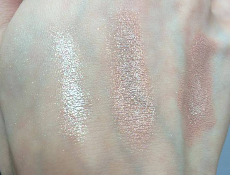
The difference between water and Fix+ is that the latter contains glycerin, a chemical used in all mixing mediums as it helps retain water (i.e., no evaporated chalky mess). Fix+ is, then, a diluted mixing medium as well as a skin “refresher.” A little spritz on to your brush and the pigments in your shadows are given an immediate boost. In the picture below, I swatched from my gorgeous new MAC ‘A Harvest of Greens’ quad with and without FIx+ and the difference – particularly with the first two lighter colours – is huge!
Use 3: Cream Thinner
Please excuse the less than elegant name… In my ‘November Favourites’ post I wrote about how my love for my MAC Paint Pot had come to a sad end due to it’s woefully short shelf-life; after only a few uses, the cream had become so thick and dry that it was impossible to blend. With a little bit of Fix+, however, the cream came back to life and was, in my opinion, a better texture than before, thinner, smoother and easier to work with.

I’m yet to try it out, but I’d imagine that the same process can be used to thin out foundations, concealers, cream highlighters and blushes. The possibilities are endless!
So how do you use your Fix+ spray? If you don’t have it yet, would you invest in it?
Hope you like!
Molly x


 For nighttime looks, I needed something that would make my pigments ‘pop’ (cringe… but you know what I mean), so I opted for Illamasqua’s Sealing Gel. This dinky bottle may seem expensive at £7, but it’s uses are endless. It is a mixing medium revered amongst make-up artists for turning eyeshadows into liquid eyeliners. However, if you place a few drops on your eye lid, tap with your finger until it becomes tacky. Once your pigment is applied on top, you’ll see an unbelievable transformation: the colour is bright, the shimmer intense and the coverage even (no lumps of gunky glitter clogging your lid).


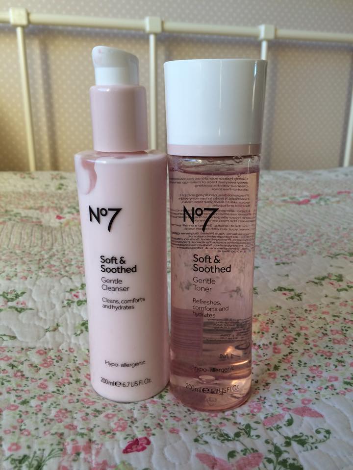
 younger my mom told me that while cleansers open your pores, toners close them; I don’t have the dermatological evidence to back this up, but it does enforce the equal importance of cleansing and toning (ideally twice a day). My favourite moisturiser is also No7, I review it
  d weather, my skin can often look red and mottled. To solve this issue I use this colour calming primer, again by No7. The lotion is green – opposite to red on the colour wheel – meaning, once blended, it is particularly effective at reducing redness and helps to even out your complexion (as you can see from the picture below).

 I confess, most of these things were bought last Friday during the sales so they are very recent favourites, but favourites all the same.
 I know I’m a bit late to the Hoola party, but until now I have been using a NYC Mosaic Bronzer that I bought for 99p around two years ago. I stumbled across NYC’s powder and was so pleased with the colour (not too orangey and not packed full of glitter) that I didn’t dare to try another. But I’ve since watched numerous beauty vlogs where Hoola is so obvious a choice that it barely gets mentioned. I had to go buy it. It’s soft matte brown colour is perfect for contouring the cheeks, jaw and forehead and adds a subtle, healthy glow to the skin. With a dinky fantail brush included, the beautifully designed box is a handy addition to my handbag so I can top up on the go.
 I set out with the hope of picking up ‘Styled in Sepia,’ but it turns out that ‘limited edition’ is very, very limited when it comes to MAC lipsticks. Ilamasqua’s ‘Buff’ was initially my back-up but, in hindsight, I prefer it’s grey-taupe colour to MAC’s warmer version. It’s texture is also that bit creamier than MAC’s mattes and, oddly, Illamasqua’s matte ‘Posture’ that I bought last week.
 The majority of clothes that I bought in the sales were replacements for the basics in my wardrobe (like last year’s jumpers that have now shrunk, stretched or bobbled). This t-shirt was my special purchase and is now put away ready for Christmas cocktail hour. Despite it’s casual loose-fitting shape, the sleeves are made of a delicate lace and the colour palette – black, grey, silver and pastel green – is uniquely sophisticated. It’s a little bit of 1920s Gatsby in my wardrobe.
 I have always assumed that tan handbags are just for summer, where black bags are for winter. These, however, are surprisingly versatile and add a bit of interest to the typically bleak winter palette of grey, navy and black. Tan leather also compliments this season’s berry and burnt orange shades perfectly; a 1970s tooled leather saddle bag will take you through to Spring where the era is set to make a comeback.

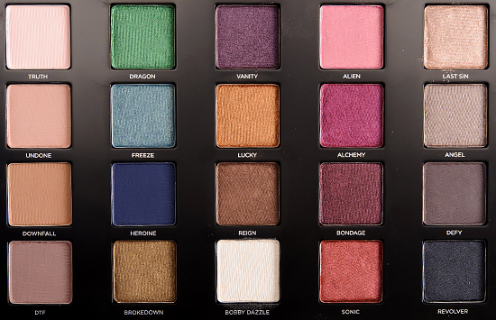 As always, I have a few complaints. While the shadows have an amazing colour payoff, they are particularly powdery. I’m not sure whether this is more noticeable here because of the number of shimmers (prone to a crumbly texture – think ‘Dust’ from Naked 3) or whether it is an unusual oversight by UD. Regardless, be careful of this excess if you have already applied your foundation and concealer!
 ‘Champagne Shimmer with Silver Micro Glitter’
 Bright Metallic Green Shimmer’


