Anastasia Beverly Hills ‘That Glow’ Glow Kit

If 2015 was the year of contouring, 2016 is the year of highlighting. Both Jeffree Star and Nikkie Tutorials have recently taken to Youtube to post full-face looks using only highlighting powders and central to their routines are the ABH Glow Kits.

Released at the end of 2015 to honour Anastasia Soare’s birthday, the palettes continue the success of the brand’s Illuminators, which took the beauty world by storm. And what could be better than one highlighter? Well, four.

ThatGlow1

The ‘That Glow’ Kit is the warmer of the two palettes currently available (though we await the release of the ‘Sun Dipped’ version this summer): while the ‘Gleam’ Kit offers rosy, pearl tones, ‘That Glow’ is all about a golden bronze shine. As a pale girl myself, I must confess that I snapped up ‘Gleam’ in an instant, ‘That Glow’ just looked too bronzy, my milk bottle skin wouldn’t do it justice. But, I was wrong. In fact, in my opinion, the ‘That Glow’ Kit is the slightly more versatile palette of the two, even for someone as fair as me.


Packaging:

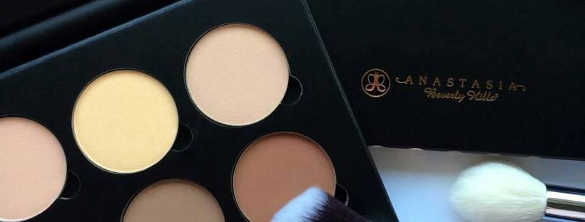
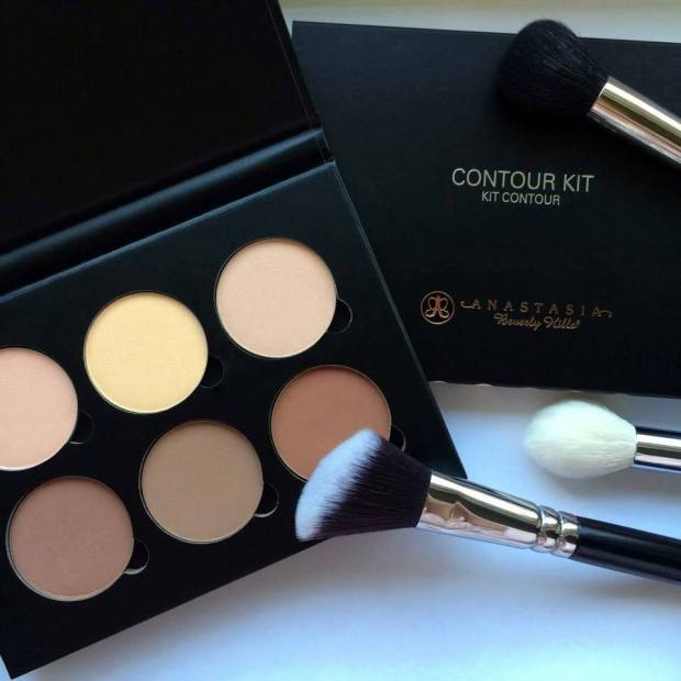
In contrast to the weighty, decorative, luxurious, packaging on the market – the Urban Decay Gwen Stefani Blush Palette, for example – the Glow Kits cardboard casings may be a little underwhelming. That being said, they are very resilient to wear and tear, mostly because they are so slim and lightweight. They can be slipped into a suitcase, handbag or Zuca without taking up much room at all. The pans can also be removed and added to a custom magnetic palette if preferred.


IMG_0387

IMG_0390.JPG

So, the shades themselves:

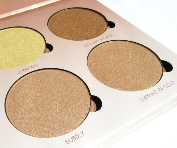
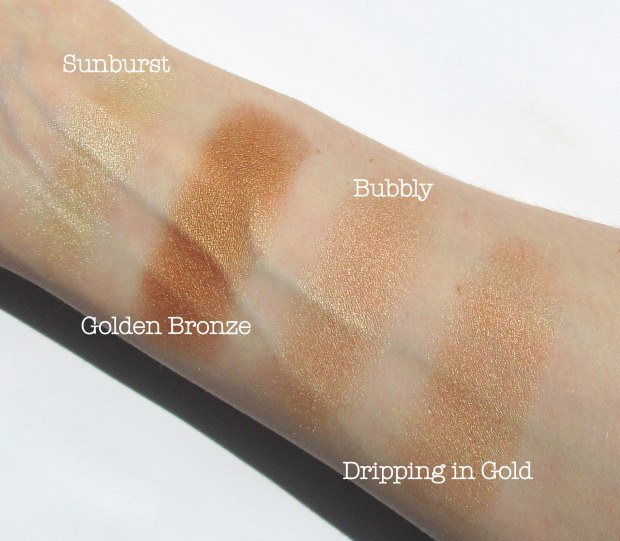
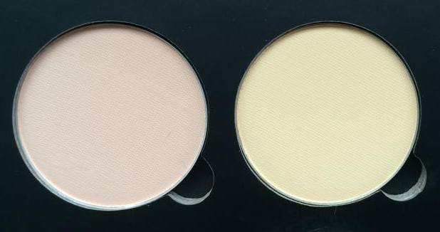
-Sunburst: ‘a bright luminous gold with a metallic finish’

-Bubbly: ‘a champagne rose with a pearlescent finish’

-Dripping in Gold: ‘a lavish gold with a vivid reflective finish’

-Golden Bronze: ‘a sultry, warm bronze with a gold-flecked finish’


Colour Range:

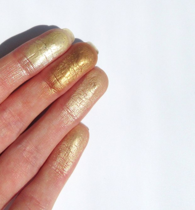
There really is a shade for everyone, and for every possible use on the face, eyes and body. Though ‘Sunburst’ looks very yellow in the pan, on the skin it is less a ‘luminous’ gold than a true champagne that, if not used as a highlight, can be mixed with face powder for that all-over luminosity. ‘Bubbly’ and ‘Dripping in Gold’ are very, very similar in colour, but their respective pink and peach undertones means that they can be layered over top of blush for the ultimate mineralised finish. Lastly, ‘Golden Bronze’ <3. This shade is just too warm for me to use as a highlight, but makes for the most beautiful eyeshadow when paired with neutrals or jewel toned emeralds and navies.

IMG_0392

IMG_0395

Texture & Staying Powder:

The powders aren’t exactly soft and buttery, but are rather very finely milled. This means, though there is a fair amount of fall-out, they are extremely lightweight on the skin and are less likely to cake when layered on top of foundation, concealers or other cream-based products. Their intensity is somewhere between Becca and The Balm (swatched below); it takes a few swirls of the brush/fingers to really gather up the pigment. That being said, the powders are buildable and can also be applied with a damp brush – ideally, using a mixing medium like MAC Fix+ rather than water – to maximise their shine.

With summer just around the corner, the ‘That Glow’ Kit is the perfect addition to any makeup arsenal; it is truly a ‘kit,’ not just a highlighter palette, but an eyeshadow/blush/body bronzer set rolled into one.


Will you be getting your glow on? Check it out That Glow Kit.


*this link will take you to Roses Beauty Store, an online UK makeup stockist. In return for some of the newest releases, I’ll be blogging for them regularly.


Review: Lime Crime’s Venus 2 Palette

Two weeks ago, Limecrime.com offered the original Venus palette (review here) for only $19. That’s just over £12…

Only two days later, it was clear why. “The bish is back.” If Venus 1 was a Margarita – always good, if ‘safe’ – Venus 2 is a fiery Meat Feast with extra jalapeños.

12309343_10153167730521128_1130571686_n

The palette offers a twist on the original, it’s packaging a deeper, darker style that acknowledges many current trends – metallic, marble, russet hues and early 90s grunge. On the whole, I’m a fan of its compact size with magnetised lid and large mirror, just be careful to wrap it securely when transporting it (my Venus 1 is now in three separate pieces after an unfortunate collision with my bedroom floor).

12305980_10153167730556128_1840030474_n

So, here are the shades:

Pigeon: a deep brown with a prominent blue/green shift. Dupe: MAC’s ‘Club’/ ‘Blue-Brown’ Pigment. 

Filter: luminous cornflower blue. Dupe: similar colours include ABH’s ‘Unicorn’ (not so luminous and slightly darker). 

Marsh: mid-tone grey-green.

Mustard: that guilty-pleasure shade, think 70s corduroy. Dupe: MAC’s ‘Uninterrupted’ (in-between mustard and a warm brown).

Fly: ivory with iridescent green shift.

Jam: gorgeous pumpkin, burnt orange. Dupe: Sugarpill’s ‘Flamepoint,’ Illamasqua’s ‘Apex.’ 

Mud: deep burgundy-brown. Dupe: MAC’s ‘Sketch.’ 

Boot: matte black with flecks of blue, green and purple glitter.

As with the original Venus palette, the shadows deliver pigmentation, opacity and staying power, even without using a primer. Only ‘Boot’ requires a little bit more work in order to achieve a consistent colour.

IMG_0299

For the equivalent of just £21 (before shipping), Venus 2 is the perfect way to mix up your makeup with punchy accents and duo-chrome shine for just over half the price of a conventional palette. Find it now at limecrime.com.

Molly x


*This is not a sponsored post – I was not asked to review this palette.

**I completely understand that Limecrime is a divisive company and I respect that many of you no longer support the brand. I want to make clear that my opinion is based on my own personal experience and I know that this won’t be shared by everyone. I hope that I do not invite criticism for continuing to use their products; for me, the brand offers some of the most unique and versatile makeup on the market, which is – in my experience – of high quality and a good price. Though I have received this palette as part of a care package, I have continued, and will continue, to purchase from the company’s website with my own money.

I am in the process of finding dupes for the shades in this palette for those of you who are interested in recreating any looks I post on my Instagram.

Again, thank you for your support and I hope you respect my position on this.

Review: Urban Decay’s 24/7 Eye Pencils Set, ‘Cosmic’

Whether we like it or not, Christmas is already underway. Though I’ll be sick of hearing soppy Christmas music and queuing EVERYWHERE by mid-December, I won’t be sick of exclusive crimbo gift sets.

I am, unashamedly, a sucker – read: fool – for a ‘deal,’ so when I wandered past this cute set of Urban Decay 24/7 Eye Pencils, I had to have them. After all, an individual liner is £14, while this set of five ‘travel size’ pencils (just over half the size of the standard liner) was only £25. Bargain!

12285948_10153167457821128_434450206_n

The brand has released two of these limited edition sets; I chose ‘Cosmic,’ the neutral collection, featuring coppers and browns, but those who like a pop of colour might prefer the ‘Delirious’ set with a jewel-toned purple, green and blue.

The ‘Cosmic’ collection includes:

Cosmic: a metallic silver-white (new shade)

Trick: a metallic copper (new shade)

– Supply: a metallic warm brown (new shade)

Stag: a deep brown satin (‘fan favourite’)

Zero: a true matte black (bestseller)

12308865_10153167458301128_1970858727_n12305490_10153167458631128_216379971_n

The colour variation is brilliant for such a small set; there are shades appropriate for day and night in a great selection of finishes. I absolutely love UD’s metallic eyeshadows for their punchy colour and shine, and these pencils are no different. For UD, metallic really means metallic. Whereas some products deliver on sparkle, but compromise on colour, UD’s pencils offer both in abundance.

I perhaps would have preferred another metallic rather than ‘Stag,’ as I feel it’s there to bulk out the set rather than having much of a purpose. It looks a little flat when compared to the others. Maybe a bright gold, or even a ruby, would have worked better?

IMG_0276

Like all of the 24/7 liners, the set boasts a creamy, waterproof formula. I usually have a bit of an issue with brands using ‘waterproof’ because, often enough, this doesn’t extend to the waterline. But I can safely say that these guys stick around… and I really mean it, once they’re applied, they’re not going anywhere. They can therefore be used anywhere on the eye (or face – the world’s your oyster) just by themselves or as a base for shadows and glitter.

Overall, this is a gorgeous, versatile set and an absolute steal at just £25. With its funky presentation box, it’s an ideal present, but makes an even better gift for yourself 😉

Molly x

Review: Shien Cosmetics’ Silk Matte Lipsticks

Not so long ago, a parcel arrived, here, in the middle of England, all the way from New York. A small black shipper filled with reams of black paper and three black boxes labelled ‘Shien.’ Inside, three glossy black bullets housed the brand’s debuting Silk Matte lipsticks.

IMG_0248

For founder, Shien Lee, lipstick is about femininity and empowerment; her philosophy pays tribute to its transformative power, as fitting in the office as it is on stage. “When a woman wears my lipstick, I want her to feel like she shines.” It is little wonder, then, that of 8 shades available, 5 are red – the colour that typifies universal beauty, from 50’s glam to 00’s vamps.

Following Shien’s generous offer to choose my favourites, I chose two reds: ‘Cobra Lily,’ a rich burgundy, and ‘Red Lantern,’ a bold tomato-red. For my third choice, I wanted to try a different colour altogether, so of the nude, pink and gold shades remaining, I picked ‘Gold Viper.’ This colour is unlike any other lipstick I own; in low light, it is a deep copper and, in sunlight, a beautifully unusual rose-gold.

IMG_0244

These swatches were applied straight from the bullet… without a base… or lip-liner.

Seriously.

I couldn’t believe it either.

Thanks to Shien’s innovative ‘Silk Matte’ formula, the lipsticks have all the creaminess and shine of a satin with the staying power of a matte. It’s a feat of real-life wizardry.

Though dubbed ‘ultra-matte,’ they apply more like a super-pigmented balm. Made with moisturising white camellia oil, the product glides onto the skin without feeling sticky or greasy and leaves a lovely sheen – somewhere between Vaseline and a conventional lipstick. I’m sure I’m not alone in avoiding glosses and the like due to their irritating gooiness, while matte lipsticks can feel a little dry and flaky; these lipsticks offer the perfect compromise. Once applied, the product seems to ‘set’ in place without losing its ‘silk,’ satin finish so there is little transfer when eating or drinking (or smooching…).

Of course, these lipsticks aren’t straightforwardly matte so they won’t last as long as MAC or Illamasqua matte formulations (or the seemingly impenetrable LA Splash Liquid Lipsticks), but I think a little wear around the inside of the lip is a prize worth paying for their luscious look and feel. It’s also very easy to extend their staying power: just blot and dust with a little translucent powder.

IMG_0246

I am a huge fan of these lipsticks as they add some sophistication to my makeup arsenal. My favourites would be both ‘Red Lantern’ and ‘Cobra Lily’ as I find they have a more buttery texture, stronger colour and more silky finish (pictured above-gah! so beautiful!) than ‘Gold Viper.’ The latter takes a few more coats to get the coverage just right and is more ‘matte’ in both its look and feel. Still, it is a beautiful shade.

What do you think of Shien’s ‘Silk Matte’ lipsticks? See them here: www.shiencosmetics.com

Hope you like!

Molly x

Review: Spectrum Collections Brushes

It’s no secret that the key to beautiful makeup is 40% what you apply and 60% what you apply it with. But, that being said, my brush collection has been somewhat reserved for far too long. One brush for my lids, one for my crease, one for vigorously rubbing away mistakes. The magic of domes, tulips, angles and kabukis had evaded me; I was stuck with your bog-standard ‘shader.’

So when Spectrum Collections asked if I would like to give their brushes a whirl, I jumped at the chance to get creative. Their website was a treasure trove in purple, pink and cyan; there were brushes for precision, blending, buffing, smudging, they were tall, tapered, stubby, fluffy. I was sold. Only days later, a package arrived (in a hot pink metallic jiffy bag, no less) and inside the brand’s best-selling 8 piece Eye Set with a handwritten note.

Not only do these brushes look beautiful, they feel great in the hand and on the skin. The handles are chunky, the bristles soft but densely packed. Vegan and cruelty-free, all Spectrum Collection brushes are made with synthetic hair, which is not only a compassionate choice, but one that carries huge benefits for the user. I personally prefer synthetic brushes as they work equally well with creams as they do with powders. Products cling to the synthetic fibres more readily than they do to animal hairs, amongst which powders get a little lost and creams cause all sorts of tangles.

Another bonus is that synthetic brushes are a gazillion times easier to clean. Animal hair is verrrry porous so bacteria and dirt are more easily absorbed into the hair shaft (a particular problem if you regularly foil your eyeshadows by wetting your brush). Rubbing these germ-packed bristles all over your face can only lead to one thing… angry, angry spots. And with the hair shaft damaged, hairs are more likely to fall out, scattering in an itchy mess all over your beautifully blended eyeball *sigh*. In between more thorough washes, I just scoot over these beauties with a make-up wipe and they’re as good as new; there’s no staining, even after using black, navy or intensely pigmented shades of cerise (it’s happened before…), and the bristles don’t lose their shape or softness.

So now to the brushes themselves!

Tall-Tapered Blender

With a fluffy, loose teimagexture, this brush is ideal for blending out harsh lines to create a seamless look. It’s long, narrow shape means it snuggles into the crease perfectly to add shaded definition. A must-have for smoky eyes.

Small Angled Shader

The fibres on this brimageush are tightly packed meaning it’s great at scooping up product, while its angled edge allows it to nestle into the contours of the eye. Ideal for adding a focused pop of colour to the inner or outer corner.

Large Fluffy Shader

It’s big and it’s fluffimagey. Great for covering the entire lid, this brush can be used to apply cream-based primer and bases or a sweep of colour with no effort at all. The starting point of any look.


Medium Fluffy Shader

The little sister. It’s slightly smaller shape makes this brush even more versatile, whether applying product all over the lid or into the crease.

Stubby Shader

The densest of thimagee set, this brush is perfect for building up colour and depth as its tightly packed fibres really grab hold of product, allowing you to go bold or dark and moody to your heart’s content.

Fluffy Pencil

The narrow, tapereimaged, dense tip allows for focused application, particularly under the eye or in the inner corner. This brush is particularly useful for cut-creases as its shape and size makes it easy to blend out colour while staying inside the lines. The all-rounder.

Short Smudge

A shorter versioimagen of the stubby shader, this brush is ideal for blending out kohl or gel liners for that super intense, grungy smoky eye. My (unexpected) favourite.


Small Domed Contour

A rounded fluffy brush timagehat is not only suited to carving out the contours of the eyes, but can also be used to add definition to the nose, to buff out concealer and add highlight. The multi-tasker.


This set is the ultimate collection for those wanting to expand their eye-makeup repertoire as there’s everything you’ll need for playing with eyeshadows, from cut-creases to blown-out smoky eyes. I recently expanded my collection of Spectrum brushes, adding a small fan brush (all about that highlight life…) and a flat definer eye brush which is the brush for creating sharp straight lines and reaching that annoying bit of skin underneath your lower lashes. Along with these I received a stunning buffer brush from the brand’s new Atlantis collection – just look at the colours!!!

image

This certainly won’t be my last brush with Spectrum Collections.

What do you guys think of these beauties? Find them at www.spectrumcollections.com

Hope you like!

Molly x

Review: Anastasia Beverly Hills Artist Palette

In short, my review of ABH’s Contour Kit went something like this: they’re magical, immoveable, wonderful powders in the completely wrong colour. Pale girl problems. So as I saw the Artist Palette, a stunning collection of neutrals and brights, I knew the quality would be top-notch, and now the colours were perfect – I had to have it.

When the package first arrived, being totally honest, I was a little liiiiiitle bit disheartened by the size of the pans. But that’s just me being greedy. Converted from US dollars, this palette costs under half of those produced by Urban Decay and Too Faced, neither of which offer particularly generous amounts of each colour. So for the price (and the quality you get for that price) you can’t moan at this being on the ‘petite’ size.

In my last review I had a little moan about the look and feel of the Contour Kit, but the Artist Palette is different. Well… not by much; it has the same stiffened board casing and magnetised closure, but there’s something sturdier about it. (I even performed the ultimate test of dropping this in the bathtub on holiday to find that no water or bubble bath had found its way inside. Surely the acid test of any magnetised clasp?) In my opinion, the casing is finished to a standard that’s better suited to the eyeshadows it contains, there’s no rough edges, no dents , tears or scuffs. And while the Contour Kit went for the ultra-sophisticated all-black colour scheme, the Artist Palette is decorated with flashes of bright colour as a hint to what’s inside.

Open up the lid and you’ll find 12 beautiful shades ranging from a dusty mauve-pink to a bright, warm yellow. Ordering this palette online, it’s difficult to see the shades clearly; yes, there’s a blue, a green, an orange and a pink, but they’re more complex and dimensional than that.

swatchesaabh

Here’s my breakdown of the colours (adapted from ABH’s own descriptions):

-Dusty Rose: think LimeCrime’s ‘Cashmere’ in an eyeshadow, the perfect “griege” with a hint of mauve.

-Aubergine: described as “velvet eggplant,” a deep purple-black.

-Anaconda: the description “shimmery green” does NO justice to this colour and I’m not even a fan of green eyeshadows. This is a true emerald green with a fine gold shift.

-Punch Fuschia: think of a bold, punchy fuschia colour… You got it.

-Buttery: the colour of a good vanilla icecream.

-Blue Velvet: a rich navy. And by ‘rich’ I mean that it’s actually a deep shade of blue, not like some ‘navy’ shadows that turn out as a nondescript dark smudge (I’ve been let down before…).

-Charcoal: described as ‘matte black,’ but I’d argue it’s somewhere between black and deep grey as the name suggests.

-Unicorn: hands down my favourite eyeshadow in the palette and, quite possibly, ever. A heaven-sent periwinkle. Gah, I love it.

-Phresh: a bold canary yellow, another unexpected favourite of mine.

-Baby, I’m a Star: a soft, mid brown with gold shimmer. The ‘meh’ colour IMO (every palette has one).

-Orange You Fancy: the loud, glitzy sister of Orange Soda, a brightened orange shadow with gold sparkle.

-Beigely: A frosted beige much like MAC’s Satin Taupe, but a smidgen warmer.

These swatches were taken with no primer or base, just a dip of the finger and you can see that the colour pay-off is amazing, particularly for the brights.

If I could make some tweaks to these colours to suit my personal taste I would make “Buttery” into a champagne or pearl highlighter shade like MAC’s “Phloof” (the ultimate…). I like my brow highlight to have a subtle satin finish, but “Buttery” is both too cream to show up on my skin and too matte to truly ‘highlight’ anything. As it is, however, “Buttery” is really handy for blending novices as it can be used to buff away harsh lines without depositing any extra colour = magic! On the other hand, I would take the shimmer out of “Baby, I’m a Star.” A matte mid-tone brown like this would be so useful for adding definition to the eye when using light, bright colours and softening harsh lines when using darker colours. Adding the substantial gold sparkle to this shadow makes it quite difficult to use unless it covers the lid in a rather conventional smoky eye. Beyond this, the colour is neither here nor there. With “Beigley” having a similar shimmer, I think ABH could afford to make one of the two super-neutral shades into a matte.

Texture-wise, these shadows remind me a lot of those by Illamasqua or Sigma: they aren’t particularly ‘creamy’ in the pan like those by MAC or Urban Decay, but have a super-fine powder formula. This can be deceiving as it might feel as though the brush isn’t collecting much product or that you’re not applying enough product to the skin, but with only a light sweep of the brush, the colour pay-off is bold and opaque.

11759594_10152948579951128_1743823194_n

This not only extends the life of the palette (as you need to use very little product), but also helps with the longevity of the shadows on the skin. Creamier formulas can sometimes sit a little heavy on the eyes and can be a real nuisance for those with oily skin types due to sliding and creasing. These light-weight powders are therefore great for adding colour without ‘gunk’ and, with a spot of primer, hold up for 8 hours with very little signs of movement (having tested Beigely and Dusty Rose on my mom, who has oily skin). For dry-combination skin like mine, the ‘powder-y’ nature of these shadows can accentuate any flakiness or fine lines around the eye, so be sure to moisturise thoroughly before use. That being said, these powders could hold up alllllllll day; I actually fell to sleep in the look pictured on the left (whoops!) and woke up to find the lovely periwinkle hue still there.

My faith in Anastasia Beverly Hills is restored!

What do you think of the Artist Palette?

Hope you like!

Molly x

Faking a tan: MAC’s Powder Blush in Harmony

The sun is coming out, summer’s on its way and, yes, I could just sit outside slathered in oil with a sheet of tin foil, but why sweat when I can just fake a tan? This tutorial will show you, especially you pale folk, how to fake it without the risk of streaks or that lingering smell of biscuits.

11348840_10152797372816128_1972554482_n

Contour

So, of course, the most important part of this look is your base with the secret being – as always – contouring. Whatever you do, do not try and fake it by using a darker shade of foundation/concealer! Contouring will only add colour to those areas of your face that would usually catch the sun, making for a more natural looking ‘tan.’

My preference for this look is a powder contouring product; cream-based pigments and concealers can look a little heavy on the skin and the look we’re aiming for is something fresh and ultra-natural. Powders are also much easier to work with in terms of building up colour and blending thoroughly. My go-to powder contour will forever be NYX’s Blush in Taupe, a perfect cool-toned brown. But, alas, a tan will never be cool-toned, so my mission began – find a warm contouring product for the palest of the pale.

11287403_10152797372791128_561216259_n

And here it is, MAC’s Powder Blush in Harmony, my most favourite product for this Spring/Summer. The colour is particularly difficult to describe as it lies somewhere between warm and cool tones. MAC describe it as a “muted rose-beige brown,” which kind of sounds like they couldn’t decide how to label it either, but I guess they’re not far wrong. The key with Harmony is that it doesn’t have that bronzer-type orange/terracotta look, instead it’s ‘rose-beige’ hue mimics the colour that pale skin would conventionally turn in the sun (providing it’s slathered in factor 30).

I begin by first applying my usual concoction of foundation: MAC’s Studio Fix Fluid in NW10 and Illamasqua’s Skinbase in 02. On the left below I have indicated the areas that I would usually contour using MAC’s Harmony and on the right, those areas I would contour with my conventional cool-toned contour, i.e. NYX’s Taupe blush.

Screen Shot 2015-05-21 at 18.17.57.png

Add the two together and viola – sunkissed skin! As you can see, I bring my warm contour a little wider and higher than my cool contour, straying into the areas of my face I would usually highlight. Just as highlighter is used on the high points of the face, so too should this warm contour as these areas (cheekbones, nose, chin and forehead) are always the first to tan.

I choose to apply MAC’s Harmony first using my Zoeva Cream Contour Brush (though intended for cream based products, the angled edge of this brush makes it ideal for hugging the natural curvature of my face), being careful to diffuse it as much as possible – the wonderful feather-light formula makes this very easy! Blending a small amount of product around and underneath your jaw line will help prevent your neck looking a completely different colour to your face and I also like to add some across my collarbones to continue the illusion that I’m lusciously bronzed all over (remember to do this if you’re wearing a low cut top).

11358692_10152797372746128_69643950_n

I then use my MAC 186 Small Contouring Brush (it’s small, dense tip is great for focused and defined contouring) to apply NYX’s Taupe into the hollows of my cheeks using tight circular motions in an upwards direction. I’ve added a comparison photo of the cool and warm contour to give you an idea of how warm Harmony is (please excuse the state of my NYX’s blush, it’s particularly loved!).

Then for my nose, I use my Sigma Detail Brush to draw two lines about a centimeter apart down the edges of my nose with Urban Decay’s ‘Tease’ eyeshadow from the Naked 2 palette (NYX’s Taupe works equally well, but the buttery eyeshadow is particularly easy to blend). Having blended this in with my fingers, I use any excess product left on the 186 brush to continue blending and deepen the colour.

Highlight

MAC’s Lightscapade holds a special place in my heart as a 10/10 highlighter, but I think this look requires something a little warmer than its pale champagne colour. My favoured highlighter for this Spring/Summer is Illamasqua’s Lumos from the Sculpting Duo; it’s peachy gol11304283_10152797372771128_223119123_n
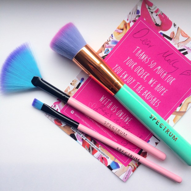
d tone with super-fine shimmer adds the perfect natural ‘glow’ to the skin that, together with MAC’s Harmony, makes for the ultimate ‘sun goddess’ pairing.

I apply this is all of the conventional areas (overlapping some of my warm contour), particularly focusing on the bridge of nose and the highpoints of my cheekbones using my Zoeva Luxe Highlighter Brush. Beware that Lumos is a particularly fine powder so you may need a few coats to get the glimmer you desire (it also has quite a lot of fall out, so don’t apply it whilst wearing your best white dress…I speak from experience).

Blush

I don’t feel that this look really needs a blusher as there is already plenty of warmth in the contour; all the same I opted for an blushequally bronzed, glowy looking colour just to finish the face (I guess you could use a pink or plum, but I think the ‘flushed’ cheek is more girl-next-door than beach babe).

MAC’s Cream Colour Base in Shell makes the ideal blush for this sun-kissed look; just as Harmony brings together just the right amount of pink and beige, so does Shell have the perfect blend, a iridescent rose gold. With its gorgeous glossy finish, this cream colour adds that “fresh-from-the-sea” glow to balance the matte contour. I apply it with my fingers to the apples of the cheeks, sweeping it back and upwards to join my highlight, sitting just above my contour. This product also makes for a striking yet simple eyeshadow, just dab over the lid for a super chic take on the glossy eyes trend.

Eyes + Lips

For the look that I originally posted on Instagram, I chose a cool brown/taupe palette for my eyes and lips, using MAC’s Satin Taupe eyeshadow and LA Splash Cosmetics’ matte liquid lipstick in Ghoulish. I find that warm, deep colours can sometimes make me appear paler than usual as my skin doesn’t have the same depth of colour. So here I worked on the opposite principle: these neutral cool tones help to accentuate what warmth there is in my skin and so help me to appear more ‘tanned.’

tanyrah

That being said, my favourite lipsticks to add to this base are at the other end of the ‘subtle’ spectrum. MAC’s Costa Chic or Jeffree Star’s 714 are both neon coral, a shade notable for making tans look ahhhhh-mazing. The sheer brightness of these lippies can’t help but to emphasis the warmth of your contour making even the palest of the pale appear lusciously golden (I used Costa Chic in the picture on the right above). I’ll be writing another blog post specifically on coral lipsticks so stay tuned!

Will you be ‘faking’ it this summer?

Hope you like!

Molly x

Review: Anastasia Beverly Hills Contour Kit

I really want to love this palette, but I can’t.

Anastasia Beverly Hills is the brand that turns girls into goddesses. First they fixed our eyebrows and now they fix our faces, sculpting cheekbones and jawlines since April 2014 when the long awaited Contour Kit went on sale.

It’s only in the last few months that I’ve truly realised the wonders of contouring and so, ever since, this palette has been at the top of my wish list. Last Thursday I received some particularly good news (more on this in a later post!) and decided to just bite the bullet.

I’d seen pictures of the palette all over Instagram, but expected a little more than what I got. It looks, dare I say it… cheap *wince*

With the image ABH has as a glamourous, luxury brand, I think it would better suit an Illamasqua-esque packaging: an all-black, glossy case made of sturdy, chunky material with a mirror inside, maybe? Instead, the casing is made of a stiffened, matte black card, the type that will scuff and mark quite easily. Oh, and there’s no mirror 😦 I’d actually be happy to pay more than £40 for this kit if the packaging was just that bit more ‘fancy.’

11088254_10152696530011128_1867326654_n

But, even then, I still couldn’t use it.

Short of extending out a robotic arm and applying the powders for me, I expected them to deliver on every level. And, don’t get me wrong, there’s not a huge hype surrounding this kit for nothing; it seems that what money has been saved on the quality of the packaging has gone into the quality of the powders.

The term ‘buttery’ gets used a lot by beauty bloggers, but these powders really are lusciously smooth. You’d be forgiven for thinking they were cream-based; there’s no fall out and the pigmentation is amazing, even with the smallest dab of the brush. It’s another cliché, but a little really does go a verrrrrry long way. I’d imagine it would be a long time before you needed to buy a refill pan.

11086953_10152696548201128_256792745_n

For me, it will be a very very very long time – you could even say forever – as I won’t be using 4 of the 6 shades.

So now for the meaty bit: the colours.

I should have seen this coming. The palette is intended for ‘Light/Medium’ skin and though I fit into the former category, I certainly don’t fit the latter. I’ve seen a number of fair girls pull these shades off beautifully but, on reflection, perhaps they aren’t as pale as I am…

The Face Powders

11091167_10152696530006128_1864087248_n

As the two matte shades in the palette, I’ve assumed that Vanilla and Banana are the intended ‘face powders’ for setting and correcting. Vanilla, while a lovely colour in itself, should really be called ‘Light Peach.’ In the swatches below I’ve compared Vanilla to Bare Minerals’ Powder Foundation in ‘Fair’ and MAC’s Mineralise Powder in ‘Light,’ the difference is huge. There’s no way someone as pale as I am could use this as a powder; on Saturday, I actually used it in place of a blush!

11081453_10152696463956128_147367902_n

I knew when I ordered the palette that I would very rarely use Banana – if at all. If you like the sound of Ben Nye’s Banana Powder (which is quite hard to get hold of in the UK), this would make a great alternative. For me, however, the colour is just too strong to use alone. I tried it as a corrector and it works wonderfully, cancelling out the blueish hues of under eye circles. Just dab it over problem areas and then cover with your usual liquid concealer. But having just bought Bobbi Brown’s corrector (which comes in a paste form), I don’t think I’ll be swayed to choose Banana instead. Powder correctors can turn gummy when used under liquid concealers and, with all the primer in the world, it still manages to crease and cake.

The Highlighter

11091167_10152696530006128_1864087248_nThe last of the three light shades is Sand, a pale nude shimmer. This is by far my favourite colour in the palette; it’s delicate shimmer catches the light in just the right way, it’s in no way glittery but has an almost pearlescent finish. In the photo below, I’ve compared Sand to my current go-to highlighters.

As you can see, the colour is very similar to Illamasqua’s Helios from the extremely popular Sculpting Duo. 

Much like Vanilla, Sand is most definitely a peachy nude, however, the satin finish means even pale girls like me can get away with it, especially when it’s layered over blusher. Ideally, though, Sand would look something more like MAC’s Lightscapade, a more universal champagne shade that suits both cool and warm undertones.

11117804_10152696560741128_1989199120_n

The Contour Powders:

11081443_10152696529991128_653013877_n  (L-R: Java, Fawn, Havana) Again, I knew when I ordered the kit that I would find little use for Java and Havana, as both are particularly warm browns. But, I thought, with Fawn – a cool earthy shade – to rely on, I could use them to add a touch of warmth when the sun was out and when (if) I caught a tan this summer.

Of course, this depended on me liking Fawn. But I don’t. In the palette, sandwiched in between two russet shades, Fawn looks the perfect grey-brown. On my face, though, it’s still just that bit too orange-y.

11088253_10152696463796128_1131556952_n

In the photo above, I’ve compared the three colours to other contouring products I own. My go-to shades are Illamasqua’s Cream Pigment in Hollow and NYX’s Blush in Taupe, both of which have a much cooler hue when compared to Fawn. Fawn is a lot like Benefit’s Hoola with the volume turned up. 

I have to be careful to add only a modest amount of Hoola before I tip into Tango territory, so Fawn is all the more risky for me. But layered with a touch of blush, Fawn makes for a lovely plum coloured blush/bronzer that’s perfect for a night out, but for a Spring day, it is just that bit too heavy for my taste.

Overall, I’d give this palette a 6 out of 10. The only saving grace being the quality of the powders; as you can see from my swatches, their pigmentation and opacity rivals cream pigments! But, while the colours aren’t unusuable, they do need to be mixed with other products in order to suit my skin tone.

ABH has since promised a ‘Fair/Light’ kit, which will hopefully include all those shades necessary for sculpting a pale face: white, silver, champagne and taupe.

Either that, or I’ll have to get a spray tan..

Hope you like!

Molly x

My Custom MAC Eyeshadow Palette: Part 1

I was a few steps away from the checkout, MAC’s Warm Neutrals Palette in hand, when I thought… I actually won’t use around half of these colours. It doesn’t include any of the shadows I’ve been lusting after for a while now and, in my opinion, there are a few too many yellow-y honey shades and no “curve-ball” colours that would really mix up my every day looks. For £65, it’s a pretty steep investment in something I wouldn’t use all that much. 

So I put it back and decided to build my own custom pro palette.

11072574_10152673001311128_530462597_n

MAC eyeshadows aren’t cheap by any means (individual pans cost £10) so building your own 12 piece palette will cost just under double the price of the pre-made ones. But if being able to pick out your own shades means that you’re more likely to use them at every opportunity, the extra expense is surely worth it. 

The range of colours and finishes offered by MAC is quite overwhelming when you’re trying to choose just twelve. Whenever I visit my local store, I go into a heady daze where everything and anything is beautiful, wonderful… and affordable (eesh), which doesn’t make for easy decision making. 

But I’m going to (try and) be sensible. I’ve decided to choose 4 matte transition shades, 4 warm neutrals (frosts/shimmers) and 4 more unique, out-there colours to mix up my go-to looks. Here are my first 6 beauties:

 Mattes:

11084430_10152673001286128_1269759344_n

L-R: Wedge, Quarry, Handwritten

Wedge: This is one of MAC’s most popular transition shades, a lovely warm beige. Given that I’m a sucker for warm colours, I was surprised to find that I don’t actually own a matte in this colour, so it was an obvious choice to help blend other shadows. Its neutral hue and matte finish provide a “no make-up, make-up” look which is perfect for Spring and helps to add definition to the eye with subtle depth. 

Quarry: A lesser known shade, Quarry is a unique grey-beige matte with a cool mauve undertone. In comparison to Wedge, Quarry is great for blending out cooler shades of grey, pastels and silver. Again, a great staple for lighter Spring-time looks when you want to tone down that dark smoked out eye.  

 11081649_10152673001251128_1376393010_n 
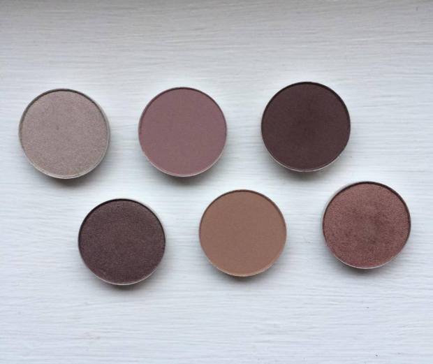
Handwritten: Okay, so I know I’ve just said that I’d look to tone down a smoky eye for Spring, but there are some days when nothing else will do. If in doubt, smoke it out, right?! 

Black smokes can look a little heavy on my face, particularly if my eyes are tired and a little puffy, so I usually rely on chocolate browns or deep burgundies as my go-to smoke shades. Handwritten is ideal for this, either placed across the lid or blended into the crease. 

Warm Neutrals:

11056723_10152673001241128_432067580_n

L-R: Satin Taupe, Sable

Satin Taupe: My first “proper” eyeshadow was Bare Minerals’ Loose Shadow in the colour ‘Celestine,’ a beautiful mid-tone taupe with a gold shimmer. I must have worn it almost every single day whilst I was at university, no matter what the occasion. Since leaving (and having an income!), my makeup collection has grown and Celestine has gotten lost – or ‘over-shadowed’ (BADDUM…) – by my other palettes. When I swatched Satin Taupe, it instantly reminded me of Celestine (if not as shimmery) and I knew I had to have it. 

Maybe it’s just me, but I often work on creating multi-tonal smokes in my crease and underneath my eyes, but can sometimes be left stumped as to what to use on my lid. I need a neutral colour with enough oomph to stand up to dark smokes and enough interest to work well be itself. Satin Taupe is the answer!   

11081663_10152672999761128_1406915266_n Sable: This was the first shadow I was drawn to when scanning the shelves at MAC. Sable is a warm, earth coloured red – the marsala shade – with a delicate gold shimmer that is not at all ‘glittery,’ but rather has a gorgeous pearlescent finish. I tend to use this in a similar way to Handwritten to mix up my usual smoky eye looks. Though classed as a ‘shimmer,’ Sable’s shine is subtle enough to be smoked out in the crease without causing your eyes to glimmer like beacons – an absolutely beautiful shade perfect for switching up classic looks for those summer-time date nights!


Curve-balls:

11046895_10152672999771128_1908136478_n 

Vex: This is a strange colour, but strange in a really really good way. It doesn’t look much of a “curve-ball,” but it’s duo-chrome finish is so difficult to capture on camera. While it looks like an ordinary silver grey shadow in some lights, in others it shines like a pearl with pink, purple and green hues. The best way to draw out the multi-dimensional colour of this shadow is to foil it with MAC’s Fix+ or another mixing medium. I’ll definitely be making the most of this shade this Spring as it makes for a gorgeous compliment to pastels and smokes alike, it’s great for adding a quirky edge to simple looks.

MACVex  So, that’s half of my collection already sorted! Ideas for my next 6 shades include ‘Cranberry,’ ‘Pink Freeze,’ ‘Mythology,’ ‘Plum Dressing,’ ‘Crystal’ and ‘Trap’ with possible curve-balls being ‘Plumage,’ ‘Sumptuous Olive,’ ‘Jest’ and ‘Lucky Green.’ 

What are your favourite MAC shades? Would you consider making your own custom palette?

Hope you like! 

Molly x

FOTD: Valentine’s (and some questions for you guys!)

I don’t usually post my FOTD’s, but rather post pictures on Instagram with product details underneath; would you like to read more about (or even see, if I can work out Youtube and editing software…) my make-up tutorials?

11005681_10152607400136128_1161942599_n

Above is a shot of the products I used in my Valentine’s FOTD; I exaggerated my usual winged liner and added a second smoked-out wing underneath using the different angles of my eyeliner brush to smudge my gel liner. I also carved out my eyes in a subtle cut-crease using the nudes in my Sigma Warm Neutrals palette, eventually adding a little of Illamasqua’s Pure Pigment in Furore to my lid.

My lips were initially a verrrry nude colour using Lime Crime’s Cashmere but I felt it didn’t add enough definition to my mouth in comparison to my eyes, so I added a layer of Illamasqua’s lovely grey-mauve ‘Posture’ on top to create a muted purple colour, and voilà!

So would you like to read more posts like this? Or see how I do it? Are there any looks/ reviews/ topics you would like to see?

I’m excited to read your feedback – hope you like!

Molly x