Laura Mercier’s Priming Duo: Foundation Primer + Eyebright

Primers have become an increasingly important part of my daily routine as I’ve gotten older. In my early teens, I had woefully dry skin, particularly around my nose, and found no way to remedy it other than to pull away the loose flakes (GROSS). In my late teens, I seemed to miraculously develop a T-zone and experienced ‘angry spots’ and open pores for the first time along with my already crispy nose (DOUBLE GROSS). Now, in my early twenties, my skin has plateaued at a manageable, if sometimes frustrating, combination of greasy and flaky (triple gross?). So along with my usual concoction of moisturising products, primers are a staple of my make-up kit.

Laura Mercier’s Foundation Primer, £29

Before now, my first and only primer had been Revlon’s Photoready which, despite having used it religiously for three years, wasn’t always up to scratch. Though it keeps my makeup in place for around 4 hours without noticeable creasing, its chalky paste-like texture does little for my already dry skin. It not only makes my rough patches more pronounced but can make my whole face feel tight and uncomfortable. So having scoured the internet for an alternative, there was one primer that seemed to stand out from the crowd – Laura Mercier’s Foundation Primer.

I know, I’m considerably late to the party, but its continued success since its first release in 1995 is hard to ignore. Winner of InStyle’s Best Beauty Buys Award last year, I figured its £29 price tag was a small price to pay for such an apparently amazing product. And who am I to argue with InStyle? Nobody.

But, as with anything, it has its quirks. Having used such a thick primer for years, the consistency was the first thing to strike me. It is a particularly loose, semi-set gel that turns to liquid as soon as it touches the skin. This carries the usual benefits: a little goes a very long way, there’s no risk of it caking and it feels instantly hydrating. Which are all good, but deceptive.

The formula is so thin that it feels as though it’s not actually doing much to your face, much like splashing it with water. Perhaps I’ve been kept in the dark for too long, but I’ve always associated primers with making my skin feel ‘buffed,’ that crazy smooth, lump and dimple-free, almost furry, feeling when all pores are filled and all wrinkles blurred. This meant, on first application, I assumed I hadn’t applied enough and coated my face in at least three days’ worth only to find my skin as un-‘buffed’ as ever…and a little sticky.

So the trick is to let it set before applying any products on top; if you’re too hasty, the formula has no time to create that desired ‘barrier’ over pores and fine lines and you’ll see no pay off. But give it a minute or so and this stuff makes for a lightweight, but seemingly impenetrable face fortress.

Unlike some, less expensive primers, this doesn’t zap all moisture from the skin in an attempt to prevent shine; instead it sets to a semi-matte, ‘second skin’ finish that allows for a flattering natural sheen. This is great news for those with dry/combination skin like mine, as it doesn’t feel tight or dehydrating and allows for what ‘glow’ you have to peak through. For those with oily skin, though, this formula may not be ‘heavy-duty’ enough to hold back shine for the whole day. On my oilier days (phases of the moon and all that…), I’ve noticed that, although my makeup doesn’t budge, I still need something to blot my T-zone. Those with oily skin types may therefore prefer to give the Oil-Free version of this primer a try as it is specifically geared towards controlling oil production and soothing blemish prone skin.

IMG_0233

The wonders of Laura Mercier’s Foundation Primer have been talked about for almost twenty years, and with good reason, but before you invest, it’s worth testing out the product at your local beauty counter to get a feel for its effective, if peculiar, formula.

Laura Mercier’s Eye Basics in Eyebright, £19

Laura Mercier’s Eye Basics are a small collection of tinted eye primers that work to prime, conceal and correct your eyelids. Seven of the Basics are neutral colours intended for particular skintones, but the eighth, Eyebright, is a striking baby blue. Even when Laura Mercier does colour, it’s in the most sophisticated of ways, with deep plums, navies and emerald greens so Eyebright stood out as something entirely different… I had to buy it.

The reviews of this product on various sites are awful with most complaining about the unusual colour, but I like it…I think. Due to a consistent lack of sleep (and a slight allergy to eyelash glue), my eyelids are always puffy in the morning. This, together with my already pale skin tone, makes for sallow, veiny and swollen skin that needs to be soothed and hidden, pronto. A sweep of Eyebright and my eyelids look instantly brighter and more even; the pale blue colour helps give life to pallid skin and neutralises redness, while anti-oxidants Vitamin A, C and E along with other anti-inflammatories reduce puffiness. Unlike the other colours in the range, Eyebright also has medicinal properties (apparently… LM doesn’t state exactly what these are) to heal and soothe broken skin. Which I don’t have…but when I do, it’ll be helpful.

Once blended, much of the colour fades to an almost sheer, white semi-matte finish which my fair skin can get away with wearing alone, but I’d  imagine that, on darker skin tones, this white wash across the eyes would look too stark. As a base for eyeshadows, though, Eyebright works with any skin tone and helps cling to pigment, making shadows look more opaque and pigmented.

Crease-resistant and waterproof, Eyebright is a good product to have in your beauty arsenal to give a much needed lift to tired eyes, used alone to colour correct and conceal or beneath eyeshadows to prime. That being said, this isn’t cheap. And does it do something that no other product can? Well, no, not really. A good concealer, corrector or eyeshadow base can do pretty much the same thing. For me, the real benefit of Eyebright is the colour; concealers and correctors can hide dark circles and redness, but are rarely pale enough to truly ‘brighten’ my skin. ‘Brightening’ concealers are often very yellow – in an attempt to cancel out blueish shadows. On certain skin tones, this just replaces one problem with another – tiredness with ‘jaundice.’ If you’ve been searching for something to avoid both of these issues, then maybe it’s worth giving Eyebright a go!

Would you consider Laura Mercier’s primers? What are your favourite priming products?

Hope you like!

Molly

Faking a tan: MAC’s Powder Blush in Harmony

The sun is coming out, summer’s on its way and, yes, I could just sit outside slathered in oil with a sheet of tin foil, but why sweat when I can just fake a tan? This tutorial will show you, especially you pale folk, how to fake it without the risk of streaks or that lingering smell of biscuits.

11348840_10152797372816128_1972554482_n

Contour

So, of course, the most important part of this look is your base with the secret being – as always – contouring. Whatever you do, do not try and fake it by using a darker shade of foundation/concealer! Contouring will only add colour to those areas of your face that would usually catch the sun, making for a more natural looking ‘tan.’

My preference for this look is a powder contouring product; cream-based pigments and concealers can look a little heavy on the skin and the look we’re aiming for is something fresh and ultra-natural. Powders are also much easier to work with in terms of building up colour and blending thoroughly. My go-to powder contour will forever be NYX’s Blush in Taupe, a perfect cool-toned brown. But, alas, a tan will never be cool-toned, so my mission began – find a warm contouring product for the palest of the pale.

11287403_10152797372791128_561216259_n

And here it is, MAC’s Powder Blush in Harmony, my most favourite product for this Spring/Summer. The colour is particularly difficult to describe as it lies somewhere between warm and cool tones. MAC describe it as a “muted rose-beige brown,” which kind of sounds like they couldn’t decide how to label it either, but I guess they’re not far wrong. The key with Harmony is that it doesn’t have that bronzer-type orange/terracotta look, instead it’s ‘rose-beige’ hue mimics the colour that pale skin would conventionally turn in the sun (providing it’s slathered in factor 30).

I begin by first applying my usual concoction of foundation: MAC’s Studio Fix Fluid in NW10 and Illamasqua’s Skinbase in 02. On the left below I have indicated the areas that I would usually contour using MAC’s Harmony and on the right, those areas I would contour with my conventional cool-toned contour, i.e. NYX’s Taupe blush.

Screen Shot 2015-05-21 at 18.17.57.png

Add the two together and viola – sunkissed skin! As you can see, I bring my warm contour a little wider and higher than my cool contour, straying into the areas of my face I would usually highlight. Just as highlighter is used on the high points of the face, so too should this warm contour as these areas (cheekbones, nose, chin and forehead) are always the first to tan.

I choose to apply MAC’s Harmony first using my Zoeva Cream Contour Brush (though intended for cream based products, the angled edge of this brush makes it ideal for hugging the natural curvature of my face), being careful to diffuse it as much as possible – the wonderful feather-light formula makes this very easy! Blending a small amount of product around and underneath your jaw line will help prevent your neck looking a completely different colour to your face and I also like to add some across my collarbones to continue the illusion that I’m lusciously bronzed all over (remember to do this if you’re wearing a low cut top).

11358692_10152797372746128_69643950_n

I then use my MAC 186 Small Contouring Brush (it’s small, dense tip is great for focused and defined contouring) to apply NYX’s Taupe into the hollows of my cheeks using tight circular motions in an upwards direction. I’ve added a comparison photo of the cool and warm contour to give you an idea of how warm Harmony is (please excuse the state of my NYX’s blush, it’s particularly loved!).

Then for my nose, I use my Sigma Detail Brush to draw two lines about a centimeter apart down the edges of my nose with Urban Decay’s ‘Tease’ eyeshadow from the Naked 2 palette (NYX’s Taupe works equally well, but the buttery eyeshadow is particularly easy to blend). Having blended this in with my fingers, I use any excess product left on the 186 brush to continue blending and deepen the colour.

Highlight

MAC’s Lightscapade holds a special place in my heart as a 10/10 highlighter, but I think this look requires something a little warmer than its pale champagne colour. My favoured highlighter for this Spring/Summer is Illamasqua’s Lumos from the Sculpting Duo; it’s peachy gol11304283_10152797372771128_223119123_nd tone with super-fine shimmer adds the perfect natural ‘glow’ to the skin that, together with MAC’s Harmony, makes for the ultimate ‘sun goddess’ pairing.

I apply this is all of the conventional areas (overlapping some of my warm contour), particularly focusing on the bridge of nose and the highpoints of my cheekbones using my Zoeva Luxe Highlighter Brush. Beware that Lumos is a particularly fine powder so you may need a few coats to get the glimmer you desire (it also has quite a lot of fall out, so don’t apply it whilst wearing your best white dress…I speak from experience).

Blush

I don’t feel that this look really needs a blusher as there is already plenty of warmth in the contour; all the same I opted for an blushequally bronzed, glowy looking colour just to finish the face (I guess you could use a pink or plum, but I think the ‘flushed’ cheek is more girl-next-door than beach babe).

MAC’s Cream Colour Base in Shell makes the ideal blush for this sun-kissed look; just as Harmony brings together just the right amount of pink and beige, so does Shell have the perfect blend, a iridescent rose gold. With its gorgeous glossy finish, this cream colour adds that “fresh-from-the-sea” glow to balance the matte contour. I apply it with my fingers to the apples of the cheeks, sweeping it back and upwards to join my highlight, sitting just above my contour. This product also makes for a striking yet simple eyeshadow, just dab over the lid for a super chic take on the glossy eyes trend.

Eyes + Lips

For the look that I originally posted on Instagram, I chose a cool brown/taupe palette for my eyes and lips, using MAC’s Satin Taupe eyeshadow and LA Splash Cosmetics’ matte liquid lipstick in Ghoulish. I find that warm, deep colours can sometimes make me appear paler than usual as my skin doesn’t have the same depth of colour. So here I worked on the opposite principle: these neutral cool tones help to accentuate what warmth there is in my skin and so help me to appear more ‘tanned.’

tanyrah

That being said, my favourite lipsticks to add to this base are at the other end of the ‘subtle’ spectrum. MAC’s Costa Chic or Jeffree Star’s 714 are both neon coral, a shade notable for making tans look ahhhhh-mazing. The sheer brightness of these lippies can’t help but to emphasis the warmth of your contour making even the palest of the pale appear lusciously golden (I used Costa Chic in the picture on the right above). I’ll be writing another blog post specifically on coral lipsticks so stay tuned!

Will you be ‘faking’ it this summer?

Hope you like!

Molly x

Hair Care Routine I: My Hair History

When I was 14 I chopped my hair off and bleached it platinum blonde.

And that was that. At 23, it’s still the same – save a touch of lilac.

This is the first half of my hair care routine series, my hair history; I thought before I babble on about how I colour and condition my hair, I best show you what states it’s been in over the years and how I have managed (and, at times, rescued) it.

The Cut

So in the vaguest terms I have a pixie cut, but a pixie cut has many variations: fringe length, fringe shape, choppy or sleek and – the-be-all-and-end-all for me – the length of those bits that fall in front of your ears.. My first style (top left) was heavily influenced by my eternal girl crush, Agyness Deyn, who had just hit the big time with her signature über short choppy style with a mini fringe.

By the time I went to university, my fringe had grown to an asymmetrical style. Though this is my personal favourite, there’s a fine line between it looking funky and old-fashioned. In the second photo, my layers were still quite choppy. While this is great and quite ‘modern’ looking, I like a bit of poof to my hair. The issue with wanting poofiness is clear in the third picture… hair bear bunch, anyone? This was taken in my paranoid phase, when I was anxious that super short hair only made my face look bigger.. Eventually my layers became so long that, once I had blow-dried it, I looked a bit like a mushroom 😦

hair4

Another issue with this look is those bits in front of my ears – they’re just too long. Over the years, I’ve realised just how much difference these wisps make to your overall look. Too long and you stray into ‘mature woman’ territory, too thick and the whole style becomes a bit confused. It’s very difficult to get these pieces to lie flat to your face, so they often kick out, which can make the cut look unfinished and outgrown, imo.

It’s only in the last few months that I’ve really started to love my hair, the length, the style and the colour. I think I’ve finally found my style: choppy layers cut tightly around my neck and my ears with a sweeping full fringe.

Special Mentions

This cut (left) was for a hair competition that focused on new angles and sharp lines. The section above my ear was cut to a straight edge while the piece underneath tapered to a super precise point (I should also add that that huge mohawk was not my own, but a considerable bunch of extensions). I loved this hairstyle because it was so different and almost futuristic looking, but ultimately it proved too hard to maintain.

My paranoid phase culminated in this block fringe (right). A fringe like this is a great way to mix up your pixie cut style with a youthful, modern edge. It also provides a great frame for your face, which is ideal if you like to showcase your make-up.

The Colour

For years and years I bleached my hair with Schwarzkopf Live Colour XXL 00A Absolute Platinum. £4 and forty minutes later my hair was white blonde and I absolutely loved it. But during my first year of uni, I fancied a change and agreed to take part in a hair competition that involved having these huge tiger stripes added to my fringe. The stripes came out a lot darker than the hairstylist was happy with, so just a day later, they massaged (or should I say scrubbed) bleach into my fringe in an attempt to lighten the dark brown to an auburn colour.

hair5

Though this worked out for the photo, it absolutely ruined my hair. I remember brushing through my fringe and having my hair stretch like elastic; it completely lost its shine and took hours and hours to dry. If you’re thinking of bleaching your hair at home, particularly if you want to go from brown to white blonde, please please PLEASE remember that it carries risks. Dark hair won’t lift to an even white colour in just one sitting, but repeatedly bleaching will ruin the condition of your hair. Bleach breaks down keratin – the element that gives your hair shine and strength – so try to space out bleaching to avoid ending up with a dull, gooey mess.

My hair was in such bad condition that I had to grow the bleach out to give my hair chance to repair itself. This meant living with my natural hair colour 😦 I have naturally ashy hair, which felt a little bland after having Draco Malfoy-esque white so, with all the bleach gone, I snuck in a few subtle highlights (left). Annnnnnd, not long after, I had it bleached again *face palm*… I couldn’t resist.

image6

That brings me up to last summer and my latest obsession with toners! I’ve tried pink and peach, but – as with make-up – these warm colours work better with skin that has an equally warm under-tone. For me, cooler hues of blue and purple suit my fair skin best, but my ultimate favourite is my current lilac colour. Toners are becoming a lot more popular now with great, cheap brands available in most drugstores, i.e. Bleach London. There’s also a growing trend for colour-depositing shampoos and conditioners, which provide a gentle, non-evasive way of adding colour to your hair – the colour/conditioner combination is a particularly good way of maintaining smooth, shiny, rainbow, locks.

image7

So there’s a potted history of my hair! To see what products I use to keep the colour and cut looking as fresh as possible, watch out for my second instalment of my hair care routine – coming soon!

Hope you like!

Molly x

Review: Anastasia Beverly Hills Contour Kit

I really want to love this palette, but I can’t.

Anastasia Beverly Hills is the brand that turns girls into goddesses. First they fixed our eyebrows and now they fix our faces, sculpting cheekbones and jawlines since April 2014 when the long awaited Contour Kit went on sale.

It’s only in the last few months that I’ve truly realised the wonders of contouring and so, ever since, this palette has been at the top of my wish list. Last Thursday I received some particularly good news (more on this in a later post!) and decided to just bite the bullet.

I’d seen pictures of the palette all over Instagram, but expected a little more than what I got. It looks, dare I say it… cheap *wince*

With the image ABH has as a glamourous, luxury brand, I think it would better suit an Illamasqua-esque packaging: an all-black, glossy case made of sturdy, chunky material with a mirror inside, maybe? Instead, the casing is made of a stiffened, matte black card, the type that will scuff and mark quite easily. Oh, and there’s no mirror 😦 I’d actually be happy to pay more than £40 for this kit if the packaging was just that bit more ‘fancy.’

11088254_10152696530011128_1867326654_n

But, even then, I still couldn’t use it.

Short of extending out a robotic arm and applying the powders for me, I expected them to deliver on every level. And, don’t get me wrong, there’s not a huge hype surrounding this kit for nothing; it seems that what money has been saved on the quality of the packaging has gone into the quality of the powders.

The term ‘buttery’ gets used a lot by beauty bloggers, but these powders really are lusciously smooth. You’d be forgiven for thinking they were cream-based; there’s no fall out and the pigmentation is amazing, even with the smallest dab of the brush. It’s another cliché, but a little really does go a verrrrrry long way. I’d imagine it would be a long time before you needed to buy a refill pan.

11086953_10152696548201128_256792745_n

For me, it will be a very very very long time – you could even say forever – as I won’t be using 4 of the 6 shades.

So now for the meaty bit: the colours.

I should have seen this coming. The palette is intended for ‘Light/Medium’ skin and though I fit into the former category, I certainly don’t fit the latter. I’ve seen a number of fair girls pull these shades off beautifully but, on reflection, perhaps they aren’t as pale as I am…

The Face Powders

11091167_10152696530006128_1864087248_n

As the two matte shades in the palette, I’ve assumed that Vanilla and Banana are the intended ‘face powders’ for setting and correcting. Vanilla, while a lovely colour in itself, should really be called ‘Light Peach.’ In the swatches below I’ve compared Vanilla to Bare Minerals’ Powder Foundation in ‘Fair’ and MAC’s Mineralise Powder in ‘Light,’ the difference is huge. There’s no way someone as pale as I am could use this as a powder; on Saturday, I actually used it in place of a blush!

11081453_10152696463956128_147367902_n

I knew when I ordered the palette that I would very rarely use Banana – if at all. If you like the sound of Ben Nye’s Banana Powder (which is quite hard to get hold of in the UK), this would make a great alternative. For me, however, the colour is just too strong to use alone. I tried it as a corrector and it works wonderfully, cancelling out the blueish hues of under eye circles. Just dab it over problem areas and then cover with your usual liquid concealer. But having just bought Bobbi Brown’s corrector (which comes in a paste form), I don’t think I’ll be swayed to choose Banana instead. Powder correctors can turn gummy when used under liquid concealers and, with all the primer in the world, it still manages to crease and cake.

The Highlighter

11091167_10152696530006128_1864087248_n
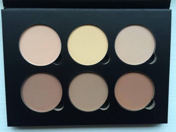
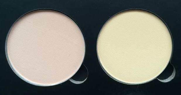
The last of the three light shades is Sand, a pale nude shimmer. This is by far my favourite colour in the palette; it’s delicate shimmer catches the light in just the right way, it’s in no way glittery but has an almost pearlescent finish. In the photo below, I’ve compared Sand to my current go-to highlighters.

As you can see, the colour is very similar to Illamasqua’s Helios from the extremely popular Sculpting Duo. 

Much like Vanilla, Sand is most definitely a peachy nude, however, the satin finish means even pale girls like me can get away with it, especially when it’s layered over blusher. Ideally, though, Sand would look something more like MAC’s Lightscapade, a more universal champagne shade that suits both cool and warm undertones.

11117804_10152696560741128_1989199120_n

The Contour Powders:

11081443_10152696529991128_653013877_n  (L-R: Java, Fawn, Havana) Again, I knew when I ordered the kit that I would find little use for Java and Havana, as both are particularly warm browns. But, I thought, with Fawn – a cool earthy shade – to rely on, I could use them to add a touch of warmth when the sun was out and when (if) I caught a tan this summer.

Of course, this depended on me liking Fawn. But I don’t. In the palette, sandwiched in between two russet shades, Fawn looks the perfect grey-brown. On my face, though, it’s still just that bit too orange-y.

11088253_10152696463796128_1131556952_n

In the photo above, I’ve compared the three colours to other contouring products I own. My go-to shades are Illamasqua’s Cream Pigment in Hollow and NYX’s Blush in Taupe, both of which have a much cooler hue when compared to Fawn. Fawn is a lot like Benefit’s Hoola with the volume turned up. 

I have to be careful to add only a modest amount of Hoola before I tip into Tango territory, so Fawn is all the more risky for me. But layered with a touch of blush, Fawn makes for a lovely plum coloured blush/bronzer that’s perfect for a night out, but for a Spring day, it is just that bit too heavy for my taste.

Overall, I’d give this palette a 6 out of 10. The only saving grace being the quality of the powders; as you can see from my swatches, their pigmentation and opacity rivals cream pigments! But, while the colours aren’t unusuable, they do need to be mixed with other products in order to suit my skin tone.

ABH has since promised a ‘Fair/Light’ kit, which will hopefully include all those shades necessary for sculpting a pale face: white, silver, champagne and taupe.

Either that, or I’ll have to get a spray tan..

Hope you like!

Molly x

My First Lush Purchases

I’m so late to the party with this one, but now I’m here, I’m staying ’til the lights come on.

There’s a reasonable excuse for my tardiness, though; when I was younger I bought a selection of bath fizzes on holiday and after using only one of them I came out in a horribly itchy rash from my neck to my toes. Ever since I’ve avoided anything strongly perfumed like the plague and, because you can smell a Lush store from 100 metres away, that meant all things Lush.

Having bought a Lush lip scrub a few months ago (it was vigorously recommended to me by a friend) and having not come out in hives, I wondered back in my local store to have a nose around and came away with these three pots of loveliness.

Big Salt Shampoo, £12.25

I have fine hair and a lot of it so I am constantly adding all sorts of products to give it a bit of life: hairspray, wax sprays, gels, gums, leave-in conditioners, mousses, toners, dry shampoos, serums – you name it and it’s probably in my hair. As such, it doesn’t seem to stay fresh for more than a day without looking and feeling heavy and greasy. Lush’s Big Salt Shampoo is the answer; its unique formula is designed to remove this gunk by exfoliating your hair and scalp, leaving both wonderfully smooth and refreshed (and smelling of fresh laundry!).

The name is literal: huge chunks of sea salt are suspended in a lusciously thick shampoo. The salt acts as an exfoliator, scrubbing away dirt from the scalp and hair strands, and a volume booster (along with the help of  extra virgin olive oil and seaweed, both rich in protein) by slightly drying the hair, much like a sea salt spray does. With reduced moisture, the hair is not so ‘slippy’ and less like to slide out of shape and style, meaning it’s easy to achieve that beachy, tousled look that’s ideal for Spring.

11096702_10152689733821128_713802206_n

Of course, if used too regularly, the salt will begin to dry your hair too much; I only use it once a week at the most. Another reason I have to use this sparingly (*sad face*) is because it contains lemon and lime juice, both natural bleaching agents. While these help make your hair look ultra-shiny, they are the nemesis of toners and hair colourants. As with any shampoo, toners and hair colours will fade, but the added ingredients in this pot of magic will accelerate this.

Overall, then, I’d definitely recommend this product for those of you who, like me, choke in a cloud of hairspray each morning and, by the end of the week, feel like their head is clogged full of product. I’ve never before used a shampoo that has been so effective at removing all those nasty gunky bits in such a natural, gentle way.

Rub, Rub, Rub, £8.75

So if Big Salt is an exfoliator for your head, this is for your bod. Again, the secret with this is sea-salt. Having sensitive skin, I was a little nervous that the formula would bring me out in spots, but the fine grains of salt offer gentle exfoliation as well as antiseptic properties that helps remove dead skin without causing agitation.

The mixture lathers only slightly when mixed with water meaning it doesn’t lose any of it’s impact and leaves skin feeling super soft, fresh and hydrated. A body scrub that also moisturises is quite difficult to come by in my experience; as you can see in the picture below, the scrub is quite loose and seems to leave behind an oily residue on the skin.

11084557_10152689730421128_223128685_n

For a Lush product, I personally find the smell rather so-so. Made with mimosa blossoms, the scrub has a very verrrrry ‘clean’ smell, which is nice, but not particularly girly or sweet smelling for my taste. That being said, it’s not an awful smell and always makes the product suitable for guys too (don’t say I never think of you gentlemen ;)).

The only warning I offer is to be careful using this after shaving. Yes, I know you should exfoliate and then shave, but sometimes I forget… The citrus juice and salt in this mixture will soon let you know if you’ve nicked your leg…

Helping Hands, £7.75

I can’t stand when my hands are dry; when it feels like any sudden movements will result in split skin and flecks of blood. As I’m usually covered in make-up, I repeatedly wash them with soap and water, which does nothing for my skin. Lush’s Helping Hands hand cream is perfect for restoring all this lost moisture and making my skin feel supple again.

This cream particularly targets sore hands: honey, lavender and marigold bring relief to sore and chapped skin; chamomile reduces redness and linseed softens skin to limit splitting and flaking. All Lush moisturisers rely on an amazing cocktail of natural emollients. Helping Hands is packed full of almond oil, cocoa butter and shea butter to create a thick lotion that takes only seconds to soak in, leaving no greasy residue only wonderfully soft skin.

Again, the smell is divisive. The most prominent smells are that of the butters which both have a peculiar nutty, almost smoky, smell, but it is by no means overpowering and seems to disappear as soon as the lotion sinks into the skin.

So there are my first Lush purchases and they won’t be my last! Though they’re not cheap, the quality of the products are unbelievable and knowing that every ingredient has been selected from a natural source with individual thought as to it’s purpose and effect makes every single penny worth it.

What are your favourite Lush products? What would you recommend I try next?

Hope you like!

Molly x

My Custom MAC Eyeshadow Palette: Part 1

I was a few steps away from the checkout, MAC’s Warm Neutrals Palette in hand, when I thought… I actually won’t use around half of these colours. It doesn’t include any of the shadows I’ve been lusting after for a while now and, in my opinion, there are a few too many yellow-y honey shades and no “curve-ball” colours that would really mix up my every day looks. For £65, it’s a pretty steep investment in something I wouldn’t use all that much. 

So I put it back and decided to build my own custom pro palette.

11072574_10152673001311128_530462597_n

MAC eyeshadows aren’t cheap by any means (individual pans cost £10) so building your own 12 piece palette will cost just under double the price of the pre-made ones. But if being able to pick out your own shades means that you’re more likely to use them at every opportunity, the extra expense is surely worth it. 

The range of colours and finishes offered by MAC is quite overwhelming when you’re trying to choose just twelve. Whenever I visit my local store, I go into a heady daze where everything and anything is beautiful, wonderful… and affordable (eesh), which doesn’t make for easy decision making. 

But I’m going to (try and) be sensible. I’ve decided to choose 4 matte transition shades, 4 warm neutrals (frosts/shimmers) and 4 more unique, out-there colours to mix up my go-to looks. Here are my first 6 beauties:

 Mattes:

11084430_10152673001286128_1269759344_n

L-R: Wedge, Quarry, Handwritten

Wedge: This is one of MAC’s most popular transition shades, a lovely warm beige. Given that I’m a sucker for warm colours, I was surprised to find that I don’t actually own a matte in this colour, so it was an obvious choice to help blend other shadows. Its neutral hue and matte finish provide a “no make-up, make-up” look which is perfect for Spring and helps to add definition to the eye with subtle depth. 

Quarry: A lesser known shade, Quarry is a unique grey-beige matte with a cool mauve undertone. In comparison to Wedge, Quarry is great for blending out cooler shades of grey, pastels and silver. Again, a great staple for lighter Spring-time looks when you want to tone down that dark smoked out eye.  

 11081649_10152673001251128_1376393010_n Handwritten: Okay, so I know I’ve just said that I’d look to tone down a smoky eye for Spring, but there are some days when nothing else will do. If in doubt, smoke it out, right?! 

Black smokes can look a little heavy on my face, particularly if my eyes are tired and a little puffy, so I usually rely on chocolate browns or deep burgundies as my go-to smoke shades. Handwritten is ideal for this, either placed across the lid or blended into the crease. 

Warm Neutrals:

11056723_10152673001241128_432067580_n

L-R: Satin Taupe, Sable

Satin Taupe: My first “proper” eyeshadow was Bare Minerals’ Loose Shadow in the colour ‘Celestine,’ a beautiful mid-tone taupe with a gold shimmer. I must have worn it almost every single day whilst I was at university, no matter what the occasion. Since leaving (and having an income!), my makeup collection has grown and Celestine has gotten lost – or ‘over-shadowed’ (BADDUM…) – by my other palettes. When I swatched Satin Taupe, it instantly reminded me of Celestine (if not as shimmery) and I knew I had to have it. 

Maybe it’s just me, but I often work on creating multi-tonal smokes in my crease and underneath my eyes, but can sometimes be left stumped as to what to use on my lid. I need a neutral colour with enough oomph to stand up to dark smokes and enough interest to work well be itself. Satin Taupe is the answer!   

11081663_10152672999761128_1406915266_n Sable: This was the first shadow I was drawn to when scanning the shelves at MAC. Sable is a warm, earth coloured red – the marsala shade – with a delicate gold shimmer that is not at all ‘glittery,’ but rather has a gorgeous pearlescent finish. I tend to use this in a similar way to Handwritten to mix up my usual smoky eye looks. Though classed as a ‘shimmer,’ Sable’s shine is subtle enough to be smoked out in the crease without causing your eyes to glimmer like beacons – an absolutely beautiful shade perfect for switching up classic looks for those summer-time date nights!


Curve-balls:

11046895_10152672999771128_1908136478_n 

Vex: This is a strange colour, but strange in a really really good way. It doesn’t look much of a “curve-ball,” but it’s duo-chrome finish is so difficult to capture on camera. While it looks like an ordinary silver grey shadow in some lights, in others it shines like a pearl with pink, purple and green hues. The best way to draw out the multi-dimensional colour of this shadow is to foil it with MAC’s Fix+ or another mixing medium. I’ll definitely be making the most of this shade this Spring as it makes for a gorgeous compliment to pastels and smokes alike, it’s great for adding a quirky edge to simple looks.

MACVex  
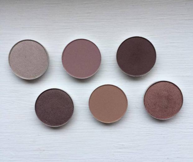
So, that’s half of my collection already sorted! Ideas for my next 6 shades include ‘Cranberry,’ ‘Pink Freeze,’ ‘Mythology,’ ‘Plum Dressing,’ ‘Crystal’ and ‘Trap’ with possible curve-balls being ‘Plumage,’ ‘Sumptuous Olive,’ ‘Jest’ and ‘Lucky Green.’ 

What are your favourite MAC shades? Would you consider making your own custom palette?

Hope you like! 

Molly x

Essentials: Bobbi Brown’s Corrector

I’m tired. Okay, I’m exhausted. But I don’t want people to know it.

And it happens every time: an hour after applying my makeup, they start to creep back to the surface, those dark under eye circles. These aren’t just ‘bags,’ they’re suitcases and they refuse to go away.

Despite a cocktail of concealers, my attempts to mask them are all in vain. By 3pm my eyes look dark and drawn. So how do those other people do it? How do they look as fresh at 8pm as they did at 8am? The answer: correctors.

Colour correctors can be applied underneath concealers in a paste form, or over the top of concealers in powder form, and are produced in a variety of shades according to their purpose (and their place on the colour wheel):

Green counters red –for taming angry spots and broken veins;

Yellow counters purple –for masking particularly dark circles, scarring and bruising;

Orange counters blue – for hiding under eye circles;

I chose Bobbie Brown’s Corrector (£19.00) because of its amazing texture; correctors are, by their nature, a lot thicker and tackier than concealers, but this is thick while easy to blend, gooey but not greasy. In my opinion, Bobbi Brown also has the widest variety of shades available. I had looked into buying MAC’s Conceal and Correct duo but found the colour choices quite limited. Yes, I want enough orange to hide my dark circles, but I don’t want to look like I’ve had a fight with a can of St Tropez.

The lightest shade of corrector available in the Bobbi Brown range is called ‘Porcelian Bisque,’ an almost magnolia colour with the slightest hint of warmth. I assumed that this would be the ideal shade for me, but when swatching it in-store I found it too light (!shock horror!). This would be a great choice for those wanting to try a tame corrector for the first time, or those lucky enough to have only the faintest dark circles. I, on the other hand, want a Photoshop worthy corrector, so I picked ‘Porcelian Peach.’

11020337_10152672991041128_404125399_n

As the name suggests, this shade is still among the lightest offered by the brand, but it has a considerable orange hue. In the swatch above I’ve compared it to my typical concealer shade, NARS Radiant Creamy Concealer in Chantilly (on the left). Bobbi Brown’s offering is the brightest of the two by far and has a salmon-esque colour as opposed to NARS’ typically yellow-toned bases. The corrector immediately lifts and brightens the skin, while it’s texture (I hope you can tell from this swatch just how thick and luscious it is) acts as both a wonderfully smooth primer and a glue to hold down your concealer.

I have to admit, I was a little nervous at first; being so pale, I’m particularly paranoid about my colour choices and, though I’ve had a number of concealer faux pas, I’ve never applied something so peachy intentionally. But, it works! In the pictures below, I applied my base as I usually would on the left and have added the corrector on the right. The difference is huge, and wonderful!

The true test of a corrector is its staying power. When your concealer begins to break down and fade after 5-6 hours (even when using the premium brands), a corrector will stay in place at full coverage for around 8-9 hours, meaning your face looks as fresh and dark circle-free as it did when it was first applied.

Of course, it’s not a miracle worker and there are some things to be careful of. This is by no means a light formula and adding another paste to your makeup routine does increase the risk of caking and creasing. The former can be easily avoided as long as you aren’t heavy-handed and blend the corrector in well – a  little goes a very long way (this one in particular won’t lose its intensity once blended).

As for creasing, I’ve found that applying a good amount of primer beforehand and a fair dab of powder afterwards helps to stop this from happening for the majority of the day. When I begin to notice lines appearing, it simply work the products back into my skin using my finger, reapply some powder, and I’m ready to go for the next few hours: a small price to pay for a dark circle eraser!

So, would you consider Bobbi Brown’s corrector?

Do you use correctors as part of your getting ready routine?

Hope you like!

Molly x

Essentials: Illamasqua’s Hydra Veil

There’s a lot of hype, and an equal amount of confusion, surrounding Illamasqua’s Hydra Veil. What is it? What does it do? Why does it look like that?! Well as someone who battles with flaky, dry skin, anything with ‘hydra’ in its name is an instant hit with me. Saying that, at £30, this product isn’t cheap and with its exact purpose somewhat ‘veiled’ in mystery (BADDUM-TSCH), it’s been one of those items that I’ve been lusting after, but not quite had the guts to buy.

Then payday came around and I got a little spendy.

I understand that there is a thread throughout my posts on the theme of “I bought this thinking it was [blah] when it turned out to be [significantly different blah].” Please trust that I really, really, do do my research on products before I buy them, but Hydra Veil seemed to evade any form of definition. What is a primer? What is a moisturiser? Neither or both?

So I bought it thinking it was the former; my foundation, particularly Illamasqua’s own Skin Base, has been settling into my fine lines a little too quickly of late, so I thought I’d invest in a good primer.

Illamasqua’s Hydra Veil is not a primer.

Well, not technically. Neither is it a “skin care” product as it doesn’t offer any long-term benefits to the skin – it won’t prevent those crow’s feet from forming and it won’t treat blemishes. But that doesn’t mean that it’s not absolutely AMAZING.

Illamasqua describes this as a “cosmetic care” product…

What I imagine they’re trying to get at is that Hydra Veil is geared towards enhancing the appearance of your makeup (your ‘cosmetics’), rather than treating or repairing your skin. With this instant hit of hydration, your skin becomes the perfect canvas.

In a typical Illamasqua-esque tub, all black, sleek and simple, there is a pool of clear jelly and a tiny little spoon. Cute, but a weird start to my getting-ready routine. It’s like no other beauty product I’ve tried before: just scoop out a pea sized amount and smother it all over your face. The veil has the texture of a semi-set jelly which barely holds its shape, so as soon as you apply a small amount of pressure it completely breaks down to a water-like consistency, making it easy to spread across the skin. If you apply the correct amount (more on this later), the product melts away in seconds to create that velvet soft, ultra smooth feeling that you would usually achieve with primers.

This is probably where all the confusion comes from as Hydra Veil does leave the skin feeling ‘primed’ for makeup. However, primers work by effectively placing a ‘lid’ over the top of pores and filling in fine lines. Any makeup applied afterwards therefore sits on top of this primer rather than falling into these crevices. This ‘lid’ also reduces the amount of oils secreted from the pores meaning that you’re less likely to develop shiny patches throughout the day.

Ilamasqua’s Hydra Veil, on the other hand, does not create such a ‘lid’ and it doesn’t fill in fine lines; this super smooth feeling is caused by the veil providing the skin with a huge, instantaneous hit of hydration which swells skin cells to leave that healthy, plumped feeling – an ideal base for makeup. Because of this, there’s no guarantee that your makeup will stay put for longer. It will, however, help to prolong that freshly-applied look by creating a delicately dewy glow.

Why not just splash your face with water? Water evaporates too quickly, particularly from a warm surface like skin, and can actually draw more moisture out than that it allows in.  Hydra Veil contains Glycerin (which I spoke about here), a product often found in mixing medium as it evaporates at a much slower rate than water. This means that products stay ‘wet’ for longer = the secret to that extended fresh-faced look.

I have noticed a huge difference when applying my foundation after Hydra Veil; my base seems to glide on effortlessly, no uneven patches, no difficulty blending, no caking or scuffing across dry skin. In particular, Hydra Veil works brilliantly in conjunction with Illamasqua’s SkinBase, the formula of which is given to highlighting every lump and bump. I haven’t noticed as big a difference in the longevity of my makeup, only that it looks ‘fresher’ for longer – which is obviously a massive bonus! Applying a spot of primer underneath my eyes and around my nose after the veil soon sorts this issue for a smile/frown/squint-proof base. It is especially good at waking up tired, puffy eyes, so massage some onto your lids to open up your peepers. (Illamasqua also recommends this as a post-shave balm (for guys, of course) to help soothe broken skin with a moisture punch)

The strengths of Illamasqua’s Hydra Veil are also its weaknesses; while it’s innovative formula works wonders, it can take a little getting used to. A very little goes a very long way; too much will only sit on the surface of the skin and have to be dabbed away = wastage and for an expensive product, wastage is a big no-no. It is worth experimenting with this product to see what is best for you: how much do you need; what areas of your face take to it best; what primers/foundations work best with it; they’re all questions raised by its weirdly wonderful design, and though it may take a few attempts, it will definitely be worth it in the end!

Would you consider Illamsqua’s Hydra Veil?

Hope you like!

Molly x

Review: MAC’s Mineralise Skinfinish – Natural and Lightscapade

So, my mini Manchester haul part two (see part one here) involves these beauties – MAC’s Mineralise Skinfinish in ‘Natural – Light’ and ‘Lightscapade.’

I get a real buzz out of buying products like these because they look so perfect and generous. Well, for the first handful of uses at least. The compacts are huge with MAC’s signature style: a clean, all black design with smooth, rounded edges. And that’s without seeing the products themselves: the pans are equally large and domed, the powders just as clean and smooth and, particularly in the case of ‘Lightscapade,’ mesmerizingly pretty.

MAC’s Mineralise Natural Skinfinish in ‘Light,’ £23.00

I’ve been looking for a decent powder for a while now. It seems that, as I get older, my skin gets oilier, so I don’t have a stock of powders I can rely on and my experience with different brands is quite limited. But you can’t go wrong with MAC, right?

Before now I’ve used Rimmel’s Stay Matte Powder for my work face and Bare Escentuals Loose Mineral Foundation for my ‘dressed-up’ face. Both have their weaknesses. Rimmel’s powder makes for a great blotting powder as it quickly absorbs oils, but unfortunately, on my skin, the powder doesn’t “Stay Matte.” It breaks down after 3-4 hours of wear meaning, by the end of the day, my concealer and foundation slips and slides as much as ever. It’s not bad for £3.99 though!

At the other end of the scale, there’s Bare Escentuals’ powder foundation. I plan to do an “In Defence Of” post about this as I think it gets a pretty bad rap from the beauty community; it’s by no means the powder, but it’s not all that bad once you’re used to its quirks. The trick to this powder is that less is more. I won’t go into too much detail here, but as a powder foundation, not a setting powder, it has a more opaque finish and a slightly thicker texture. Applying too much if therefore effectively like applying two layers of foundation = cake-face. A verrrrry light dusting can work well over the top of liquid foundation, but it’s just not right, and it’s been bugging me. 


So in comparison to Bare Escentuals, MAC’s Skinfinish is the ideal setting powder and is designed to work in conjunction with liquid bases = no cake-face. It has a very ‘thin,’ light consistency which makes it very easy to apply and helps avoid that awful gunky look as it sits on top of your foundation rather than mixing into it (as Bare Escentuals can). 

Coverage/Colour:

I find the idea of ‘coverage’ in relation to powders confusing: is a powder really meant to offer much? I personally don’t want my powder to contribute any real coverage to my face; doing so would only reverse the effort I’ve put into contouring and highlighting. I therefore only apply it sparingly to those culprit areas (underneath my eyes, around the tip of my nose, between my eyebrows and on my chin) with the intention of locking in place my foundation/concealer and matte-ifying the odd greasy bit. 

As I wrote about in my foundation post, MAC’s paler foundations/concealers/powders have a decidedly yellow undertone (as you can see from the swatch above) which is great for masking dark circles but not so effective at reducing redness so I wouldn’t rely on this to help cover that angry zit. The opacity of the powder can be adjusted depending on what you apply it with: a powder puff will pick up more product than a brush, while a damp beauty blender collects even more if you want a thicker covering. Still, I find that too much powder only dries out the skin surrounding the pimple which draws attention to it’s sticky-outy-ness *sigh* 😦

Finish/Staying Power:

The huge benefit of using this powder over conventional powders, and particularly translucent powders, is its ‘Mineralise’ formula.  A lot of powders are too matte, too focused on oil absorption, that they suck any sign of life out of your skin. MAC’s Mineralise range relies on the tiny light-reflecting minerals (much like those in NARS’ Radiant Creamy Concealer) to deflect light away from the face. While Lightscapade contains gazillions of these minerals for a gorgeous satin shine, the Natural Skinfinishes contain just enough to create a ‘glow,’ the desirable semi-matte “second skin” finish that mimics the subtle shine of naked skin. 

This powder’s staying power is second to none; I’ve lately become very paranoid about my makeup settling into the fine lines under my eyes and around my mouth, but this powder seems to do the trick! Inevitably, those creases begin to appear after 7-8 hours of wear so the odd touch-up is needed, but that’s a small price to pay for a powder that helps your foundation and concealer to look freshly applied for hour after hour.

MAC’s Mineralise Skinfinish in ‘Lightscapade,’ £23.00

I’ve heard of lipstick junkies, but is there such a thing as a highlighter junkie?! 

There’s been a gap in my little collection for a powder highlight so I finally decided to just go for it. And here it is. Aaaaaaaaaaah. It seems that there are many different versions of ‘Lightscapade’ – the latest reincarnation, for the ‘Lightness of Being’ collection, changed up the colour with pink and copper veining and stamped the powder with a cable knit design – but this is the old classic in fancy new packaging. 


Coverage/Colour: 

Again, coverage is a bit of a moot point with highlighters; my major concerns are it looking blotchy and obvious. But Lightscapade applies like a dream with the same weightless consistency as the Natural Skinfinish, leaving a subtle and consistent shimmer. In fact, the powder is so fine and delicate that I often get frustrated that it’s not showing up on my face, only to walk into a different light and have my cheekbones glisten. 

As a powder highlight, Lightscapade can be layered over a cream base for a super ethereal shine or used alone for a “your-skin-but-better” sheen. Its multi-dimensional formula means that different lights give different results so it might take a while to get used to the amount that’s perfect for you. 

Lightscapade’s gold hue would suit a variety of skin tones due to its multi-coloured veining: it contains warm gold for darker complexions, mid gold for olive skin and a champagne shade (and even a bit of blue!) for pale folks like me, all mixed into one. And you can easily vary it’s tone by changing the base you use underneath it; for example, I prefer it’s cooler shades so I often layer it over a white base (MAC’s Cream Colour Base in ‘Luna,’ reviewed here). On the other hand, a plum blush or bronzer will pick out its warmer tones if you prefer.  

Finish/Staying Power:

As the star of the Mineralise range, Lightscapade is packed full of those magical minerals that allow it to shine; it’s by no means ‘glittery,’ but has an ultra-fine, super satin finish that catches the light beautifully. Paired with the Natural Skinfinish, these powders recreate the skin’s natural, healthy radiance, almost as though you’re not wearing make-up!

Much like the Natural Skinfinish, Lightscapade will last up to 8 hours without losing its colour and shine. It’s lightweight formula resists caking and, in my experience, isn’t susceptible to excess oil – it remained in place across my T zone for around 6 hours and doesn’t transfer to the fingers as easily as a cream-based highlighter can.  

What do you think of MAC’s Mineralise Skinfinish?

Hope you like!

Molly x

The Serpents Club: The Lau Necklace

I’ve never thought of myself as a jewellery fan: bracelets rattle on my desk, necklaces make me itch and earrings catch my collars. But then I discovered The Serpents Club.

Based in Manchester, The Serpents Club is an independent label specialising in beautifully unique, handmade crystal jewellery. Following the recent trend in quartz necklaces, I had trawled the high street to find pretty, if only average, offerings.

And I was beginning to lose hope when, scrolling my way into the depths of Instagram, I saw this…

11012233_10152610756361128_133724997_n

The ‘Lau’ necklace is, what I believe to be, The Serpents Club’s signature style. There is something peculiarly dainty about it; its raw chunkiness is part of its whimsical charm, the polished stone mounted in pyrite as though it had tumbled from a fairy’s grotto.

It is detailed but uncomplicated, distinctive but understated. It makes a beautiful, subtle statement.

11005776_10152610756201128_1835722385_n

Each quartz is individual in its size, shape and colouring; every piece is utterly unique. As you can see from the picture above, the Lau’s stone (a medium-sized 3 inches) is transparent apart from delicate white veils. It’s natural beauty is completely untouched – I’m head over heels!

The individuality of the necklace means it is extremely versatile: it can be worn with a casual jumper, a crisp collared shirt or a floaty dress, for breakfast, lunch or cocktail hour.

serpentsclub

At only £30, the Lau is an absolute steal, considering I’d wear it to bed if there wasn’t a risk of me showering it in dribble. I have since made two more purchases from The Serpents Club and am planning my third (it’s a difficult job with so many goodies to choice from), each thing is just as amazing as the last.

From the wonderful designer to the quirky packaging to the pieces themselves, every aspect of this label sparkles and shines.

Will you become a member of The Serpents Club?

Hope you like!

Molly x