Colourpop Super Shock Shadow in ‘Bae’

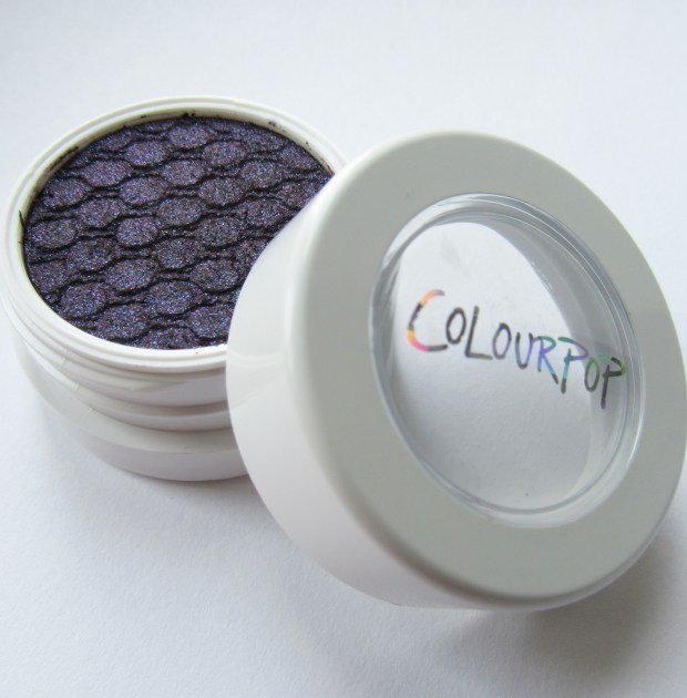
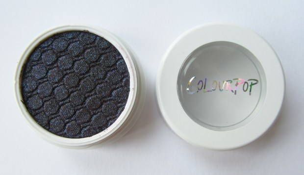
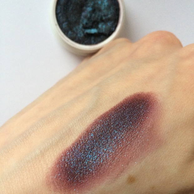
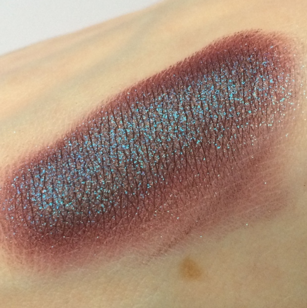
Here’s a snap of my first ever Colourpop eyeshadow, ‘Bae,’ a ‘rich eggplant purple with an emerald and turquoise glittery duo chrome metallic finish.’

IMG_0408

But, first thing’s first, what is it?

Formula 

According to Colourpop, a Super Shock Shadow a ‘long-wearing crème powder formula’ with an ‘elastic texture.’ And well… they’re right. But is it a cream or a powder? Weirdly, it falls somewhere in-between. At first touch in the pan, the product has a mousse-like consistency, velvet-soft and almost bouncy under pressure. As soon as it gathers on the finger or brush, however, it sets to a super-fine powder.

IMG_0409

IMG_0411.JPG

Once it sets, too, the powder is there to stay. I was able to wear this sans primer for around 8 hours without seeing any creasing. This is great news for both oily and dry skin alike: the super lightweight formula and silky finish is less likely to cake or go crusty throughout the day.

It is also compatible with other shadows; typically, it’s recommended that you don’t apply cream shadows over powders, unless you want a gunky, flaky mess. But as this sets to a powdery finish, it can be layered and blended with other powder shadows without any fuss. Win!

IMG_0418

Application

Being half cream/half powder, Colourpop shadows can be a little confusing: how on earth do I get it on my eyelid? As with any shadow, you can use your finger or a synthetic brush, but each with different results.

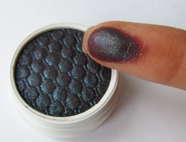
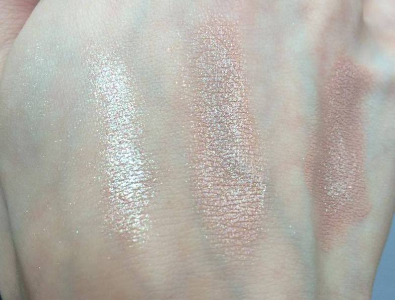
Below, the swatch on the left is applied with my finger and, on the right, with a brush. Applying with your finger reduces fall out and allows for a more consistent, though not very precise, application. A brush, on the other hand, increases the likelihood of fall out and patchiness, but does allow you to be more precise.

IMG_6471

IMG_6470.JPG

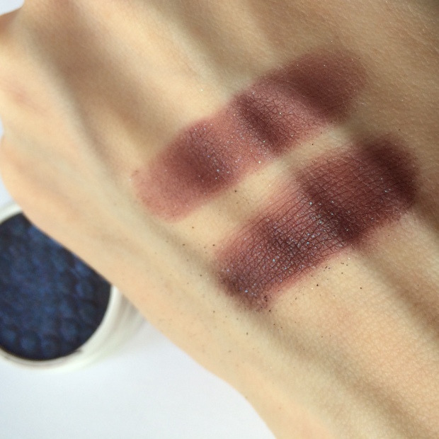
In my opinion, the best method involves a combination of both finger and brush: apply with fingers for the most part, where most pigment is needed, and then blend out with brushes.

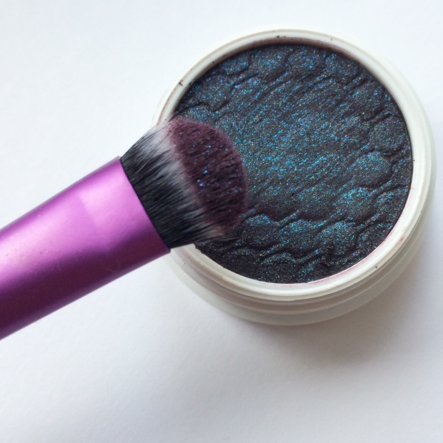
As you can see from the photo above, sweeping your finger across the pan doesn’t gather enough pigment to really do justice to the eyeshadow. I’ve found that the best method is to scoop the product. Though this does risk messing up the shadow’s pretty patterned surface, the difference in colour pay-off is HUGE.

IMG_7312

IMG_7315.JPG

An easy to use, if unusual, formula in equally unique shades, Colourpop shadows are a must-try for any makeup fan who wants to shake up their collection with some new pops of colour. Which will you be buying? Check them out here.

Anastasia Beverly Hills ‘That Glow’ Glow Kit

If 2015 was the year of contouring, 2016 is the year of highlighting. Both Jeffree Star and Nikkie Tutorials have recently taken to Youtube to post full-face looks using only highlighting powders and central to their routines are the ABH Glow Kits.

Released at the end of 2015 to honour Anastasia Soare’s birthday, the palettes continue the success of the brand’s Illuminators, which took the beauty world by storm. And what could be better than one highlighter? Well, four.

ThatGlow1

The ‘That Glow’ Kit is the warmer of the two palettes currently available (though we await the release of the ‘Sun Dipped’ version this summer): while the ‘Gleam’ Kit offers rosy, pearl tones, ‘That Glow’ is all about a golden bronze shine. As a pale girl myself, I must confess that I snapped up ‘Gleam’ in an instant, ‘That Glow’ just looked too bronzy, my milk bottle skin wouldn’t do it justice. But, I was wrong. In fact, in my opinion, the ‘That Glow’ Kit is the slightly more versatile palette of the two, even for someone as fair as me.


Packaging:

In contrast to the weighty, decorative, luxurious, packaging on the market – the Urban Decay Gwen Stefani Blush Palette, for example – the Glow Kits cardboard casings may be a little underwhelming. That being said, they are very resilient to wear and tear, mostly because they are so slim and lightweight. They can be slipped into a suitcase, handbag or Zuca without taking up much room at all. The pans can also be removed and added to a custom magnetic palette if preferred.


IMG_0387

IMG_0390.JPG

So, the shades themselves:

-Sunburst: ‘a bright luminous gold with a metallic finish’

-Bubbly: ‘a champagne rose with a pearlescent finish’

-Dripping in Gold: ‘a lavish gold with a vivid reflective finish’

-Golden Bronze: ‘a sultry, warm bronze with a gold-flecked finish’


Colour Range:

There really is a shade for everyone, and for every possible use on the face, eyes and body. Though ‘Sunburst’ looks very yellow in the pan, on the skin it is less a ‘luminous’ gold than a true champagne that, if not used as a highlight, can be mixed with face powder for that all-over luminosity. ‘Bubbly’ and ‘Dripping in Gold’ are very, very similar in colour, but their respective pink and peach undertones means that they can be layered over top of blush for the ultimate mineralised finish. Lastly, ‘Golden Bronze’ <3. This shade is just too warm for me to use as a highlight, but makes for the most beautiful eyeshadow when paired with neutrals or jewel toned emeralds and navies.

IMG_0392

IMG_0395

Texture & Staying Powder:

The powders aren’t exactly soft and buttery, but are rather very finely milled. This means, though there is a fair amount of fall-out, they are extremely lightweight on the skin and are less likely to cake when layered on top of foundation, concealers or other cream-based products. Their intensity is somewhere between Becca and The Balm (swatched below); it takes a few swirls of the brush/fingers to really gather up the pigment. That being said, the powders are buildable and can also be applied with a damp brush – ideally, using a mixing medium like MAC Fix+ rather than water – to maximise their shine.

With summer just around the corner, the ‘That Glow’ Kit is the perfect addition to any makeup arsenal; it is truly a ‘kit,’ not just a highlighter palette, but an eyeshadow/blush/body bronzer set rolled into one.


Will you be getting your glow on? Check it out That Glow Kit.


*this link will take you to Roses Beauty Store, an online UK makeup stockist. In return for some of the newest releases, I’ll be blogging for them regularly.


FOTD: Valentine’s (and some questions for you guys!)

I don’t usually post my FOTD’s, but rather post pictures on Instagram with product details underneath; would you like to read more about (or even see, if I can work out Youtube and editing software…) my make-up tutorials?

11005681_10152607400136128_1161942599_n

Above is a shot of the products I used in my Valentine’s FOTD; I exaggerated my usual winged liner and added a second smoked-out wing underneath using the different angles of my eyeliner brush to smudge my gel liner. I also carved out my eyes in a subtle cut-crease using the nudes in my Sigma Warm Neutrals palette, eventually adding a little of Illamasqua’s Pure Pigment in Furore to my lid.

My lips were initially a verrrry nude colour using Lime Crime’s Cashmere but I felt it didn’t add enough definition to my mouth in comparison to my eyes, so I added a layer of Illamasqua’s lovely grey-mauve ‘Posture’ on top to create a muted purple colour, and voilà!

So would you like to read more posts like this? Or see how I do it? Are there any looks/ reviews/ topics you would like to see?

I’m excited to read your feedback – hope you like!

Molly x

My Contouring Routine

I’m a recent contouring convert; ever since that photo of Kim Kardashian, I’ve been trying to add some definition to my face, drawing various lines in various colours in various places.

I’ve tried taupe, bronze and dark brown eyeshadows, eye pencils, creams and blushes in the hope of achieving the right look and after many attempts (and some utter disasters), I think I’ve finally cracked it!

Shading

Illamasqua’s Skin Base Lift in White and Cream Pigment in Hollow (both £17.50)

My first step is to ‘shade’ my face, or to map out where I want the light and shadow to be; I find that by first adding a subtle glow and depth to the skin, any extra definition added later to the nose and cheekbones looks more authentic. To do this, I’ve found the best products to use are cream pigments, essentially colour-rich concealers.

After applying my foundation and a very light layer of concealer around my eyes (just to even out those blueish veins), I apply the two pigments in those places that I feel need an extra oomph.

(Please excuse the damp hair and pyjamas…my getting-ready routine isn’t at all glamorous)

My favourite products for this shading are Illamasqua’s Skin Base Lift in White and Cream Pigment in Hollow. The Skin Base Lift has a beautifully silky, almost gooey, texture that blends easily with my foundation without losing any of its brightness. While it adds a visible glow to my skin, I don’t rely on this as my sole concealer. Illamasqua claims that each of the Skin Base Lifts has a peach undertone that perfectly counteracts blueish hues, particularly around the eyes. I guess having chosen the white shade, which obviously has very little peach to it, I have had to compromise on this full coverage. Nevertheless, I would recommend this product for those with pale skin who may struggle to find a contouring product light enough to make a noticeable difference.

Hollow is another product ideally suited to paler skin types due to it’s cooler tone. Before using this, I had been using Benefit’s Hoola to define my cheekbones: Hoola is known for having a cooler tone than most bronzers meaning it works well on even the fairest skin, but I personally prefer Hollow as its colour is cooler still, meaning it adds shade without any unconvincing ‘tan’ or orange hue.

Once applied, I then blend these pigments out with my beauty blender being sure to avoid any streaks, but also to keep the colours within their demarcated ‘zones.’

Defining

NYX Powder Blush in Taupe (£6.00) and Illamasqua’s Gleam in Aurora (£21.50)

For adding further, more defined, shadows to my face, I prefer to use a dark powder. As I like to add a little more colour to my nose (which, due to my combination skin, can get oily), I use a powder to avoid adding more product, which can lead to caking.

I use NYX’s Powder Blush in Taupe, a similar grey-brown to Hollow, to carve out my cheekbones with a dense blusher brush and to shape my nose with a detail brush, as shown below. As a powder, it is much easier to build up substantial colour without clogging the skin with too much product.

That being said, for my highlighter, I would have typically used a white eyeshadow with a light shimmer, until I discovered Illamasqua’s Gleam. I recently bought a bundle from eBay which included this Gleam and now I can’t stop using it.

gleamaurora

Many reviews I have read have complained that this highlighter’s sticky formula can lift off foundation and it certainly does (I have caused all kinds of blotches because of it) if not used sparingly. To me, it is less of a cream and more of a gel-like consistency and, though quite peculiar to work with, produces the most ethereal delicate glow.

My Gleam, Aurora, is a lovely champagne colour which works well with warmer shades of eyeshadow and lipstick on fair skin. With cooler shades of make-up, I would probably opt for a similarly cool toned highlighter – I’m waiting for Illamasqua to bring out a white/silver Gleam!

My face is now ready for eyeliner, mascara, the works! Contouring can look lovely and natural when just set with a little powder and left alone, but can also provide a base for adding a little blush or extra bronzer. In the look below, I chose to keep it simple with an ordinary contour and neutral lips and eyes.

What are your favourite products for contouring?

Hope you like!

Molly x

How to Make the Most of Pure Pigments

It’s the perfect time of year for adding a touch of sparkle to your make-up routine and pigments are by far the best way to do so. With Christmas parties and New Years Eve in mind, I recently bought both Beguile – described as “light shimmer” (?) but actually an iridescent white – and Furore – “champagne peach shimmer” – by Illamasqua.

Having swatched them under bright lights in store, the colour and sparkle was self-evident, I had to buy them! But when I applied them to my lids the next day, I was a little underwhelmed by the pay off. So here is a quick guide on how to make the most of your pigments.

Of course, you could just simply apply the powder to your bare skin for a simple, stripped back look, but the party season demands something a little more dramatic. The strength of your pigment depends on the base they are applied to; below I swatched the pigment alone; with Illamasqua’s Sealing Gel; with Illamasqua’s Vintage Metallix in Courtier; and with MAC’s PaintPot in Painterly.

Beguile

Beguile

Furore

Furore

As you can tell from these pictures, the difference is striking. On my pale skin, both pigments, particularly Beguile, are barely visible when used alone and only add a slight shimmer (which could work well as a subtle highlighter, though Beguile is a little less ‘natural’ due to its iridescent pink and green tones).

MAC’s PaintPot was also pretty useless; I initially thought an eyeshadow base like this one would be perfect for pigments, but the formula is too heavy and thick to allow the powder to be distributed evenly.

courtier

For a daytime look, I was looking for a product that would carry my pigment as well as tone down the glitter. My favourite thing to do this would be Illamasqua’s new Vintage Metallix in Courtier (£16.50). This cream-gel is intended to be used alone (Courtier is a gorgeous “vintage nude” with slight gold shimmer) as a smudge-resistant eyeshadow, however it provides a light but opaque, smooth but slightly tacky base – perfect for a layer of pigment!

For nighttime looks, I needed something that would make my pigments ‘pop’ (cringe… but you know what I mean), so I opted for Illamasqua’s Sealing Gel. This dinky bottle may seem expensive at £7, but it’s uses are endless. It is a mixing medium revered amongst make-up artists for turning eyeshadows into liquid eyeliners. However, if you place a few drops on your eye lid, tap with your finger until it becomes tacky. Once your pigment is applied on top, you’ll see an unbelievable transformation: the colour is bright, the shimmer intense and the coverage even (no lumps of gunky glitter clogging your lid).

This is my version of a day and night look using Pure Pigments (Furore on the left, and Beguile on the right):

How do you make the most of your pigments?

For FOTDs and previews of my blog posts, follow my instagram: http://instagram.com/beautsoup

Hope you like!

Molly x

Review: Urban Decay’s Vice 3 Palette

You could say that I bought this palette by accident, and now I know the meaning of ‘serendipity.’

I was originally looking for Vice 2, released September last year, to add a welcome addition to my palette collection with it’s perfect mix of neutrals and bold pinks and greens. But then I saw this!

In the clam-shell style typical of Vice’s past, this palette comes complete with a full-size mirror and a double-ended synthetic brush (warning: it’s reflective cover holds no mercy when it comes to mucky fingerprints).

The colours are undoubtedly beautiful with four matte transition shades (‘Truth,’ ‘Undone,’ ‘Downfall’ and ‘DTF’) accompanying 16 shimmers. The variation in colours is perfect, with warm tones narrowly out-numbering cooler tones (it is the season for reds, coppers and browns after all!).

My favourite thing about this palette is that, if you take each row separately, it offers a ready-made combination of five colours, each set combining neutrals with an unlikely pop of colour. Champagne meets emerald, taupe meets red.

As always, I have a few complaints. While the shadows have an amazing colour payoff, they are particularly powdery. I’m not sure whether this is more noticeable here because of the number of shimmers (prone to a crumbly texture – think ‘Dust’ from Naked 3) or whether it is an unusual oversight by UD. Regardless, be careful of this excess if you have already applied your foundation and concealer!

I’m also not a huge fan of the brush; the bristles seem too sparse to effectively blend shadows together. Instead, I use it to sweep over my lid when all the blending is done, just to pick up any stray powder that may be lurking there.

Special Mentions:

Unknown

DTF: ‘Taupe Matte with Subtle Floating Tonal Pearl’

This is my favourite of the mattes. It is a perfect transition shade for a smoky eye, subtle or dramatic. I think ‘taupe’ doesn’t really do it justice, it has a purple-grey tone in a natural light that blends beautifully with warm and cool colours alike.

Last Sin:Unknown2 
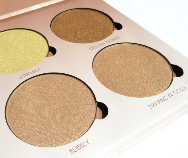
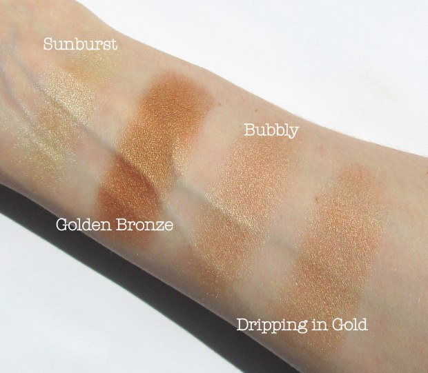
‘Champagne Shimmer with Silver Micro Glitter’

Last Sin was the colour that immediately caught my eye when I lifted the lid; to me, it’s the perfect shade for the festive season and, like DTF, blends well with coppers and browns as well as blues and greens.

Dragon: ‘Bright Metallic Green Shimmer’

I’ve never tried a colour like this before; the thought of green eyeshadow has never really appealed to me, but this colour is gorgeous, whether over the entire lid or just under the lash line. It particularly suits the pink and purple shades in the top row of the palette.

Sonic: ‘Metallic Red-Copper’

I wanted to try out this colour against my skin in anticipation of buying Lime Crime’s ‘Venus’ palette which comprises of these rusty red tones. And I love it! Blended with coppers and golds, Sonic adds something a little bit different to those usual autumn looks.

In this picture I used: DTF (transition); Last Sin (lid); Bobby Dazzler (highlighter); Sonic (lower lash line) and Defy (crease). Lips: Lime Crime Velvetine in Salem (ohmygodthebestlipcolourontheplanet).

Would you consider buying Urban Decay’s Vice 3 palette?

Hope you like!

Molly x

Essential Kit for Perfect Flicks

I discovered eyeliner when I was 14 and proceeded to smudge it all the way around my eye like Avril Lavigne did in her ‘Sk8r Girl’ video. Cringe.

Though a dramatic smoky eye just isn’t smoky enough without a bit of kohl eyeliner, nowadays I prefer the clean, precise lines that only a liquid pen can offer. So I thought I’d scoot through my essential kit for creating the smoothest curves and sharpest flicks.

Revlon ColorStay Liquid Eye Pen, £6.99.

My starting point is always to trace the line I want to follow. No matter how thin and wobbly this initial line may be, it makes it so much easier to thicken later if you have a base to work from.

For this step I always use this liquid eye pen by Revlon. In my experience, these eye ‘pens’ often have a flimsy nib, making it difficult to draw a solid line without awkwardly trying to lay the pen horizontal to the eye, using the side of the nib instead of the tip.

Revlon’s offering is perfectly sturdy, with just the right amount of give as not to feel sharp against the skin. The issue with this pen is that the nib dries out quickly: its coverage is not entirely opaque and can become quite patchy. In a normal beauty review this is obviously a huge no-no, BUT, for the purpose of tracing a line that will later by thickened and defined, this flaw is really a huge bonus. A drier nib means that the flow of product is reduced, making it easier to control where the liner is going without fear of it smudging or bleeding onto the lid (which then ruins the eyeshadow that took so long to blend… we’ve all been there 😥 )

Rimmel ScandalEyes Precision Micro Eye Liner, £5.49.

So now I have traced my line, I begin to thicken it. Whether you want to taper the line as it reaches the outer corner of the eye, or widen it to create a gorgeous flick, this Rimmel eye liner is perfect. Its tip does not come to a point, but a sloped edge. So while it’s outer corner can be used to create ultra-thin wisps, its flatter edge helps draw consistent, thick lines.

Rimmel Glam’Eyes Professional Liquid Liner, £5.29.

Eye pens can sometimes leave a raw, broken edge, particularly when they begin to dry out. To correct this, my last step is to retrace the line with a liquid liner. This Rimmel liquid liner has a super fine brush that glides smoothly over the eyelid to neaten up any unwanted cracks or wobbles and is perfect for creating the sharpest of flicks.

My tip when using liquid liners would be to apply them in long sweeping motions; though the urge is to draw the line bit by bit to be ultra precise, I have found that the most fluid lines are drawn when the liner is applied with as few motions as possible. Having to continually retrace a line in order to smooth out dips and bumps usually results in eyeliner a dozen times thicker than your original line.

With these three steps – trace, thicken and define – you can go wild with shapes and styles like this 60s inspired graphic eyeliner.

So how do you achieve that perfect liner?

Hope you like!

Molly x

My First Purchases from Illamasqua: Lipstick and Skin Base Lift

I’ve had two items on my Christmas wish list for a while now: Illamasqua’s Lipstick in ‘Posture’ and Skin Base Lift in ‘White.’ I know it may not be Christmas jussst yet, but it’s close enough so here they are!

Posture

Though Autumn is the perfect season for vampy, dark lips, I fell in love with Posture’s unusual ‘cool mauve’ colour, and thought it would bring something a little different to my usual go-to looks. Here I’ve compared it to LimeCrime’s D’Lilac to give you a better idea of how unique – and amazing! – this colour is. 10904910_10152536767286128_60703277_n-2

Along with a vivid violet lipstick, ESP, Posture was released last April as part of the brand’s ‘Paranormal’ collection and I’ve read quite a few reviews that criticise it’s ‘corpse’ appearance.

I would agree that Posture is a colour that won’t be to everyone’s taste; it’s cooler tones work well on an equally cool complexion, but may need something extra to suit those with warmer skin. I sometimes use NYX’s slim lip pencil in ‘Dark Purple’ before adding Posture over the top. This helps to add more definition to the lips as well as deepen the colour in a way that would suit all skin types.

This is my first Illamasqua lipstick and it won’t be my last. It’s texture is much similar to MAC’s matte range, if a little dryer, but that is to be expected with any lipstick that doesn’t offer a satin finish. It’s staying power is also on a par with MAC, if not that bit better, my MAC Sin tends to disintegrate and flake away if exposed to too much water (or gin…) where Posture stays put regardless.

Skin Base Lift in ‘White’

I’ve recently been experimenting with contouring; I’ve always been skeptical of the technique as it can mean caking the face with too much product, and it often isn’t a look that easily translates from the catwalk into every day life. Another obstacle I found was that, typically, highlighting demands a foundation or concealer two shades lighter than your normal skin tone. That’s where the Skin Base comes in… Here I’ve compared it to my ordinary concealer – MAC’s Studio Finish in NC15 – and the difference is huge!

Illamasqua’s Skin Base is designed as a ‘brightening concealer,’ but in my opinion it works best at brightening rather than concealing. The nature of 10928166_10152536776821128_485425217_n
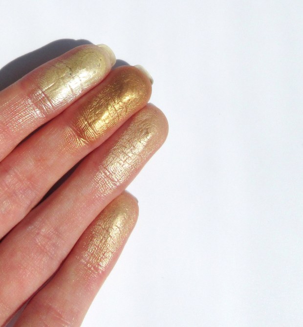
the colour means that, when applied to the cheekbones, nose and forehead, the whole face looks fresh and gleaming. However, as you may be able to tell from the picture, it does not offer as full a coverage as my MAC alternative.

Maybe I have been spoiled by MAC’s rich, thick formula, but Illamasqua’s concealer didn’t cover my blemishes or under eye circles as well as I’d hoped. Mix the two superpowers together, though, and the end result is the almightiest of cover-ups!

10808389_10152413753776128_1053403773_n

To top it all off, Illamasqua shared this photo on their instagram earlier today! Even more reason for me to go out and buy allllll of their things 🙂 don’t forget to check out my page: beautsoup.

What do you think of these products, would you try them out?

Hope you like!

Molly x

A Twist on a Classic: Winged Eyeliner and a Red Lip

This look is a timeless classic: a pared down eye balances a bold lip in a style that’s effortlessly feminine. Still, it’s always fun to play around with shapes and colours.

I began by covering my eyes with MAC’s Pro Longwear Paint Pot in ‘Painterly:’ what I like to think of as a discolouration corrector for the eye in a pale pink beige. With all my eww-y veins and redness hidden, I stuck to a very neutral palette using a matte taupe transition shade, a gold-speckled chocolate colour in my outer v and a frosted mushroom shade on my lid and along my lower lash line.  

To freshen up the look, I added bright white to the inner corner of my eye and brought it up under my eyebrow where it acts as a conventional highlighter. This gives the illusion of a bigger, brighter eye. To add to this effect, I also mirrored my usual winged eyeliner along the outer portion of my lower lash-line.

10805279_10152400526731128_1525396263_n

For the lips, I stuck to the Monroe-esque red, but added a little deep plum to the centre to create a subtle ombré effect that makes them look full and plump (it also prevents the red-lips-yellow-teeth faux pas).

I’m still on the search for my go-to red lipstick. Being ash-blonde, green eyed and pale skinned, it’s not as simple as choosing what looks like a lovely swatch. So far, my favourite is Shiseido’s Perfect Rouge in RD142 ‘Sublime,’ a richly pigmented cool-toned red.

So how would you put your twist on a classic? Do you have any recommendations for the seemingly elusive ‘perfect red’ lipstick?

Hope you like!

Molly x

Remember to follow me on instagram: beautsoup