Review: Illamasqua’s Gel Sculpt

Illamasqua’s Gel Sculpt was heralded as the new thing in contouring. It would usher in a new era of defining the face, they said. But, for what it’s worth, I’m unconvinced.

I remember the social media posts leading up to its launch: monochrome, abstract, mysterious. The hype surrounding the unveiling was huge and I was completely sucked in. I had my phone on my desk at work, continually checking my emails until it dropped into my inbox: ‘Available now.’ But then the delivery arrived and compared to the enormity of its billing, the box was teeny tiny. 

It’s so good that you won’t need to use a lot…It’ll last forever, I told myself.

And yes it probably will, because – two months later – I’ve only used it once.

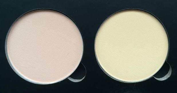
Take off the cap and you’ll find a cylinder of solid gel (it reminds me of roll-on deodorant) with a fresh floral smell. Weird, but I can handle weird. Scoot the gel across your hand and it gets weirder. What, in the bullet, looks like the perfectly cool, deep IMG_4456taupe transfers to the skin as a pale coffee hued smudge. Gel Sculpt is really a glorified cheek tint and a strange one at that.

In their quest to create the first ‘natural’ looking contouring product, Illamasqua have skimped on the colour-punch that typifies their brand. Silhouette, so far, is the only shade intended to ‘sculpt’ the face so I understand that they needed to produce a shade that would suit every skin tone, but the truth is there isn’t a universal colour that will please everyone and, even if there was, I don’t imagine it would be as warm toned as this. I guess the name ‘Silhouette’ implies its intention to mimic natural looking shadows, but I can’t help but think it should be called ‘Obvious.’

The picture on the left was taken after just one stroke on my hand, immediately after application. As you can see, the colour is wish-washy, the coverage sheer and the finish oddly glossy. When I first used this on my face, I quickly applied more coats, presuming the colour would deepen as desired, but the sepia only became more opaque… in patches. With a slight hesitation, I took up my make-up sponge to dab off the excess and start again, but by that time the gloss had turned to matte, the gel had dried and my contour was fit to survive pollution on a nuclear scale.

illamasqua

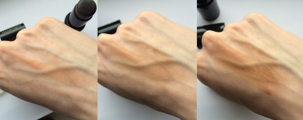
L-R: One stroke; Two strokes; A desperate amount of strokes.

A waterproof contouring product that won’t fade or rub away throughout the day? Amazing!

If you actually like it…

I just can’t seem to get my head around this product. I’ve tried applying it straight from the bullet onto my cheeks, but it dries too quickly leaving an unyielding streak of bronze that refuses to blend. I’ve also tried Illamasqua’s recommended method of application: the gel is applied to the fleshy part of your palm beneath your thumb on one hand; then bounce your palms together to distribute the product over both hands; finally, with your thumbs parallel to your ears, dab the product onto your cheeks, cradling your cheekbones.

IMG_4463

What I mean by “the fleshy part of your palm beneath your thumb.”

This method is great for creating a subtle hue around the face… if you’re careful. But as there’s little to no precision involved, it’s quite difficult to stop the product from straying into your hairline or down onto your jaw (and there’s no hope of neatening it up afterwards). I tried this method just before writing this post and had to apply more foundation underneath to try and sculpt some sort of shape from the brown splodge, which I eventually completely covered in NYX’s Taupe blush. Fail.

Perhaps, in a different shade, I’d appreciate Gel Sculpt a little more. The formula is innovative, but fraught with practical issues like ‘how on earth do I apply this?’ If the gel wasn’t to set as quickly as it does, it would be a whole different story, but for now it will sit gathering dust on my dresser.

What do you think of Illamasqua’s Gel Sculpt?

Hope you like!

Molly x

Faking a tan: MAC’s Powder Blush in Harmony

The sun is coming out, summer’s on its way and, yes, I could just sit outside slathered in oil with a sheet of tin foil, but why sweat when I can just fake a tan? This tutorial will show you, especially you pale folk, how to fake it without the risk of streaks or that lingering smell of biscuits.

11348840_10152797372816128_1972554482_n

Contour

So, of course, the most important part of this look is your base with the secret being – as always – contouring. Whatever you do, do not try and fake it by using a darker shade of foundation/concealer! Contouring will only add colour to those areas of your face that would usually catch the sun, making for a more natural looking ‘tan.’

My preference for this look is a powder contouring product; cream-based pigments and concealers can look a little heavy on the skin and the look we’re aiming for is something fresh and ultra-natural. Powders are also much easier to work with in terms of building up colour and blending thoroughly. My go-to powder contour will forever be NYX’s Blush in Taupe, a perfect cool-toned brown. But, alas, a tan will never be cool-toned, so my mission began – find a warm contouring product for the palest of the pale.

11287403_10152797372791128_561216259_n

And here it is, MAC’s Powder Blush in Harmony, my most favourite product for this Spring/Summer. The colour is particularly difficult to describe as it lies somewhere between warm and cool tones. MAC describe it as a “muted rose-beige brown,” which kind of sounds like they couldn’t decide how to label it either, but I guess they’re not far wrong. The key with Harmony is that it doesn’t have that bronzer-type orange/terracotta look, instead it’s ‘rose-beige’ hue mimics the colour that pale skin would conventionally turn in the sun (providing it’s slathered in factor 30).

I begin by first applying my usual concoction of foundation: MAC’s Studio Fix Fluid in NW10 and Illamasqua’s Skinbase in 02. On the left below I have indicated the areas that I would usually contour using MAC’s Harmony and on the right, those areas I would contour with my conventional cool-toned contour, i.e. NYX’s Taupe blush.

Screen Shot 2015-05-21 at 18.17.57.png

Add the two together and viola – sunkissed skin! As you can see, I bring my warm contour a little wider and higher than my cool contour, straying into the areas of my face I would usually highlight. Just as highlighter is used on the high points of the face, so too should this warm contour as these areas (cheekbones, nose, chin and forehead) are always the first to tan.

I choose to apply MAC’s Harmony first using my Zoeva Cream Contour Brush (though intended for cream based products, the angled edge of this brush makes it ideal for hugging the natural curvature of my face), being careful to diffuse it as much as possible – the wonderful feather-light formula makes this very easy! Blending a small amount of product around and underneath your jaw line will help prevent your neck looking a completely different colour to your face and I also like to add some across my collarbones to continue the illusion that I’m lusciously bronzed all over (remember to do this if you’re wearing a low cut top).

11358692_10152797372746128_69643950_n

I then use my MAC 186 Small Contouring Brush (it’s small, dense tip is great for focused and defined contouring) to apply NYX’s Taupe into the hollows of my cheeks using tight circular motions in an upwards direction. I’ve added a comparison photo of the cool and warm contour to give you an idea of how warm Harmony is (please excuse the state of my NYX’s blush, it’s particularly loved!).

Then for my nose, I use my Sigma Detail Brush to draw two lines about a centimeter apart down the edges of my nose with Urban Decay’s ‘Tease’ eyeshadow from the Naked 2 palette (NYX’s Taupe works equally well, but the buttery eyeshadow is particularly easy to blend). Having blended this in with my fingers, I use any excess product left on the 186 brush to continue blending and deepen the colour.

Highlight

MAC’s Lightscapade holds a special place in my heart as a 10/10 highlighter, but I think this look requires something a little warmer than its pale champagne colour. My favoured highlighter for this Spring/Summer is Illamasqua’s Lumos from the Sculpting Duo; it’s peachy gol11304283_10152797372771128_223119123_nd tone with super-fine shimmer adds the perfect natural ‘glow’ to the skin that, together with MAC’s Harmony, makes for the ultimate ‘sun goddess’ pairing.

I apply this is all of the conventional areas (overlapping some of my warm contour), particularly focusing on the bridge of nose and the highpoints of my cheekbones using my Zoeva Luxe Highlighter Brush. Beware that Lumos is a particularly fine powder so you may need a few coats to get the glimmer you desire (it also has quite a lot of fall out, so don’t apply it whilst wearing your best white dress…I speak from experience).

Blush

I don’t feel that this look really needs a blusher as there is already plenty of warmth in the contour; all the same I opted for an blushequally bronzed, glowy looking colour just to finish the face (I guess you could use a pink or plum, but I think the ‘flushed’ cheek is more girl-next-door than beach babe).

MAC’s Cream Colour Base in Shell makes the ideal blush for this sun-kissed look; just as Harmony brings together just the right amount of pink and beige, so does Shell have the perfect blend, a iridescent rose gold. With its gorgeous glossy finish, this cream colour adds that “fresh-from-the-sea” glow to balance the matte contour. I apply it with my fingers to the apples of the cheeks, sweeping it back and upwards to join my highlight, sitting just above my contour. This product also makes for a striking yet simple eyeshadow, just dab over the lid for a super chic take on the glossy eyes trend.

Eyes + Lips

For the look that I originally posted on Instagram, I chose a cool brown/taupe palette for my eyes and lips, using MAC’s Satin Taupe eyeshadow and LA Splash Cosmetics’ matte liquid lipstick in Ghoulish. I find that warm, deep colours can sometimes make me appear paler than usual as my skin doesn’t have the same depth of colour. So here I worked on the opposite principle: these neutral cool tones help to accentuate what warmth there is in my skin and so help me to appear more ‘tanned.’

tanyrah

That being said, my favourite lipsticks to add to this base are at the other end of the ‘subtle’ spectrum. MAC’s Costa Chic or Jeffree Star’s 714 are both neon coral, a shade notable for making tans look ahhhhh-mazing. The sheer brightness of these lippies can’t help but to emphasis the warmth of your contour making even the palest of the pale appear lusciously golden (I used Costa Chic in the picture on the right above). I’ll be writing another blog post specifically on coral lipsticks so stay tuned!

Will you be ‘faking’ it this summer?

Hope you like!

Molly x

Review: Anastasia Beverly Hills Contour Kit

I really want to love this palette, but I can’t.

Anastasia Beverly Hills is the brand that turns girls into goddesses. First they fixed our eyebrows and now they fix our faces, sculpting cheekbones and jawlines since April 2014 when the long awaited Contour Kit went on sale.

It’s only in the last few months that I’ve truly realised the wonders of contouring and so, ever since, this palette has been at the top of my wish list. Last Thursday I received some particularly good news (more on this in a later post!) and decided to just bite the bullet.

I’d seen pictures of the palette all over Instagram, but expected a little more than what I got. It looks, dare I say it… cheap *wince*

With the image ABH has as a glamourous, luxury brand, I think it would better suit an Illamasqua-esque packaging: an all-black, glossy case made of sturdy, chunky material with a mirror inside, maybe? Instead, the casing is made of a stiffened, matte black card, the type that will scuff and mark quite easily. Oh, and there’s no mirror 😦 I’d actually be happy to pay more than £40 for this kit if the packaging was just that bit more ‘fancy.’

11088254_10152696530011128_1867326654_n

But, even then, I still couldn’t use it.

Short of extending out a robotic arm and applying the powders for me, I expected them to deliver on every level. And, don’t get me wrong, there’s not a huge hype surrounding this kit for nothing; it seems that what money has been saved on the quality of the packaging has gone into the quality of the powders.

The term ‘buttery’ gets used a lot by beauty bloggers, but these powders really are lusciously smooth. You’d be forgiven for thinking they were cream-based; there’s no fall out and the pigmentation is amazing, even with the smallest dab of the brush. It’s another cliché, but a little really does go a verrrrrry long way. I’d imagine it would be a long time before you needed to buy a refill pan.

11086953_10152696548201128_256792745_n

For me, it will be a very very very long time – you could even say forever – as I won’t be using 4 of the 6 shades.

So now for the meaty bit: the colours.

I should have seen this coming. The palette is intended for ‘Light/Medium’ skin and though I fit into the former category, I certainly don’t fit the latter. I’ve seen a number of fair girls pull these shades off beautifully but, on reflection, perhaps they aren’t as pale as I am…

The Face Powders

11091167_10152696530006128_1864087248_n

As the two matte shades in the palette, I’ve assumed that Vanilla and Banana are the intended ‘face powders’ for setting and correcting. Vanilla, while a lovely colour in itself, should really be called ‘Light Peach.’ In the swatches below I’ve compared Vanilla to Bare Minerals’ Powder Foundation in ‘Fair’ and MAC’s Mineralise Powder in ‘Light,’ the difference is huge. There’s no way someone as pale as I am could use this as a powder; on Saturday, I actually used it in place of a blush!

11081453_10152696463956128_147367902_n

I knew when I ordered the palette that I would very rarely use Banana – if at all. If you like the sound of Ben Nye’s Banana Powder (which is quite hard to get hold of in the UK), this would make a great alternative. For me, however, the colour is just too strong to use alone. I tried it as a corrector and it works wonderfully, cancelling out the blueish hues of under eye circles. Just dab it over problem areas and then cover with your usual liquid concealer. But having just bought Bobbi Brown’s corrector (which comes in a paste form), I don’t think I’ll be swayed to choose Banana instead. Powder correctors can turn gummy when used under liquid concealers and, with all the primer in the world, it still manages to crease and cake.

The Highlighter

11091167_10152696530006128_1864087248_nThe last of the three light shades is Sand, a pale nude shimmer. This is by far my favourite colour in the palette; it’s delicate shimmer catches the light in just the right way, it’s in no way glittery but has an almost pearlescent finish. In the photo below, I’ve compared Sand to my current go-to highlighters.

As you can see, the colour is very similar to Illamasqua’s Helios from the extremely popular Sculpting Duo. 

Much like Vanilla, Sand is most definitely a peachy nude, however, the satin finish means even pale girls like me can get away with it, especially when it’s layered over blusher. Ideally, though, Sand would look something more like MAC’s Lightscapade, a more universal champagne shade that suits both cool and warm undertones.

11117804_10152696560741128_1989199120_n

The Contour Powders:

11081443_10152696529991128_653013877_n  (L-R: Java, Fawn, Havana) Again, I knew when I ordered the kit that I would find little use for Java and Havana, as both are particularly warm browns. But, I thought, with Fawn – a cool earthy shade – to rely on, I could use them to add a touch of warmth when the sun was out and when (if) I caught a tan this summer.

Of course, this depended on me liking Fawn. But I don’t. In the palette, sandwiched in between two russet shades, Fawn looks the perfect grey-brown. On my face, though, it’s still just that bit too orange-y.

11088253_10152696463796128_1131556952_n

In the photo above, I’ve compared the three colours to other contouring products I own. My go-to shades are Illamasqua’s Cream Pigment in Hollow and NYX’s Blush in Taupe, both of which have a much cooler hue when compared to Fawn. Fawn is a lot like Benefit’s Hoola with the volume turned up. 

I have to be careful to add only a modest amount of Hoola before I tip into Tango territory, so Fawn is all the more risky for me. But layered with a touch of blush, Fawn makes for a lovely plum coloured blush/bronzer that’s perfect for a night out, but for a Spring day, it is just that bit too heavy for my taste.

Overall, I’d give this palette a 6 out of 10. The only saving grace being the quality of the powders; as you can see from my swatches, their pigmentation and opacity rivals cream pigments! But, while the colours aren’t unusuable, they do need to be mixed with other products in order to suit my skin tone.

ABH has since promised a ‘Fair/Light’ kit, which will hopefully include all those shades necessary for sculpting a pale face: white, silver, champagne and taupe.

Either that, or I’ll have to get a spray tan..

Hope you like!

Molly x

Review: MAC’s Mineralise Skinfinish – Natural and Lightscapade

So, my mini Manchester haul part two (see part one here) involves these beauties – MAC’s Mineralise Skinfinish in ‘Natural – Light’ and ‘Lightscapade.’

I get a real buzz out of buying products like these because they look so perfect and generous. Well, for the first handful of uses at least. The compacts are huge with MAC’s signature style: a clean, all black design with smooth, rounded edges. And that’s without seeing the products themselves: the pans are equally large and domed, the powders just as clean and smooth and, particularly in the case of ‘Lightscapade,’ mesmerizingly pretty.

MAC’s Mineralise Natural Skinfinish in ‘Light,’ £23.00

I’ve been looking for a decent powder for a while now. It seems that, as I get older, my skin gets oilier, so I don’t have a stock of powders I can rely on and my experience with different brands is quite limited. But you can’t go wrong with MAC, right?

Before now I’ve used Rimmel’s Stay Matte Powder for my work face and Bare Escentuals Loose Mineral Foundation for my ‘dressed-up’ face. Both have their weaknesses. Rimmel’s powder makes for a great blotting powder as it quickly absorbs oils, but unfortunately, on my skin, the powder doesn’t “Stay Matte.” It breaks down after 3-4 hours of wear meaning, by the end of the day, my concealer and foundation slips and slides as much as ever. It’s not bad for £3.99 though!

At the other end of the scale, there’s Bare Escentuals’ powder foundation. I plan to do an “In Defence Of” post about this as I think it gets a pretty bad rap from the beauty community; it’s by no means the powder, but it’s not all that bad once you’re used to its quirks. The trick to this powder is that less is more. I won’t go into too much detail here, but as a powder foundation, not a setting powder, it has a more opaque finish and a slightly thicker texture. Applying too much if therefore effectively like applying two layers of foundation = cake-face. A verrrrry light dusting can work well over the top of liquid foundation, but it’s just not right, and it’s been bugging me. 


So in comparison to Bare Escentuals, MAC’s Skinfinish is the ideal setting powder and is designed to work in conjunction with liquid bases = no cake-face. It has a very ‘thin,’ light consistency which makes it very easy to apply and helps avoid that awful gunky look as it sits on top of your foundation rather than mixing into it (as Bare Escentuals can). 

Coverage/Colour:

I find the idea of ‘coverage’ in relation to powders confusing: is a powder really meant to offer much? I personally don’t want my powder to contribute any real coverage to my face; doing so would only reverse the effort I’ve put into contouring and highlighting. I therefore only apply it sparingly to those culprit areas (underneath my eyes, around the tip of my nose, between my eyebrows and on my chin) with the intention of locking in place my foundation/concealer and matte-ifying the odd greasy bit. 

As I wrote about in my foundation post, MAC’s paler foundations/concealers/powders have a decidedly yellow undertone (as you can see from the swatch above) which is great for masking dark circles but not so effective at reducing redness so I wouldn’t rely on this to help cover that angry zit. The opacity of the powder can be adjusted depending on what you apply it with: a powder puff will pick up more product than a brush, while a damp beauty blender collects even more if you want a thicker covering. Still, I find that too much powder only dries out the skin surrounding the pimple which draws attention to it’s sticky-outy-ness *sigh* 😦

Finish/Staying Power:

The huge benefit of using this powder over conventional powders, and particularly translucent powders, is its ‘Mineralise’ formula.  A lot of powders are too matte, too focused on oil absorption, that they suck any sign of life out of your skin. MAC’s Mineralise range relies on the tiny light-reflecting minerals (much like those in NARS’ Radiant Creamy Concealer) to deflect light away from the face. While Lightscapade contains gazillions of these minerals for a gorgeous satin shine, the Natural Skinfinishes contain just enough to create a ‘glow,’ the desirable semi-matte “second skin” finish that mimics the subtle shine of naked skin. 

This powder’s staying power is second to none; I’ve lately become very paranoid about my makeup settling into the fine lines under my eyes and around my mouth, but this powder seems to do the trick! Inevitably, those creases begin to appear after 7-8 hours of wear so the odd touch-up is needed, but that’s a small price to pay for a powder that helps your foundation and concealer to look freshly applied for hour after hour.

MAC’s Mineralise Skinfinish in ‘Lightscapade,’ £23.00

I’ve heard of lipstick junkies, but is there such a thing as a highlighter junkie?! 

There’s been a gap in my little collection for a powder highlight so I finally decided to just go for it. And here it is. Aaaaaaaaaaah. It seems that there are many different versions of ‘Lightscapade’ – the latest reincarnation, for the ‘Lightness of Being’ collection, changed up the colour with pink and copper veining and stamped the powder with a cable knit design – but this is the old classic in fancy new packaging. 


Coverage/Colour: 

Again, coverage is a bit of a moot point with highlighters; my major concerns are it looking blotchy and obvious. But Lightscapade applies like a dream with the same weightless consistency as the Natural Skinfinish, leaving a subtle and consistent shimmer. In fact, the powder is so fine and delicate that I often get frustrated that it’s not showing up on my face, only to walk into a different light and have my cheekbones glisten. 

As a powder highlight, Lightscapade can be layered over a cream base for a super ethereal shine or used alone for a “your-skin-but-better” sheen. Its multi-dimensional formula means that different lights give different results so it might take a while to get used to the amount that’s perfect for you. 

Lightscapade’s gold hue would suit a variety of skin tones due to its multi-coloured veining: it contains warm gold for darker complexions, mid gold for olive skin and a champagne shade (and even a bit of blue!) for pale folks like me, all mixed into one. And you can easily vary it’s tone by changing the base you use underneath it; for example, I prefer it’s cooler shades so I often layer it over a white base (MAC’s Cream Colour Base in ‘Luna,’ reviewed here). On the other hand, a plum blush or bronzer will pick out its warmer tones if you prefer.  

Finish/Staying Power:

As the star of the Mineralise range, Lightscapade is packed full of those magical minerals that allow it to shine; it’s by no means ‘glittery,’ but has an ultra-fine, super satin finish that catches the light beautifully. Paired with the Natural Skinfinish, these powders recreate the skin’s natural, healthy radiance, almost as though you’re not wearing make-up!

Much like the Natural Skinfinish, Lightscapade will last up to 8 hours without losing its colour and shine. It’s lightweight formula resists caking and, in my experience, isn’t susceptible to excess oil – it remained in place across my T zone for around 6 hours and doesn’t transfer to the fingers as easily as a cream-based highlighter can.  

What do you think of MAC’s Mineralise Skinfinish?

Hope you like!

Molly x

My Contouring Routine

I’m a recent contouring convert; ever since that photo of Kim Kardashian, I’ve been trying to add some definition to my face, drawing various lines in various colours in various places.

I’ve tried taupe, bronze and dark brown eyeshadows, eye pencils, creams and blushes in the hope of achieving the right look and after many attempts (and some utter disasters), I think I’ve finally cracked it!

Shading

Illamasqua’s Skin Base Lift in White and Cream Pigment in Hollow (both £17.50)

My first step is to ‘shade’ my face, or to map out where I want the light and shadow to be; I find that by first adding a subtle glow and depth to the skin, any extra definition added later to the nose and cheekbones looks more authentic. To do this, I’ve found the best products to use are cream pigments, essentially colour-rich concealers.

After applying my foundation and a very light layer of concealer around my eyes (just to even out those blueish veins), I apply the two pigments in those places that I feel need an extra oomph.

(Please excuse the damp hair and pyjamas…my getting-ready routine isn’t at all glamorous)

My favourite products for this shading are Illamasqua’s Skin Base Lift in White and Cream Pigment in Hollow. The Skin Base Lift has a beautifully silky, almost gooey, texture that blends easily with my foundation without losing any of its brightness. While it adds a visible glow to my skin, I don’t rely on this as my sole concealer. Illamasqua claims that each of the Skin Base Lifts has a peach undertone that perfectly counteracts blueish hues, particularly around the eyes. I guess having chosen the white shade, which obviously has very little peach to it, I have had to compromise on this full coverage. Nevertheless, I would recommend this product for those with pale skin who may struggle to find a contouring product light enough to make a noticeable difference.

Hollow is another product ideally suited to paler skin types due to it’s cooler tone. Before using this, I had been using Benefit’s Hoola to define my cheekbones: Hoola is known for having a cooler tone than most bronzers meaning it works well on even the fairest skin, but I personally prefer Hollow as its colour is cooler still, meaning it adds shade without any unconvincing ‘tan’ or orange hue.

Once applied, I then blend these pigments out with my beauty blender being sure to avoid any streaks, but also to keep the colours within their demarcated ‘zones.’

Defining

NYX Powder Blush in Taupe (£6.00) and Illamasqua’s Gleam in Aurora (£21.50)

For adding further, more defined, shadows to my face, I prefer to use a dark powder. As I like to add a little more colour to my nose (which, due to my combination skin, can get oily), I use a powder to avoid adding more product, which can lead to caking.

I use NYX’s Powder Blush in Taupe, a similar grey-brown to Hollow, to carve out my cheekbones with a dense blusher brush and to shape my nose with a detail brush, as shown below. As a powder, it is much easier to build up substantial colour without clogging the skin with too much product.

That being said, for my highlighter, I would have typically used a white eyeshadow with a light shimmer, until I discovered Illamasqua’s Gleam. I recently bought a bundle from eBay which included this Gleam and now I can’t stop using it.

gleamaurora

Many reviews I have read have complained that this highlighter’s sticky formula can lift off foundation and it certainly does (I have caused all kinds of blotches because of it) if not used sparingly. To me, it is less of a cream and more of a gel-like consistency and, though quite peculiar to work with, produces the most ethereal delicate glow.

My Gleam, Aurora, is a lovely champagne colour which works well with warmer shades of eyeshadow and lipstick on fair skin. With cooler shades of make-up, I would probably opt for a similarly cool toned highlighter – I’m waiting for Illamasqua to bring out a white/silver Gleam!

My face is now ready for eyeliner, mascara, the works! Contouring can look lovely and natural when just set with a little powder and left alone, but can also provide a base for adding a little blush or extra bronzer. In the look below, I chose to keep it simple with an ordinary contour and neutral lips and eyes.

What are your favourite products for contouring?

Hope you like!

Molly x