Though it sold out in a flash, Jeffree Star’s debut eyeshadow palette has divided opinion. It’s too bold for some, too ‘safe’ for others. But for me, the palette is undeniably the embodiment of its maker, a true chameleon.

Packaging
What first struck me was the size of the palette. It’s huge! That being said, it is very thin, so it still won’t take up too much room in your suitcase/zuca. Apart from its size, though, the outside of the palette is perhaps a little…underwhelming? It’s a lovely shade of pink, yes, but the logo seems a little off-centre given its outrageous font (just look at that ‘B’).

What’s lacking on the outside is more than made up for on the inside. I don’t usually gasp when I open palettes – maybe the odd ‘oooo…’ – but I was shocked by how stunning this is. Everything is oversized; there’s a huge mirror, big enough to actually look in when using the shadows and, speaking of shadows, they’re massive too. Apart from their size, each shade is beautifully embossed with the Jeffree Star logo for that extra slice of glam. It’s almost too pretty to touch. Almost..
Shades
Star Power – Neon Pink (matte)
Princess – Pink Pearl (metallic)
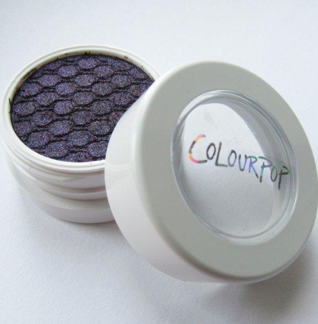
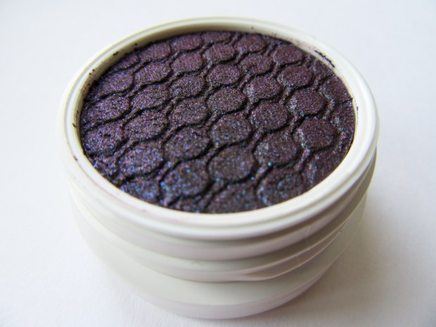
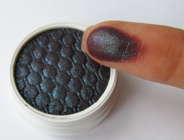
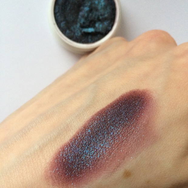
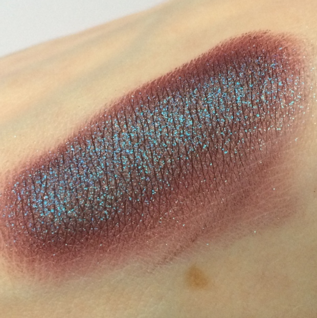
Violence – Cranberry (metallic)
Rich Bitch – Gold (glitter)
Courtney – Peach Beige (matte)
Expensive – Teal (metallic)
Confession – Brick Red (metallic)
Vanity – Deep Brown (matte)
China White – Cream (matte)
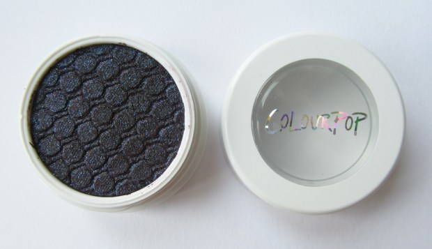
Black Rainbow – Black (multi-coloured glitter)


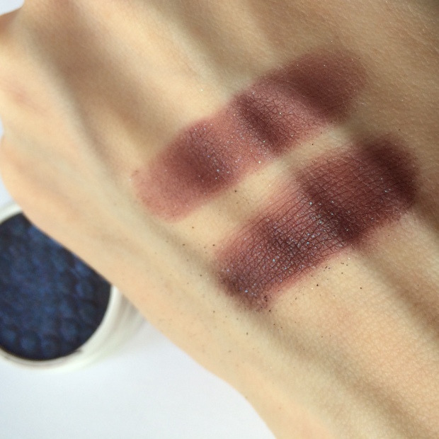
The descriptions above are of the colours as they swatch, not necessarily how they look in the pan. Both ‘Violence’ and ‘Vanity’ look very, very different in the pan; ‘Violence’ looks metallic violet, but swatches with a strong red undertone; ‘Vanity’ looks like a really unusual warm grey, but swatches a cool dark brown. I have to confess, I was a little disheartened when I swatched these two, but they do help to balance the other bold colours. They help make the palette more versatile. You can quite easily use only this palette to create a multitude of different looks because of the great mixture of neutral/bold, matte/metallic.
Just before releasing his palette to the public, Jeffree Star previewed it on his Youtube channel (screen-shotted below from makeup tutorials.com). As is shown here, the colours were chosen with the intention that they be split into four quads.


This method of selecting four complimentary colours makes the palette particularly easy to use for beginners or those wanting to dabble in a bit of extra colour. Each quad is extremely wearable with Jeffree Star’s signature edge, be it a pop of gold glitter or neon pink. Yes, the combination of metallic teal and Barbie pink may be too OTT for some, but without these bold shades the palette would be a little flat. It certainly wouldn’t be Jeffree Star.
Pigment + Texture
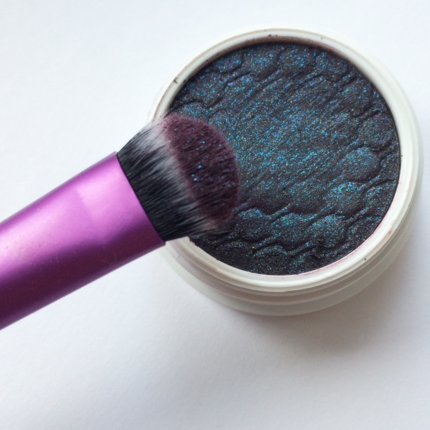
To cut a long story short, the pigment is AMAZING. The matte shadows are slightly chalkier than the metallic, but that’s to be expected. The texture is much like Sugarpill shadows, and they pack the same punch and blend like a dream. The only exception is ‘Rich Bitch,’ which is more like a pressed pigment/glitter than an eyeshadow. It kicks up quite a lot of fall out, but can be lightly pressed onto the eye for a glitter effect or blended out for a more even coat of colour.
My swatches were taken without primer and the coverage of (almost) every shadow is brilliant. The metallics glide on without patchiness and the mattes, though they require a little bit more patience, are equally opaque. I was hugely impressed with ‘Black Rainbow;’ it can be hard to find a good black shadow, there’s plenty of ‘charcoals’ on the market, but this is a true, deep black.

Overall, I love this palette! The colour choice it offers is unlike any other palette I own. It’s the perfect balance of sensible and bold, for the office or for a night out on the town. It’s a great introduction to brights for beginners and challenges the experienced makeup junkie with some new colour combinations.
Will you be trying ‘Beauty Killer?’ Check it out here.


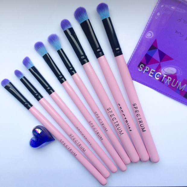
 xture, this brush is ideal for blending out harsh lines to create a seamless look. It’s long, narrow shape means it snuggles into the crease perfectly to add shaded definition. A must-have for smoky eyes.
 ush are tightly packed meaning it’s great at scooping up product, while its angled edge allows it to nestle into the contours of the eye. Ideal for adding a focused pop of colour to the inner or outer corner.
 y. Great for covering the entire lid, this brush can be used to apply cream-based primer and bases or a sweep of colour with no effort at all. The starting point of any look.
 e set, this brush is perfect for building up colour and depth as its tightly packed fibres really grab hold of product, allowing you to go bold or dark and moody to your heart’s content.
 d, dense tip allows for focused application, particularly under the eye or in the inner corner. This brush is particularly useful for cut-creases as its shape and size makes it easy to blend out colour while staying inside the lines. The all-rounder.
 n of the stubby shader, this brush is ideal for blending out kohl or gel liners for that super intense, grungy smoky eye. My (unexpected) favourite.
 hat is not only suited to carving out the contours of the eyes, but can also be used to add definition to the nose, to buff out concealer and add highlight. The multi-tasker.


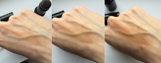
 taupe transfers to the skin as a pale coffee hued smudge. Gel Sculpt is really a glorified cheek tint and a strange one at that.