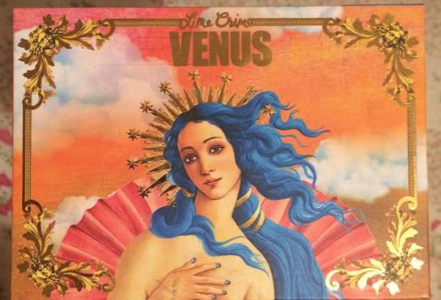
Introducing the “newtrals,” Lime Crime’s Venus mixes “Botticelli’s classical painting with the rebellion of the early 90s” to create the grunge palette.


I thought I’d collected my fair share of ‘warm’ eyeshadows: think MAC or Sigma’s ‘Warm Neutrals’ and you think taupes, caramels, the token frosted copper and highlight. But for Lime Crime, warm means deep red, russet and chocolate.
Needless to say, I saw the swatches on Instagram and fell head over heels, but was a little anxious as to how the ‘oranges’ and ‘reds’ (for want of more poetic titles) would translate on my fair skin. The smoked out bruised look may have worked in the 1990s, but this is 2015 and I have to pop in Sainsbury’s without any stares.

So when Santa left this under the Christmas tree, I got to work testing different looks and combinations. Here are my thoughts:
Colour choice: This is the best part of the palette and, perhaps, the most important part. There is a good even range of dark and light shades, all with their own unique tones that are unlike any shadows I’ve tried before. They are, too, surprisingly versatile; Icon and Divine are especially useful for giving a new twist to my go-to looks. That being said, it is worth being careful not to go wild with the reds; blended too far around the eye and it won’t be pretty, more sickly.
The wide range of the colours provided means that there will be at least one that isn’t for you. For me, this is Rebirth, the colour of ‘an overripe nectarine’ (…) or a bold medium orange. It is a beautiful shade, but will not work with my skin tone. Though I do like to use a light dusting on my cheeks over my usual blusher, just to add a different hue.
I would also like Aura to be a little lighter. As the palette’s highlight, for me, Aura would work better as a cream/champagne rather than a gold as I find myself having to brighten it with a whiter shade (usually UD’s Bobby Dazzler). Although, without it’s subtle metallic colour, the palette would be a little flat. The jury’s out!
Pigmentation: Below are the official swatches that I originally saw on Instagram. As you can see the satin shades, Aura and Shell, are particularly bright and bold, and the mattes deep and opaque. Lovely. Though I’d imagine that Doe Deere (the inventor of the palette and owner of those fingers) used some sort of eyeshadow brightener to boost the colours. Lime Crime actually does produce a brightener, but it’s £13.50 and I’d rather spend that amount on a new velvetine.

The pigmentation, then, without such a brightener can vary. Matte shades tend to need two or three coats if they’re going to look as deep and consistent as they do here. I usually cover my eye with NYX’s Jumbo Eye Pencil in Milk to achieve the most ‘true’ colour; the white base serves as a brightener would, but costs almost a third of the price. The Satin shades have a slightly better consistency, but also need a little help from a mixing medium if they’re going to look as bold as they do above.
Texture: The texture reminds me a lot of Sigma shadows. They seem ‘thin’ on the eye. By that I mean weightless, with a velvet feel. While that’s lovely, there is a fine line between that and ‘chalky.’ The mattes, in particular, can feel chalky if applied in layers and do have a fair amount of fall-out (but I’m yet to use a palette that doesn’t).
Special Mentions:

Divine: ‘Dusty Stone’
The rather bleak description does this colour no justice at all. Divine makes the perfect transition shade, but I also like to use it alone to shade my crease for subtle everyday looks. The more it is blended, the more the colour seems to develop from an average taupe to a lovely pink-toned beige. It’s like MAC’s Velvet Teddy in an eyeshadow!

Venus: ‘The Colour of Bruised Fruit’
It’s UD’s Vice 3’s Sonic, but better. Venus is a gorgeous red-brown with a light satin finish. Despite it’s unusual colour, it is surprisingly versatile and can work with similarly warm tones as well as navy, deep purples and silver. An essential shade for that sultry smokey eye.

Creation: ‘Rust Brown’
I left this colour untouched for a long time assuming that it was too orange-y for me to pull off, until one Sunday afternoon – pjs on and nothing to do – I decided to test it out. I absolutely love it! Creation is an unusual burnt orange colour that looks beautiful when paired with Divine. A must-have for those with green eyes!
In this look, I used Divine, Venus, Creation and a little Icon on my eyes, Aura to highlight my cheekbones and Rebirth as blush:

What do you think of the Venus palette?
Hope you like!
Molly x


 For nighttime looks, I needed something that would make my pigments ‘pop’ (cringe… but you know what I mean), so I opted for Illamasqua’s Sealing Gel. This dinky bottle may seem expensive at £7, but it’s uses are endless. It is a mixing medium revered amongst make-up artists for turning eyeshadows into liquid eyeliners. However, if you place a few drops on your eye lid, tap with your finger until it becomes tacky. Once your pigment is applied on top, you’ll see an unbelievable transformation: the colour is bright, the shimmer intense and the coverage even (no lumps of gunky glitter clogging your lid).


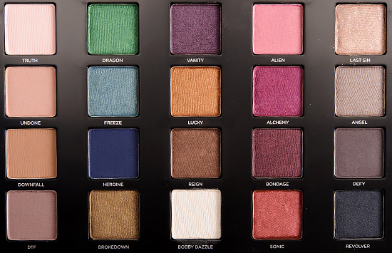
 As always, I have a few complaints. While the shadows have an amazing colour payoff, they are particularly powdery. I’m not sure whether this is more noticeable here because of the number of shimmers (prone to a crumbly texture – think ‘Dust’ from Naked 3) or whether it is an unusual oversight by UD. Regardless, be careful of this excess if you have already applied your foundation and concealer!
 ‘Champagne Shimmer with Silver Micro Glitter’
 Bright Metallic Green Shimmer’


 Sigma’s Warm Neutrals Palette presents 12 gorgeous shadows, each with richly pigmented pink, beige and burgundy tones – perfect for Autumn.


 t’s shape, it’s colouring and it’s definition, as I have done in this picture. Instead of the tear-drop shape, I’ve flicked out the corner of the arc to mimic my eyeliner; added UD’s Naked 2 ‘Blackout’ to my crease; and brought the eyeliner underneath my eye into a point at the inner corner to create a cat-eye effect.


